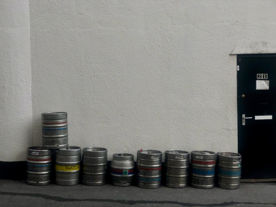
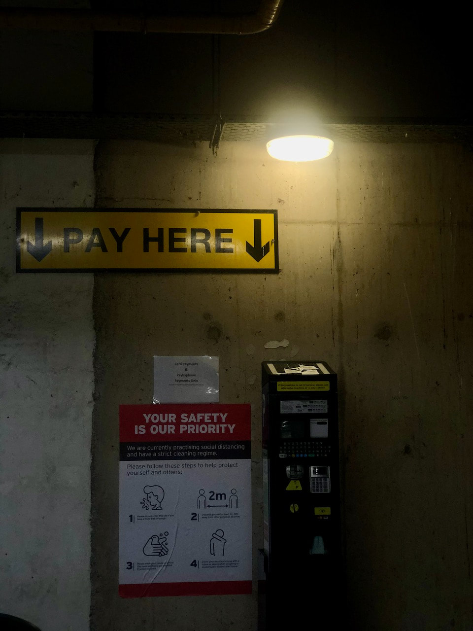
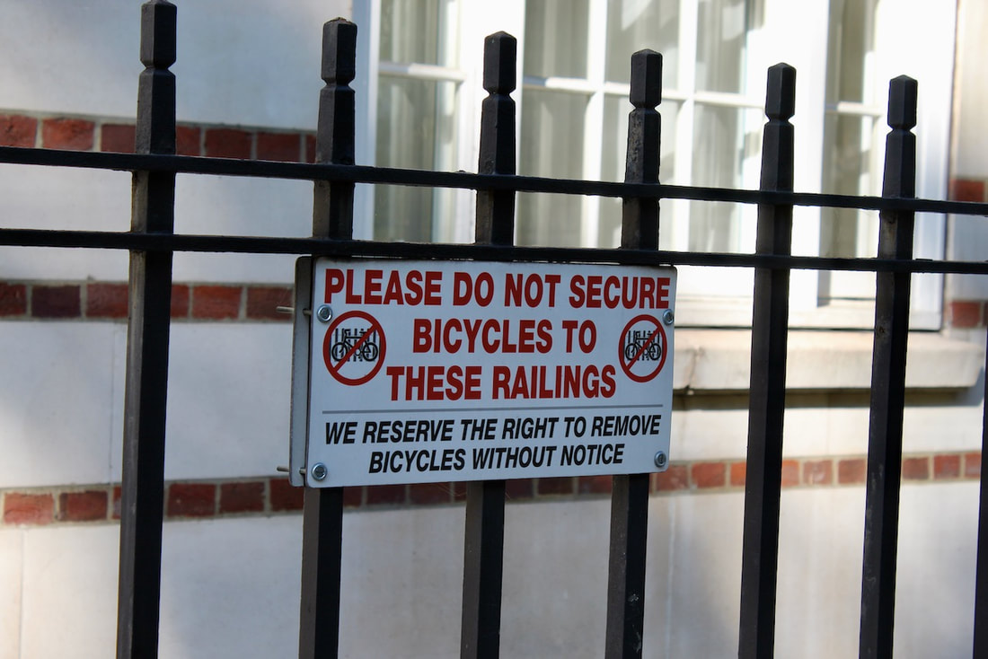
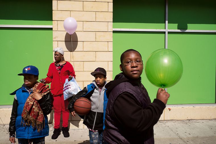
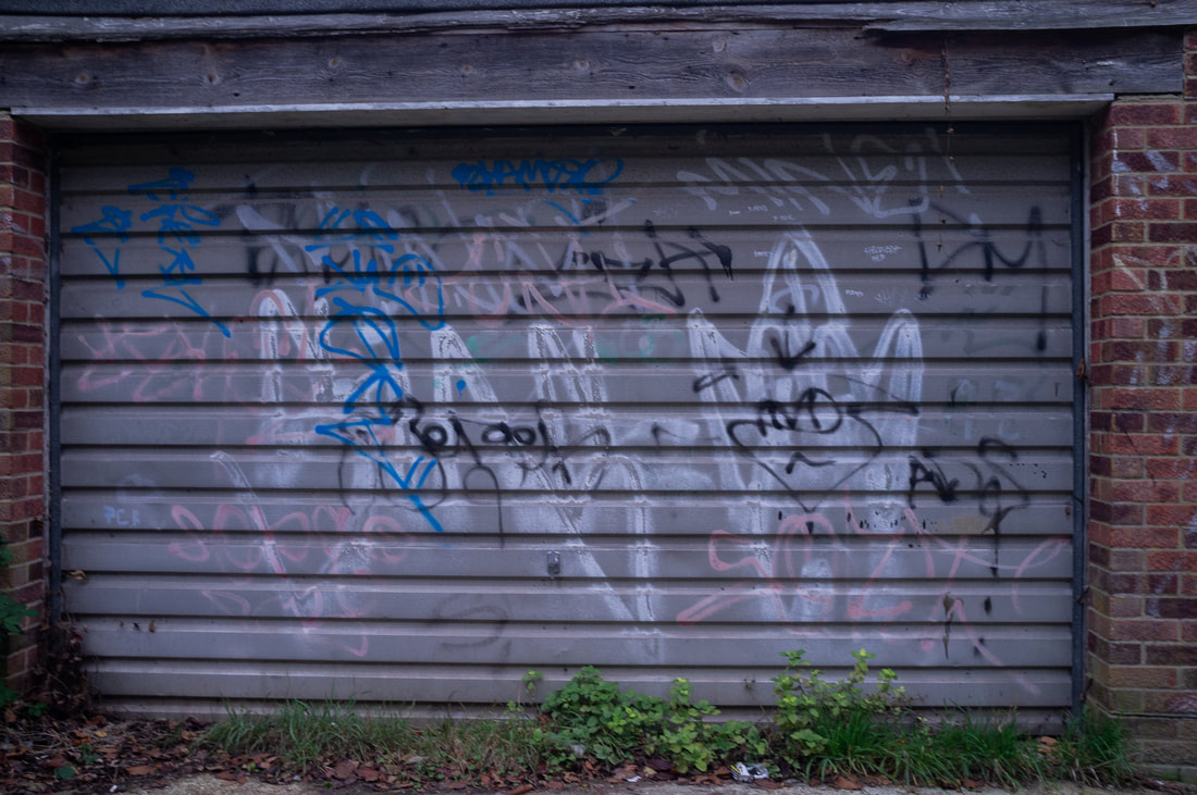
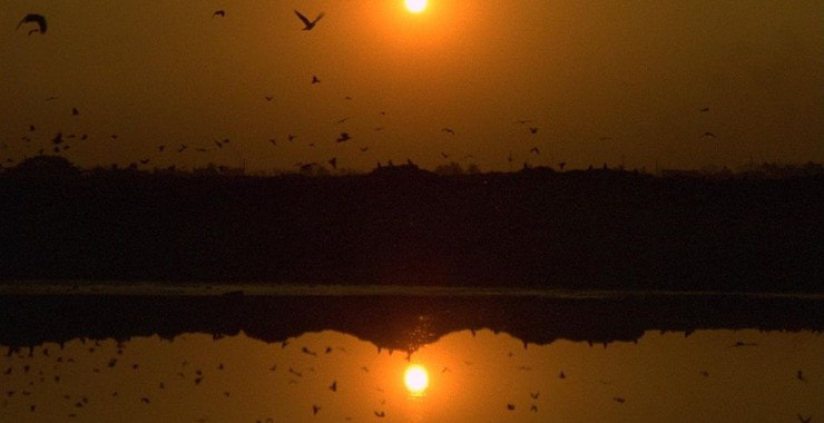
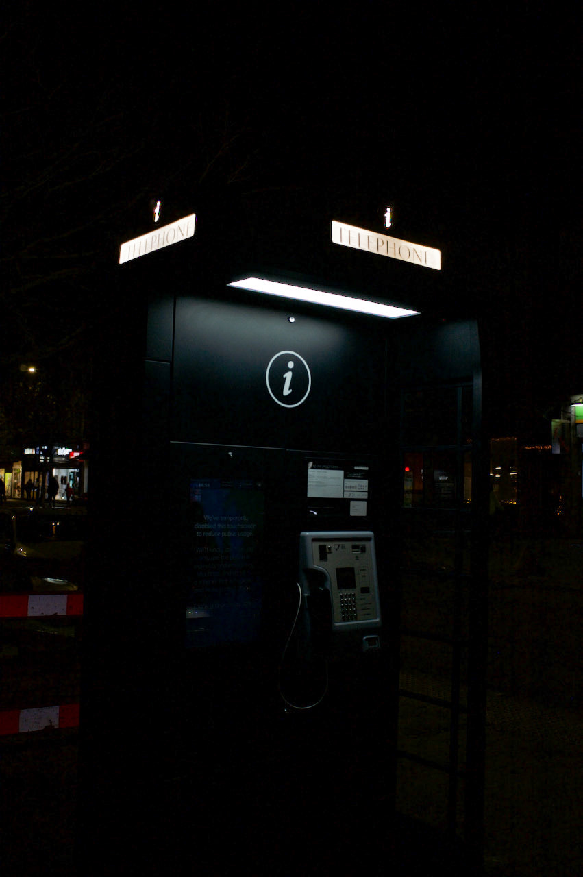
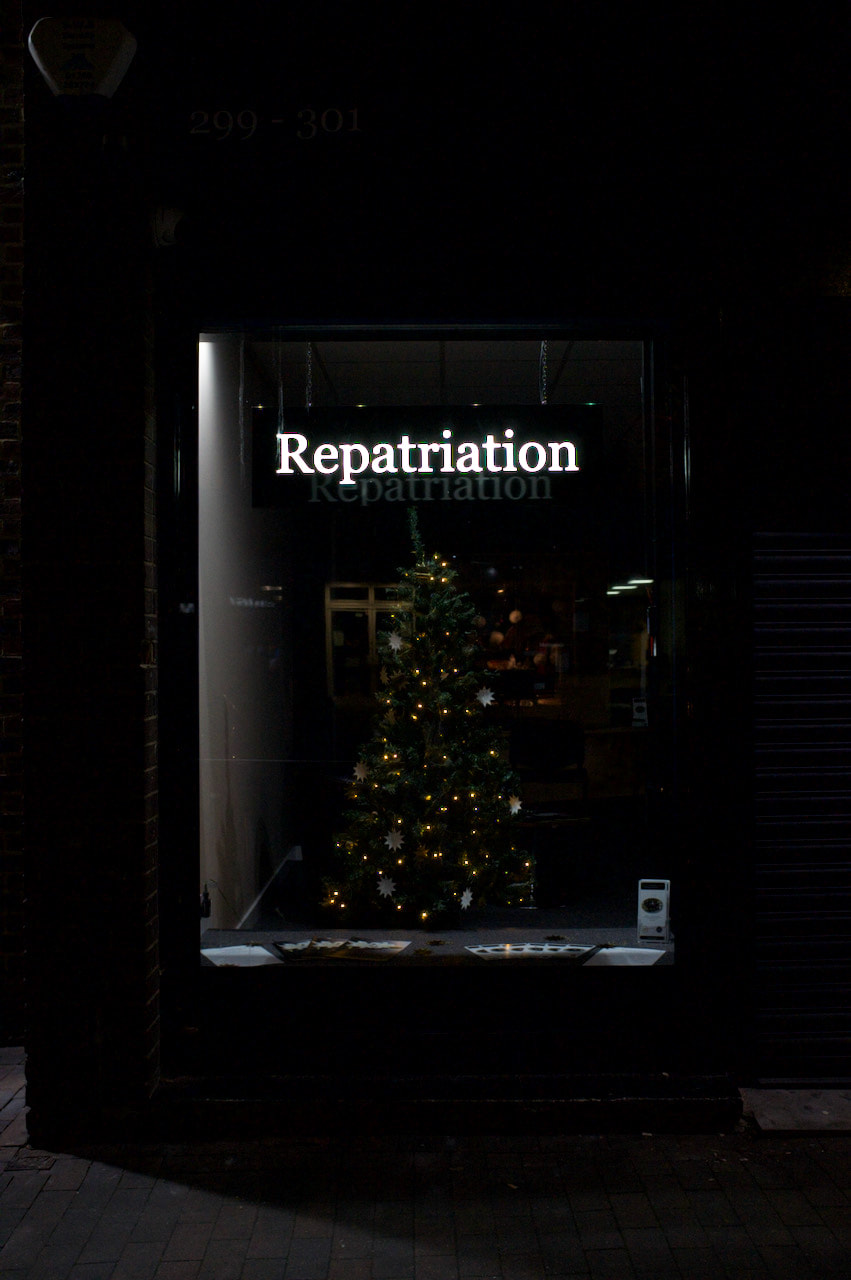
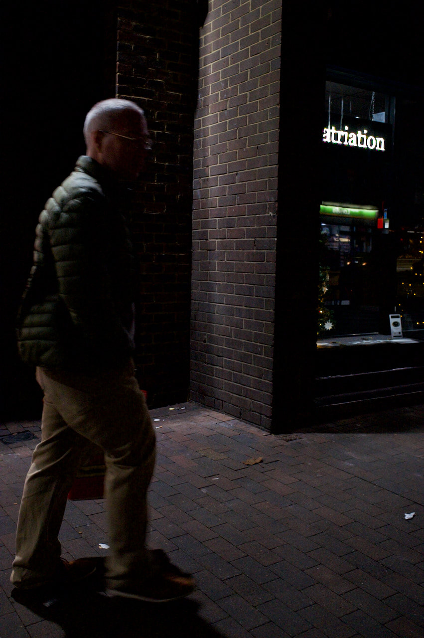
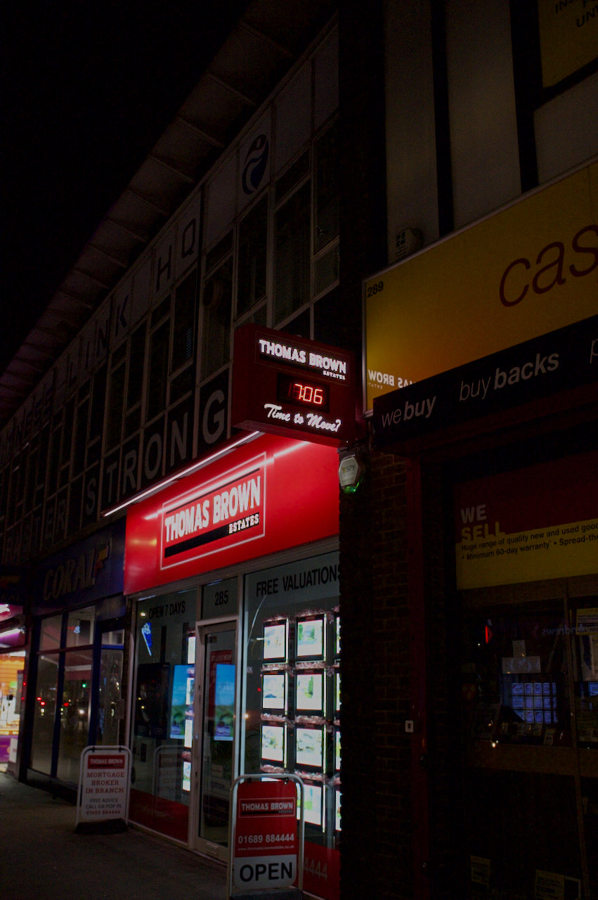
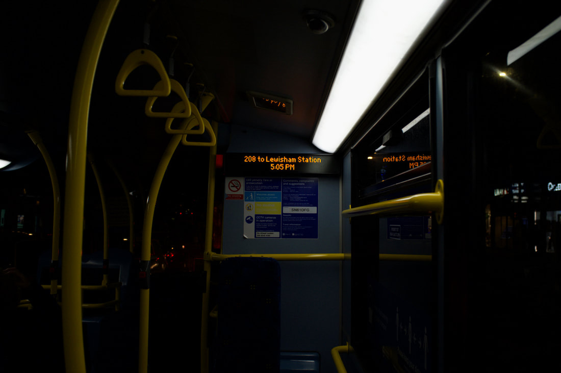
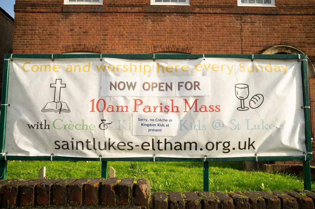
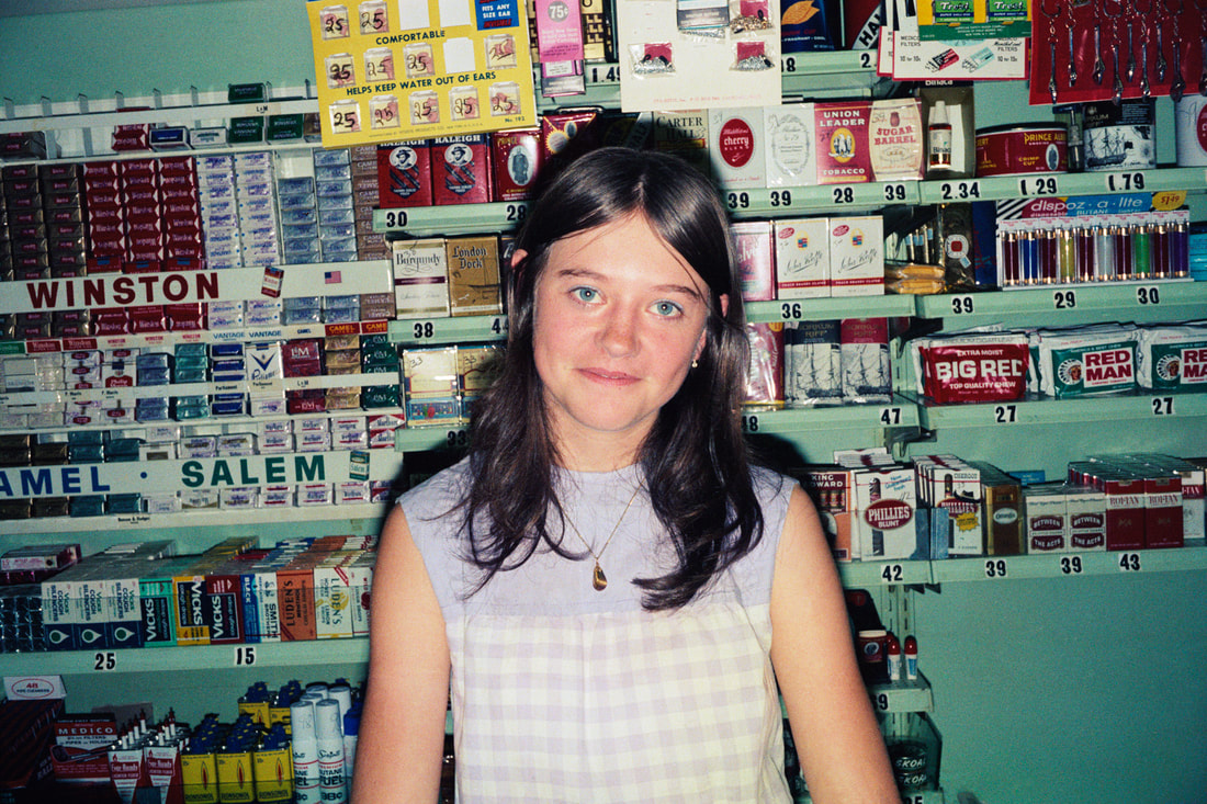
Introduction
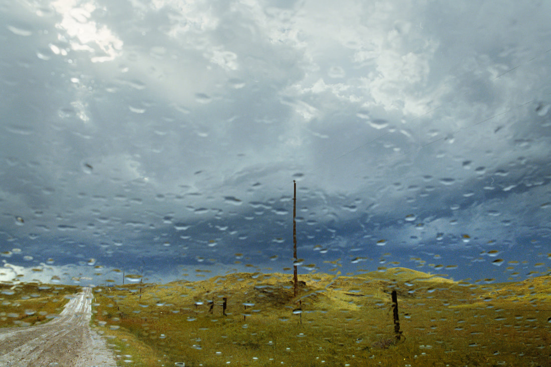
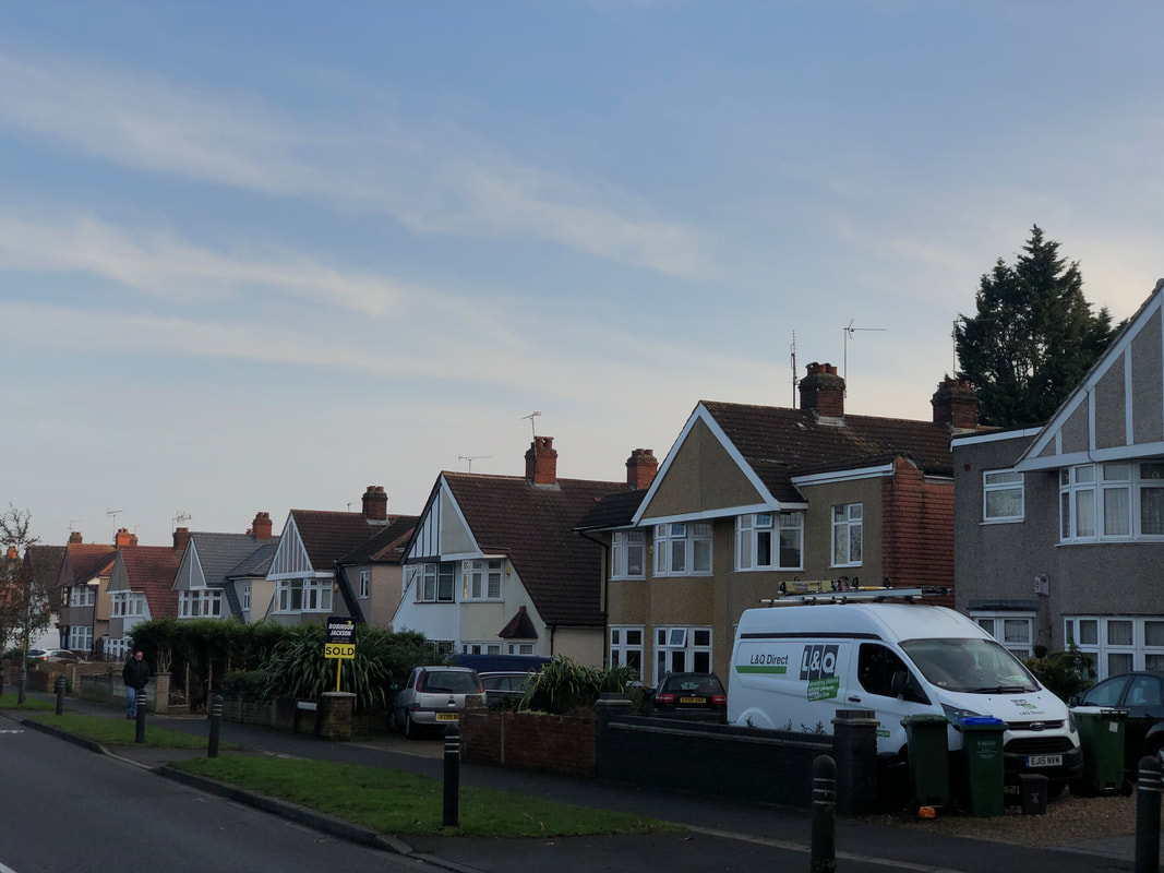
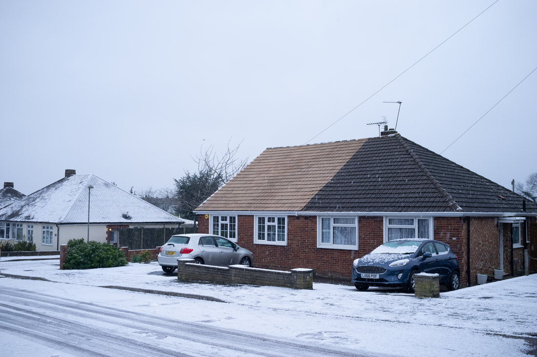
My initial thoughts are to use the current climate to show how everyday life has been affected, and how once parts of it has been stripped away it is missed and was taken for granted. To coincide with this I would like to experiment with using street photography to show how the every-day life has been overall affected, with less people being able to go outside and work, and using abstract photography to create a sense of loss using simplistic shapes, colours and so on to show how everything could be considered unfamiliar and stripped away. Using photographers such as Todd Hido, in his photos of houses to create a feeling of desolation and distance, Kathy Ryan's use of lines and shapes to break up images into sections and obscure normal objects.
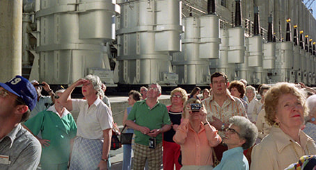
Examples from Paul Strand
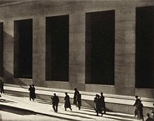
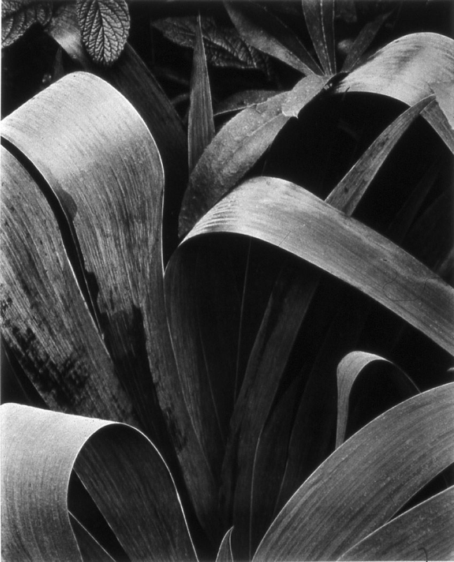

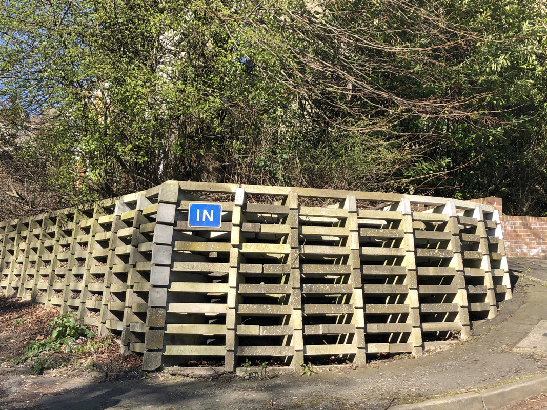
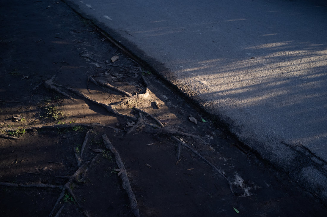
I find these images important as they all have a sense of bleakness and it isn’t demonstrated by directly showing an emotion or forcing the viewer to view that. Paul Strand has done this by having minimal amounts of objects in the frame, but also the use of straight lines can evoke a source of power that building have over people, as on the first image it seems like an object that is overlooking the people walking past it. The way Paul Strand used lines in the images breaks each of the images up into shapes rather than looking at it as just objects, as shown by the 2nd image as he hasn’t just taken a photo of the whole plant but a small section of it, making it more interesting and obscuring it.
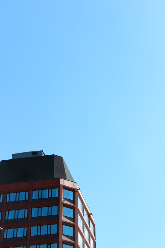
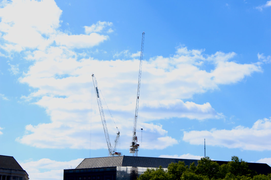
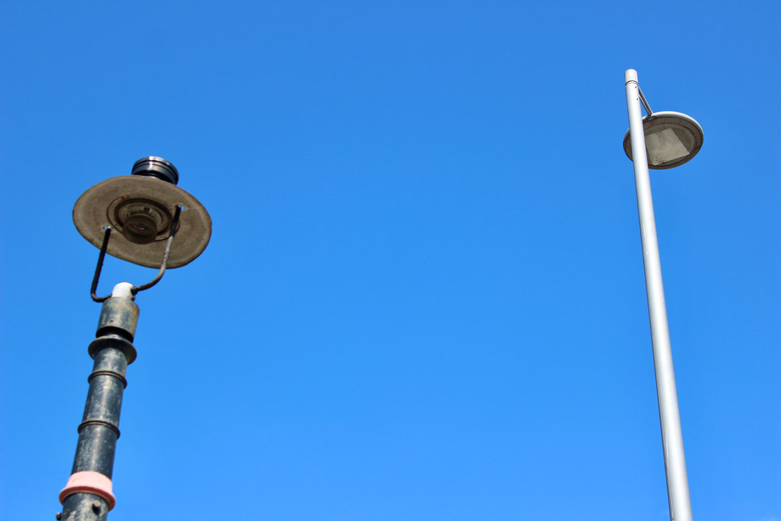
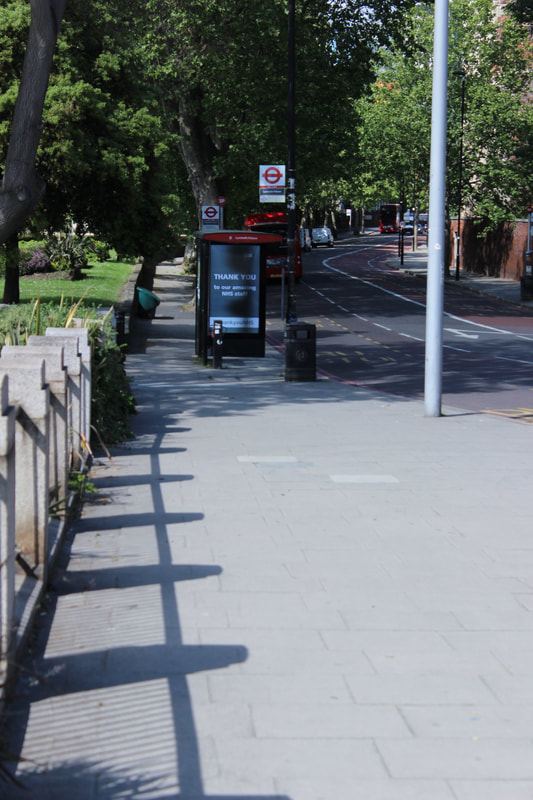
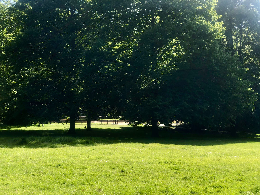
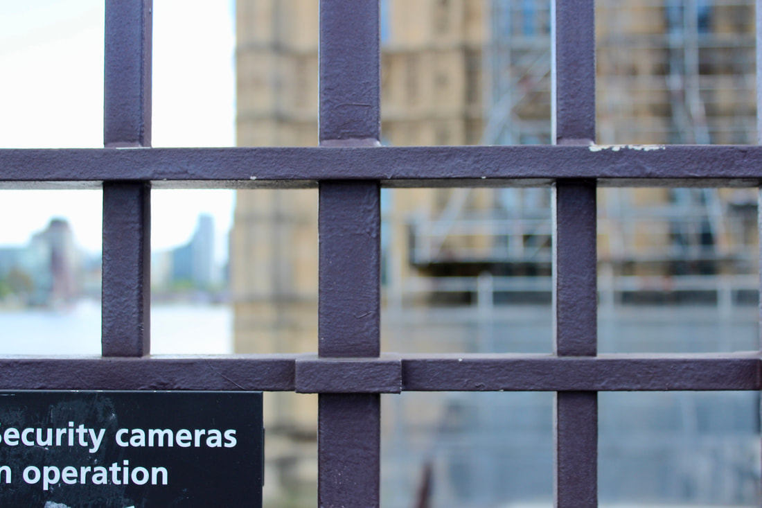
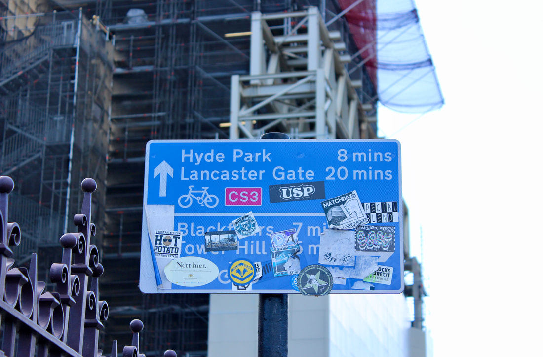
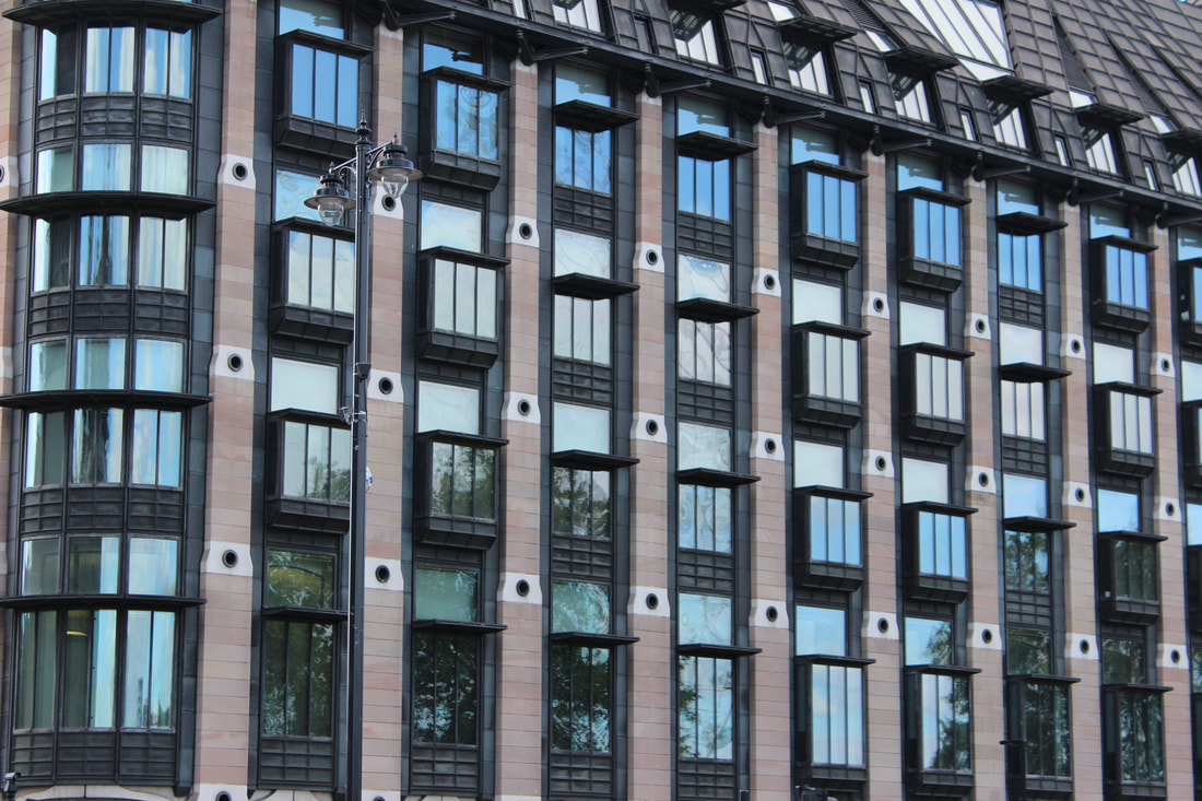

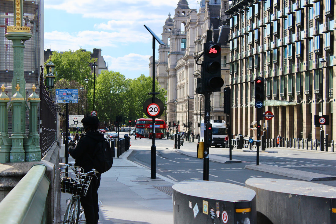
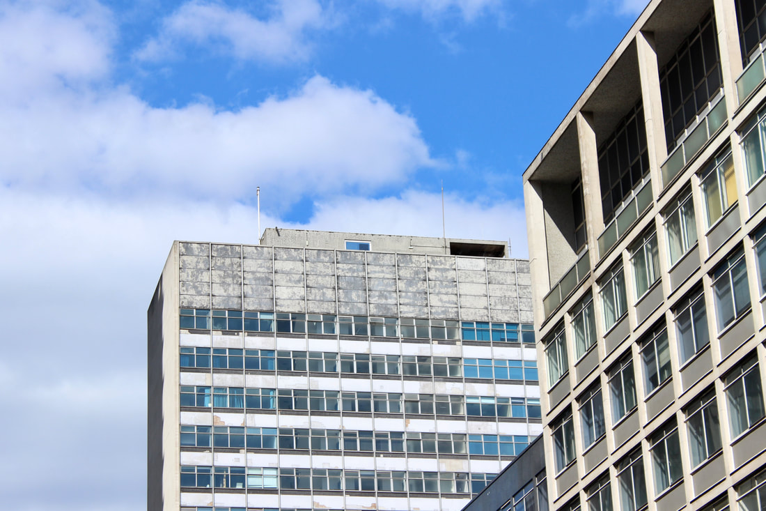

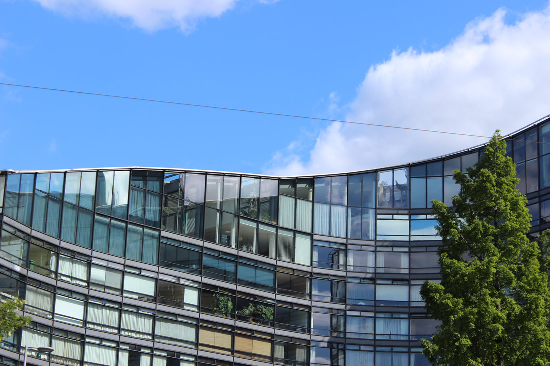
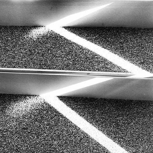
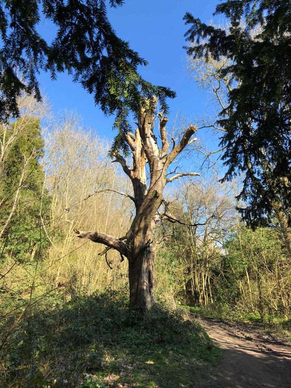
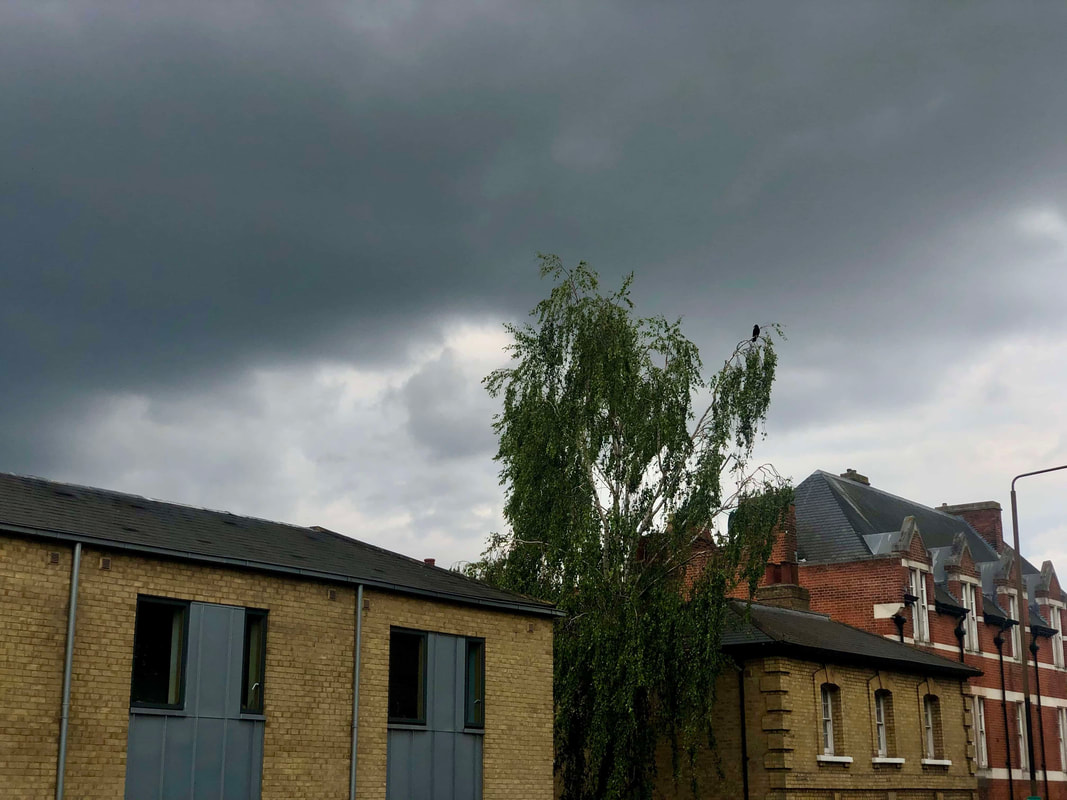
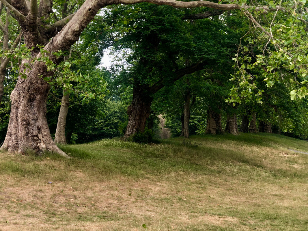
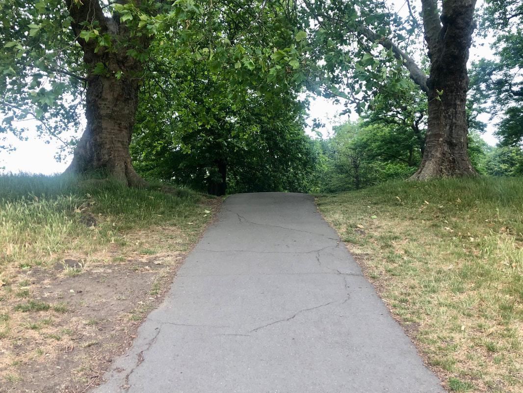
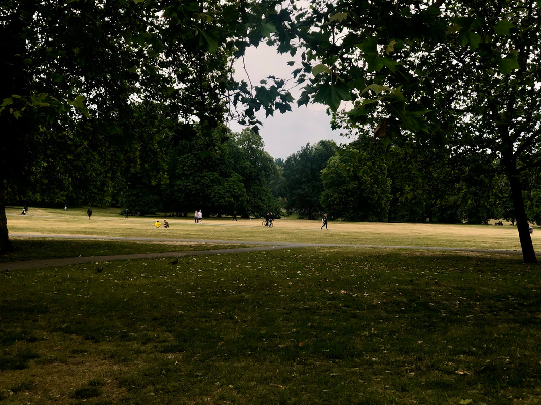
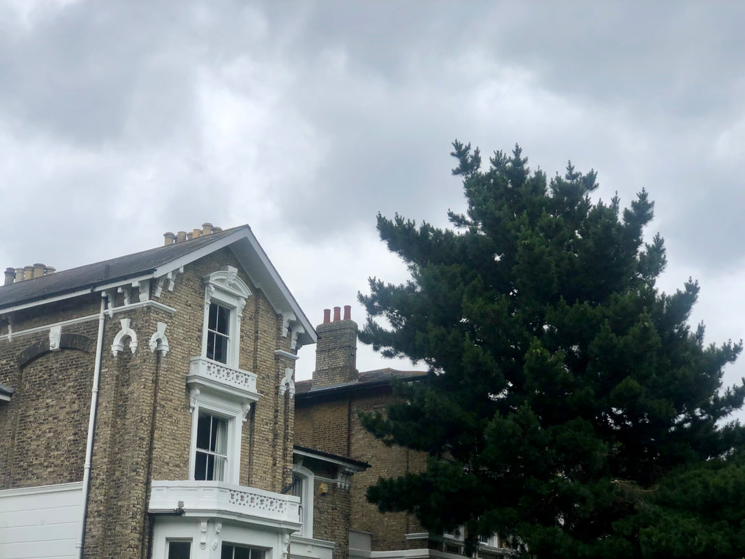
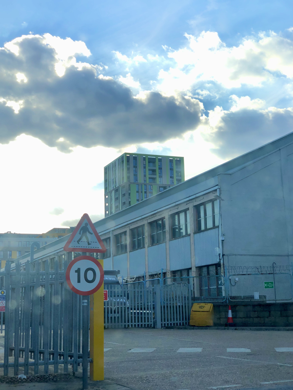
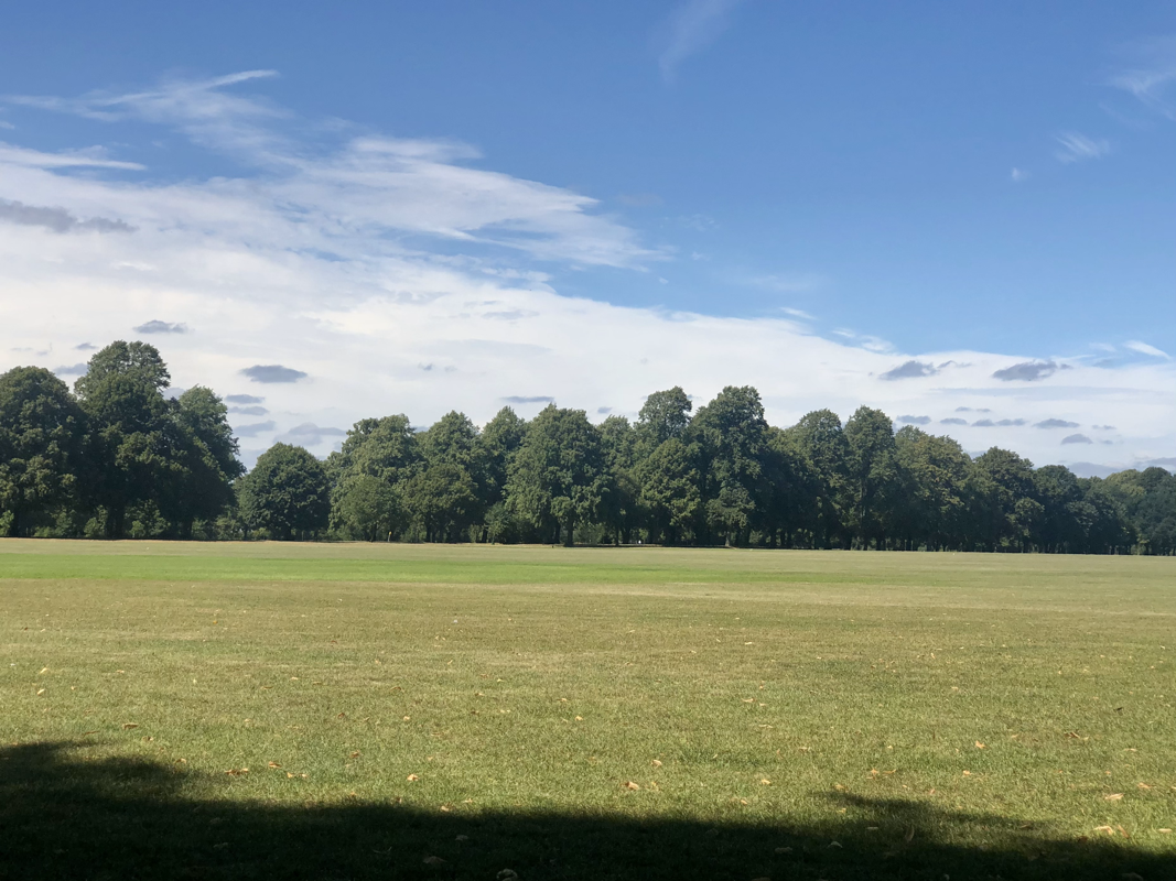
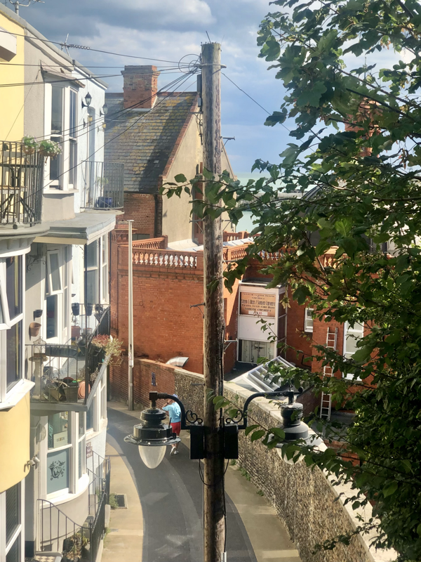
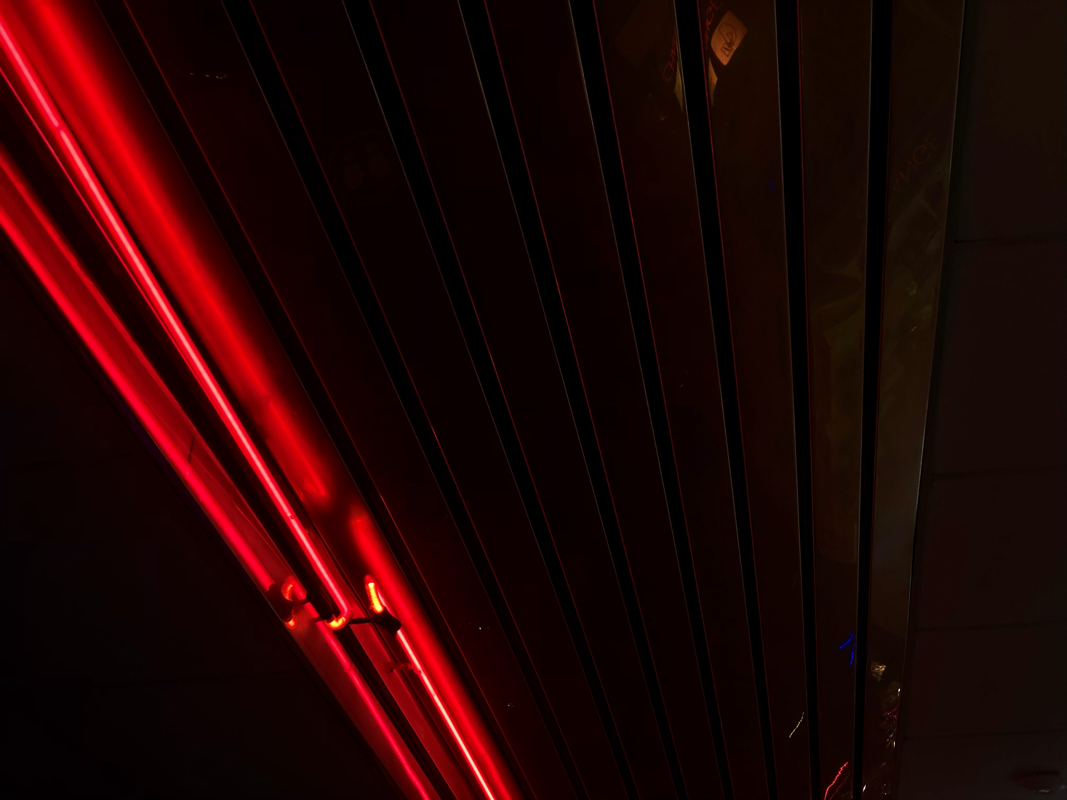
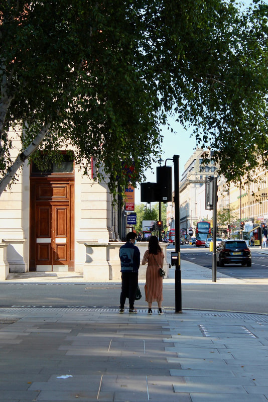
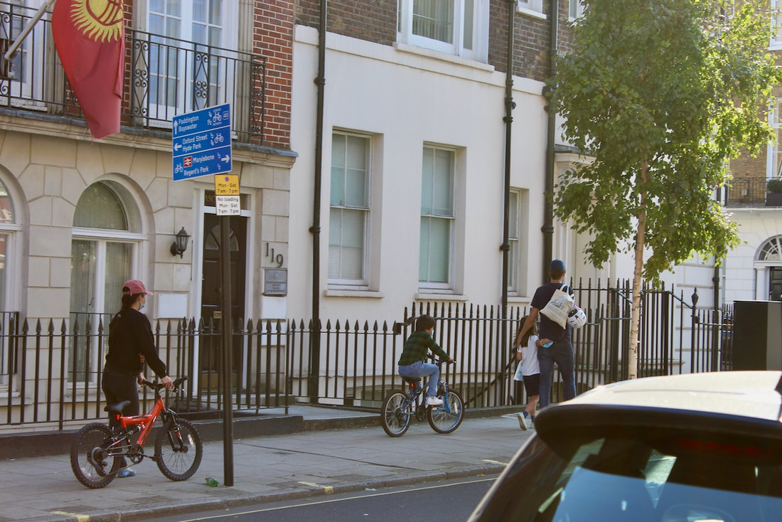
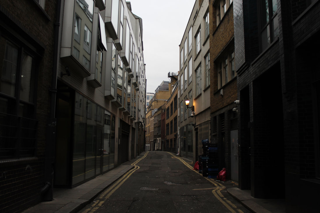
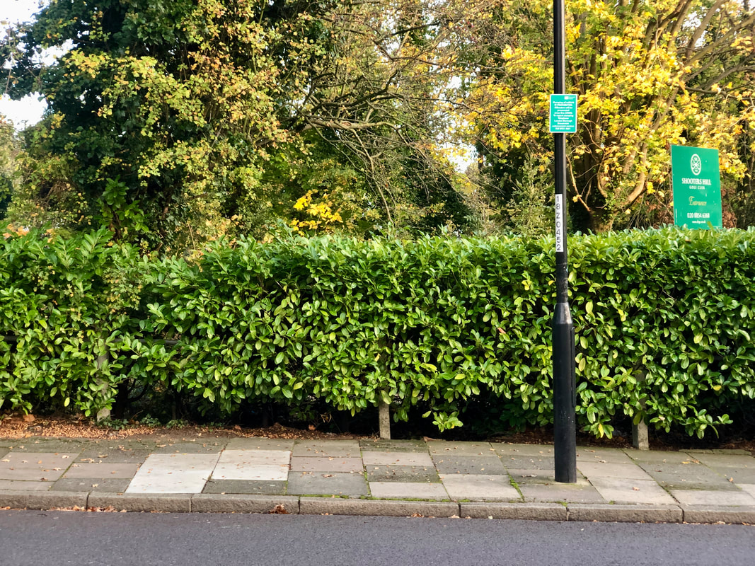
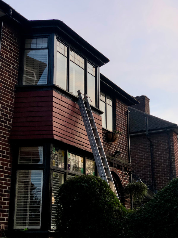
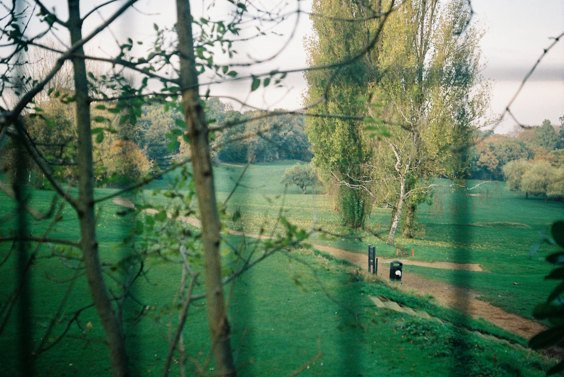
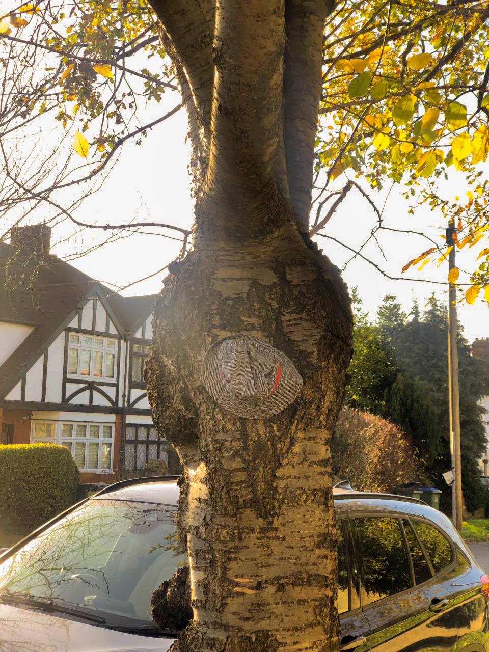
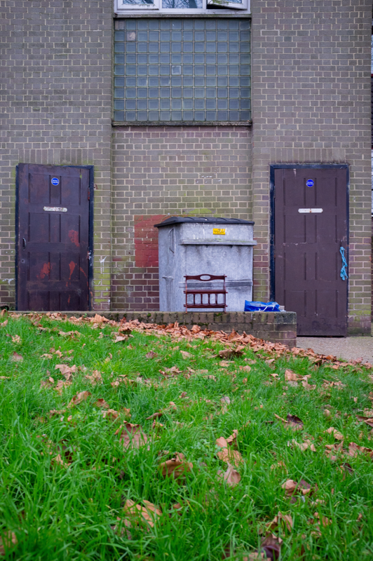
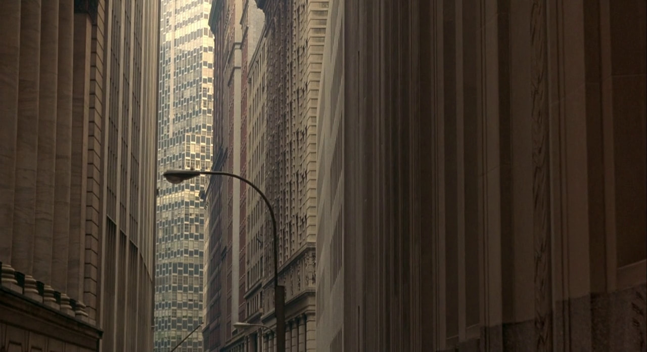
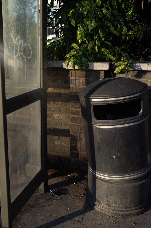
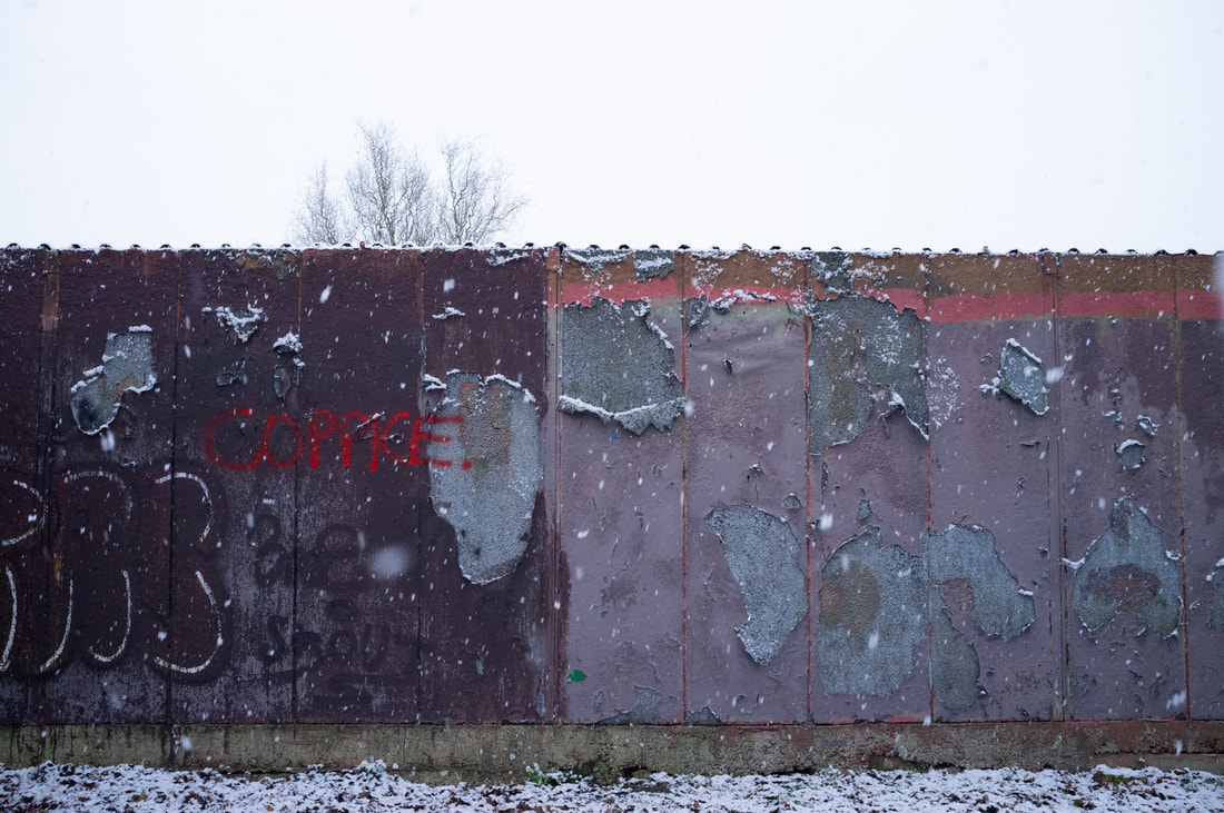
I took these photos when on a bike ride to Hyde Park, as I thought during the lockdown it would be good to use this opportunity to do something I've wanted to do. In these images I attempted to recreate the Paul Strand images and his style of using lines to break up the pictures into sectors and shapes. I find straight lines appealing in photography because it can create a sense of industrialisation, specifically when done with architecture, but is also synonymous with specific genres in art which have gained huge amounts of recognition, such as cubism. The lines also can force the viewer to look at a certain point if it leads to a specific part of the photo. In the first image I attempted to use negative space to have a photo of two halves, one of the beauty of nature but also one of the beauty of modern cities and architecture, which I have an interest in. The next two I wanted to obscure the buildings and make them seem as just patterns on a wall rather than as the faces of the buildings themselves.
Paul Graham Interview Questions
The Interview
1. What is "easy" about photography? What is "difficult"?
In the opening paragraph, Paul Graham states that "it's so easy", my interpretation of what he is talking about here is the fact that the physical aspect and the basics of photography is easy to conceptualise and also to perform. The simple act of taking a photo of something that the photographer deems to be photo-worthy is easy. It is simply the click of a button. However what is difficult is to capture something at the correct time as life is constantly flowing and moving through whilst people are just observing or not paying attention.
2. What does Paul Graham value about photography?
Paul Graham, I believe, values the timing of the photos and how they were completed. For example, he states "Is it the hard won photograph, knowing, controlled, pre-visual? Yes" He goes on a list mentioning the different types of scenarios that he all values as the photograph is taken at the right time, and place.
3. What advice does Paul Graham offer us about what to photograph?
Paul Graham, yet again, goes through a number of scenarios which could be considered as photo-worthy to some people. What I gather from this is that anything can be photographed if it is of some value to the person taking it, wether it is an emotional or purely because of the looks.
4. How much planning should we do before getting started?
He mentions the idea that the more planned before hand it is there is a lot less room for surprise. I agree with this as usually when I go out and take photos I have only a rough idea of what I am going to take photos of, once I am out, taking photos I let my creativity lead me.
5. What makes photography "beautiful"?
The concept of it. The idea that the photos were taken exactly at the right time for it to look that certain way, the time, the effort, the money that is spent to make the work or works that the one person, or multiple people working in conjunction to create something that may never of existed if they weren't in the right place at the right time.
Alec Soth Interview
This interview is very intriguing for me as Alec Soth, when making his first project, didn't live in the big city, for example New York or Los Angeles, instead he used his surroundings to his advantage such as using the Mississippi River as an analogy for old America as it used to be somewhat of a motorway for the people of that time period, due to the fact that it practically runs through the country. He used this idea for his project as he followed the river down and took photos along it from what he had seen. This is particularly influencing as many photographers or even people that desire to go into the arts in some way or another have a burning want to live in the biggest cities such as New York, or London, however, there are perfectly viable and just as inspiration inducing locations where a person resides. I unintentionally did this is my photobook as for some photos, like the one of Canary Wharf, I took photos of the centre from a distance, or I just didn't enter central London and used my local area.
He also mentions the fact that for that specific project he had used and inkjet printer for the manufacturing of the book itself. With my photobook I had attempted to create it all from scratch, using my home printer to print the photos out, had perfect binding it, and so on. So the fact that a work that is relatively known was first produced as simply as using an inkjet printer is somewhat inspirational as massive amounts of production and money isn't needed to create a good photography book.
He also used an analogy which I found interesting as to why there are different types of photography distribution. He related photography to music in that streaming services are practically social medias such as instagram and Pinterest, having an album or song on vinyl is like a phonebook, in that the consumer wants to own a version of the work, and seeing a live concert is like seeing an exhibition, it is the work in its fullest without many distractions and the viewer is seeing it in person.
Joel Meyerowitz Interview
Notes
•He found watching Robert Frank more interesting than what the subjects were doing, or at least at first he thought this.
•He grew anticipation in watching the photos unfold and waiting for the clicks of the camera, as he started to notice a fluidity in Robert Frank and what he was taking photos of.
•There were almost peaks whenever the camera had clicked, as he had noticed that Robert Frank was taking photos of small gestures the girls were making, such as flicking their hair etc.
•Afterwards, he noticed the fluidity of people around him when he walked onto the street, describing the raising of a man's arm for a cab as a 'poetic revelation'.
•Photographs was a medium that was open to a somewhat different dimension, wether spiritually etc as it can represent someones spirit with a representation of their small actions that would go unnoticed in normal, everyday life.
"Human energy was so alive suddenly."
Kathy Ryan
|
|


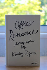
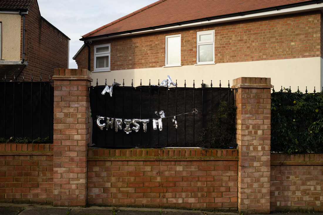
This photographer influenced me as she uses lines very effectively like Paul Strand to break up the photos and to abstract objects. This also creates a contrast with some of the other objects, for example the tables, the book and the paper to create a stark difference. This inspires me to experiment with lines and also just shapes as she uses common objects to abstract them, and distort them making them seem like something completely different and unique to the situation in which the photo was taken. In the specific book that these were taken in, Office Romance, she used the her offices as the theme for the book, as she found the architecture of the building interesting due to the fact it didn't have conventional window blinds and instead used bars across the windows, which created these interesting shadows throughout the building that she had used for her advantage. She is the Director of Photography for The New York Times, so she already had experience with photo producing before creating this book, and had an interest in the advancements of the architecture of the office block. What I had also found fairly interesting about the book is that it is all taken on an iPhone 5, showing that an expensive isn't needed to create quality images that have a unique look and style behind them.
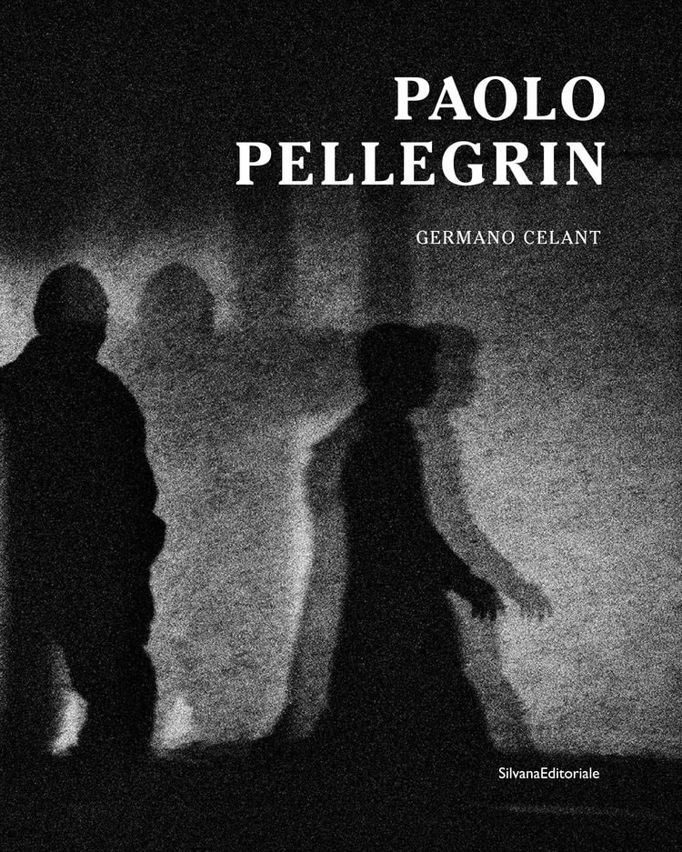
Some of her inspirations include, Alexey Brodovitch due to the emotion that the images portray, wether it is sensuality or drama. Another photographer that inspires her is, Paolo Pellegrin, specifically Un'antologia, which she describes as it being the monograph of his life's work. His work demonstrates what is happening in the world right now, and it is him at the thick of it, highlighting both the photographic sphere but also the cultural and social sphere.

Todd Hido
|
|
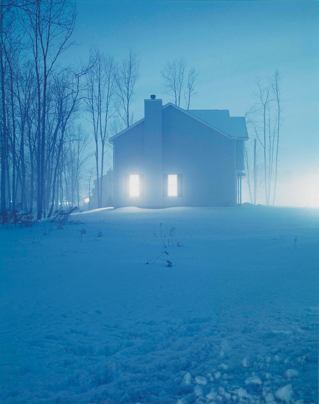
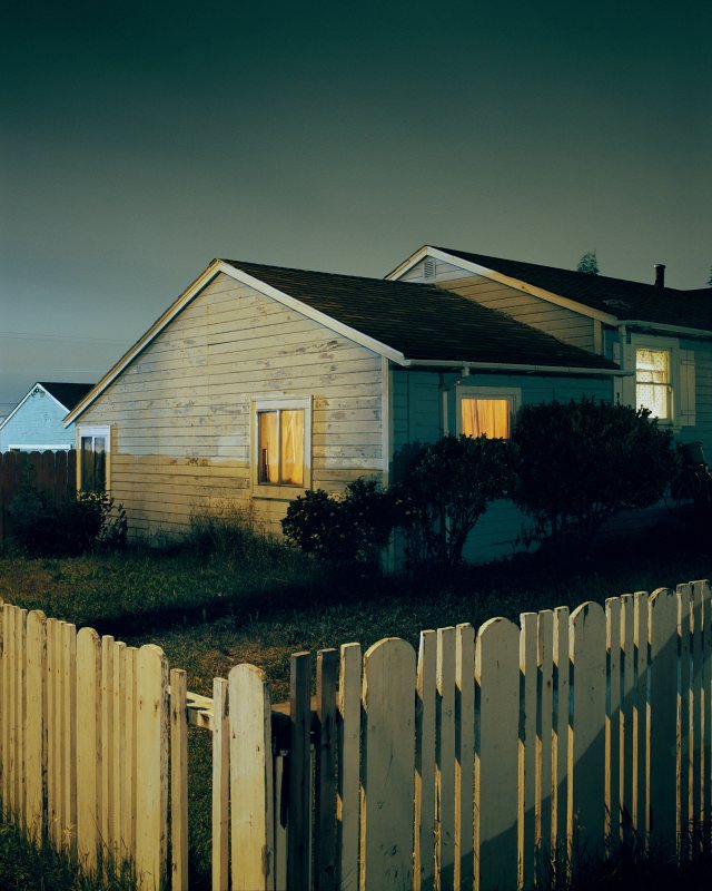
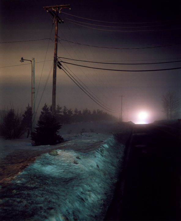
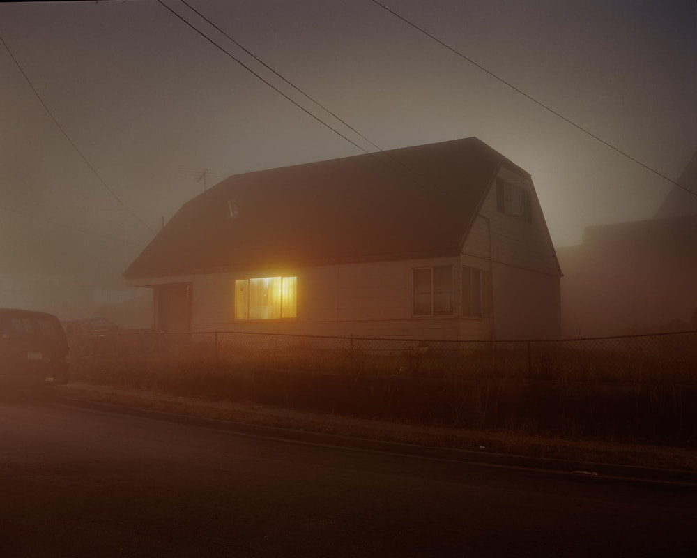

This photographer influenced me whilst creating my photobook, due to his ideology on taking photos and why he does. In the book above, he mentions that he could never be a documentary photographer or a street photographer as he prefers to take photos that remind him of where he grew up and have sentimental meaning for him. I had a similar concept in my photobook in that I took photos that reminded me of my past and to show how I have changed was a photographer but also how I have changed as a person in some sense, seeing the world in a different lens. I also admire his use of light, as he uses long exposures on medium format cameras to create the effect of windows glowing, this creates a sense of isolation, the viewer being positioned outside of the action or just viewing it and not being able to make out exactly what is happening inside the house. A choice that is left for the viewers of the photographs, specifically in House Hunting, but I also do find his landscapes to give off a similar feeling, one of isolation and bleakness as all have very little subjects in the photos, and minimal amount of light, almost a replica to his photography of households.
Upon some research I have found that his inspirations are creatives of the highest class, people such as Walker Evans and Alfred Stieglitz. These both have a similar connections, they all used their platform to show what life is realistically like, such as Walker Evans' photography of America and the suburbs, Alfred Stieglitz with some of his photos doing a similar idea of purely photographing people with barely any bias.
Upon some research I have found that his inspirations are creatives of the highest class, people such as Walker Evans and Alfred Stieglitz. These both have a similar connections, they all used their platform to show what life is realistically like, such as Walker Evans' photography of America and the suburbs, Alfred Stieglitz with some of his photos doing a similar idea of purely photographing people with barely any bias.
Andreas Gursky

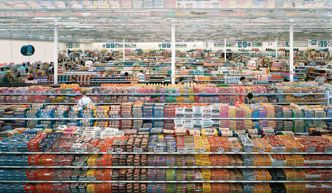


Andreas Gursky is a German photographer who studied under the respected photographers Bernd and Hilla Becher in Düsseldorf Kunstakademie. Unlike the two, he started to branch away from the photography they were renowned for, that of architecture with multiple photos displaying different angles, and he started to become interested in large scale landscapes that show a lot of movement and action. His photos are usually on a large format camera and is later manipulated to make the scene a lot bigger than it is, showing more action, allowing there to be more to take away from a photo as things may be there that other viewers may not see. His recent works have been seen to criticise the commercialism of the modern governments, this is done by the use of digital manipulation to make scenes bigger showing the expansion that many governments are trying to achieve economically and with urban areas.
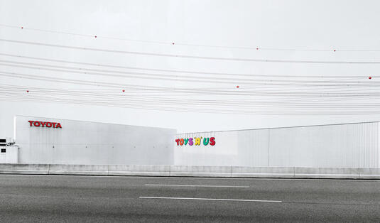
This photo is simply named Toys "R" Us, the use of colour in the photo intrigues me as the only use of vivid, or bright, colours are in the logos of the two brands, Toyota and Toys "R" Us. The use of this, wether intentional or not, highlights what many of Gursky's photographs represent, a criticism of modern expansionism . Another comment on the colours, the white of the factories seem to blend into the sky, this could be showing that factories and many of the sorts has found its way into nature and normal life, nature being the sky and the problems with factories blending in and becoming the norm, this is also exemplified through the use of everything in the photo being in clear focus. The use of it being landscape also adds to the idea of grandness, building onto the fact that these big areas of production to feed governments has taken over large areas of land and natural space that could be used for other activities.
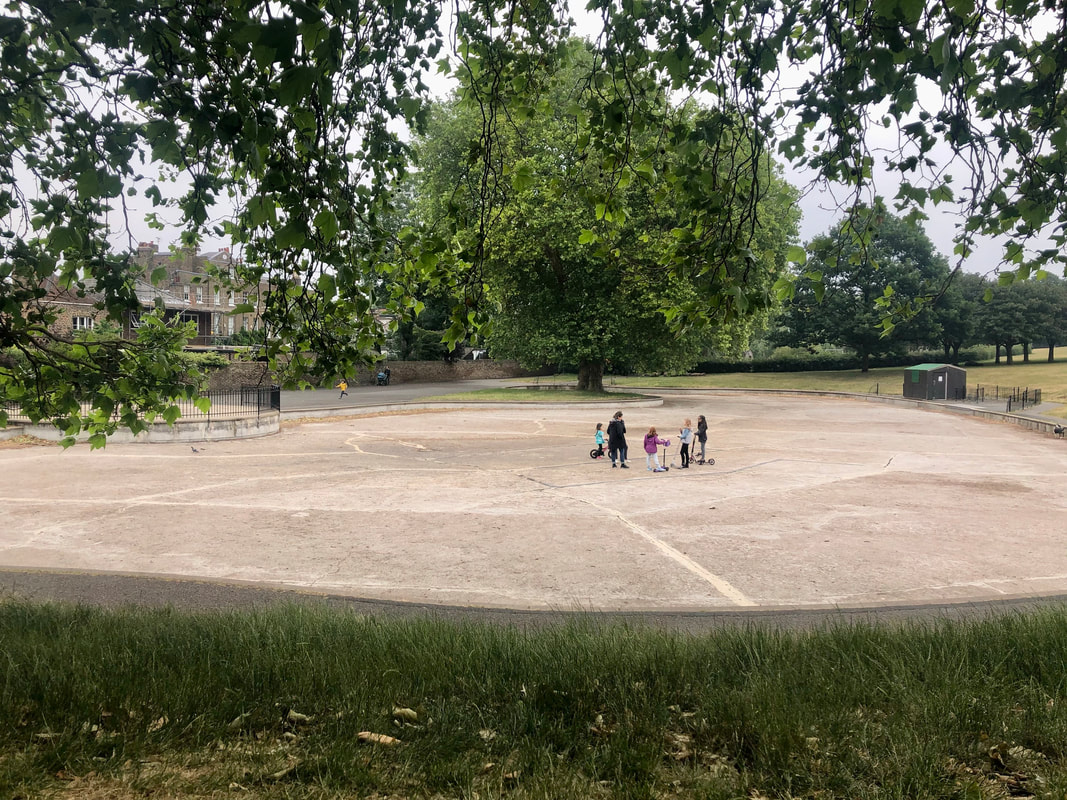
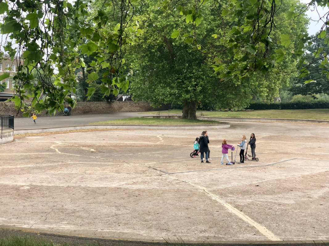
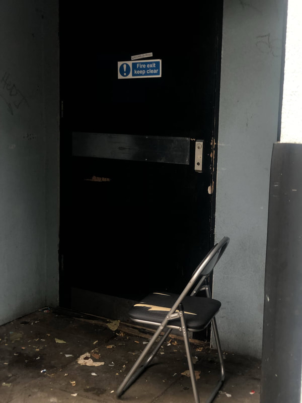
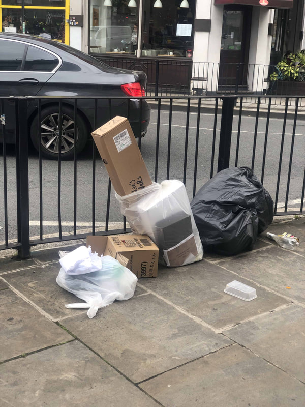
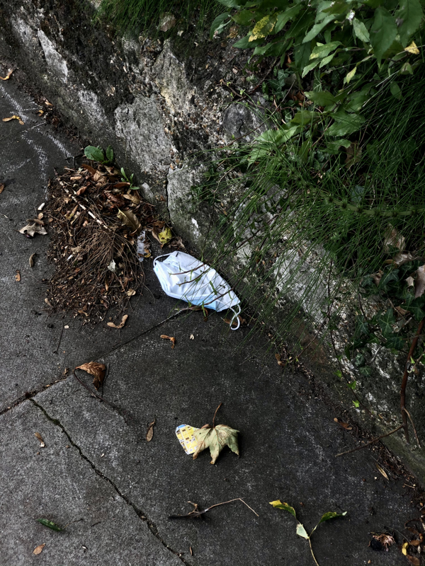
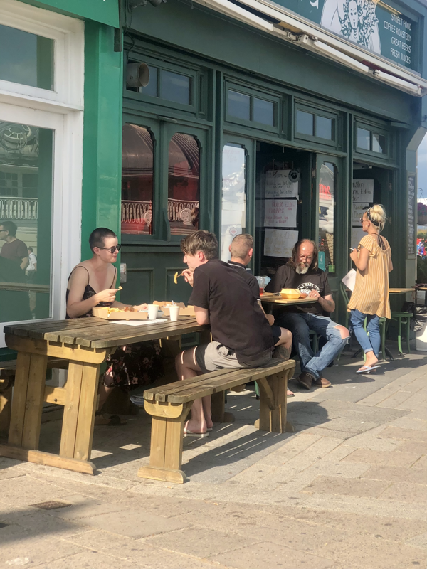
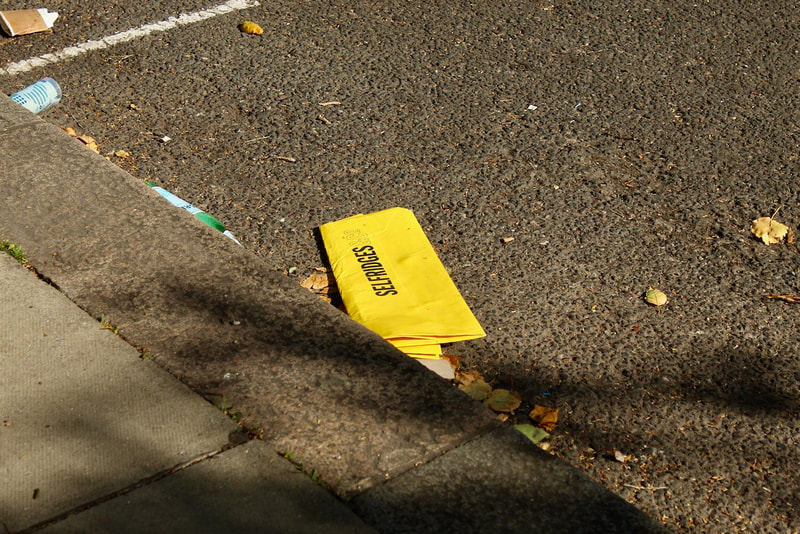
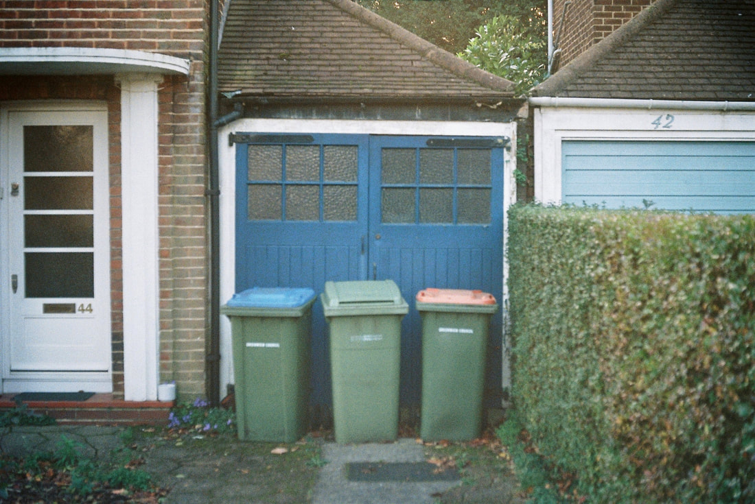
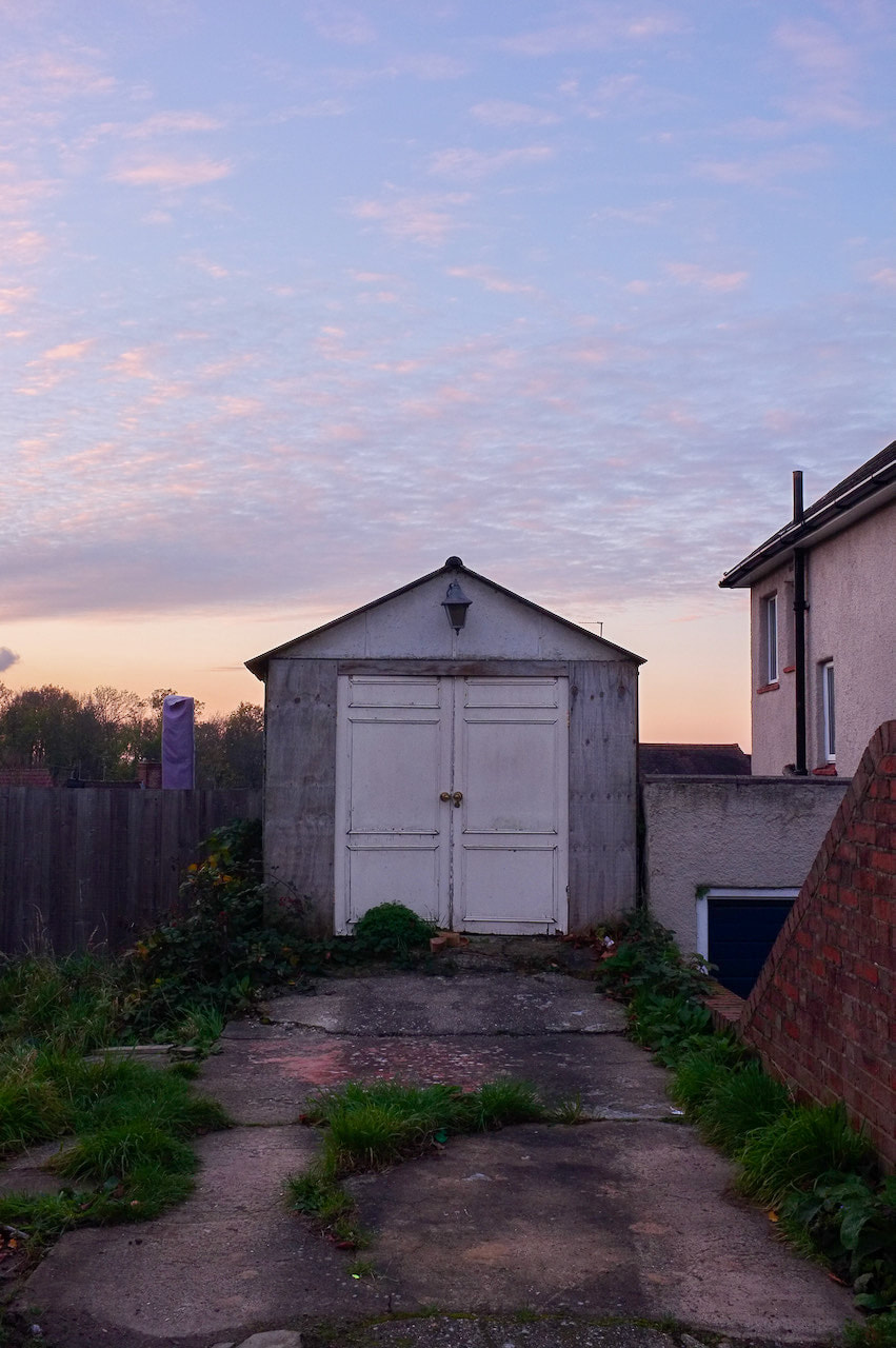
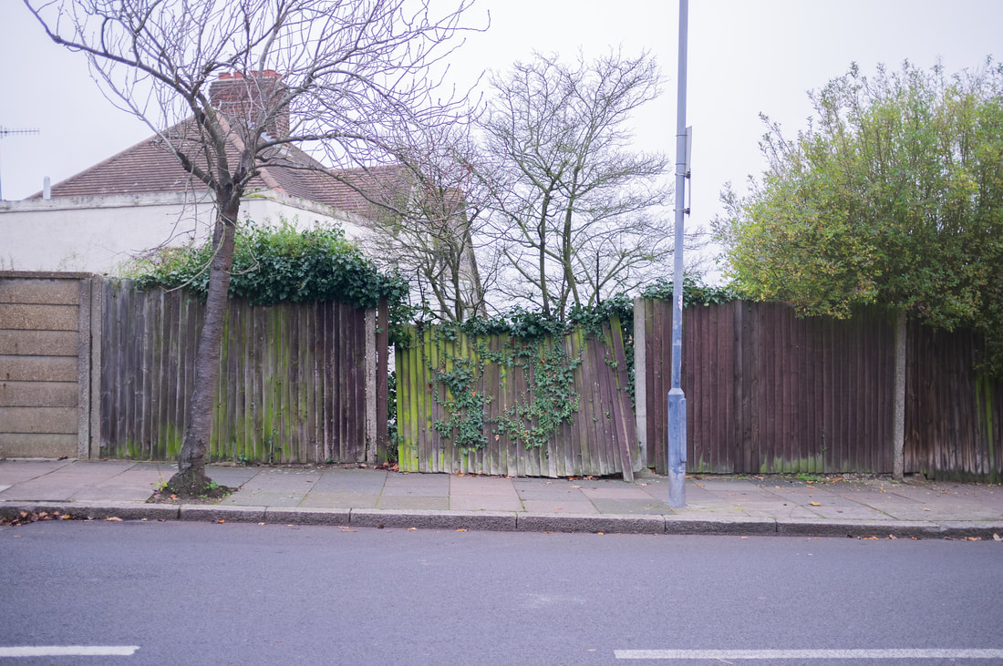
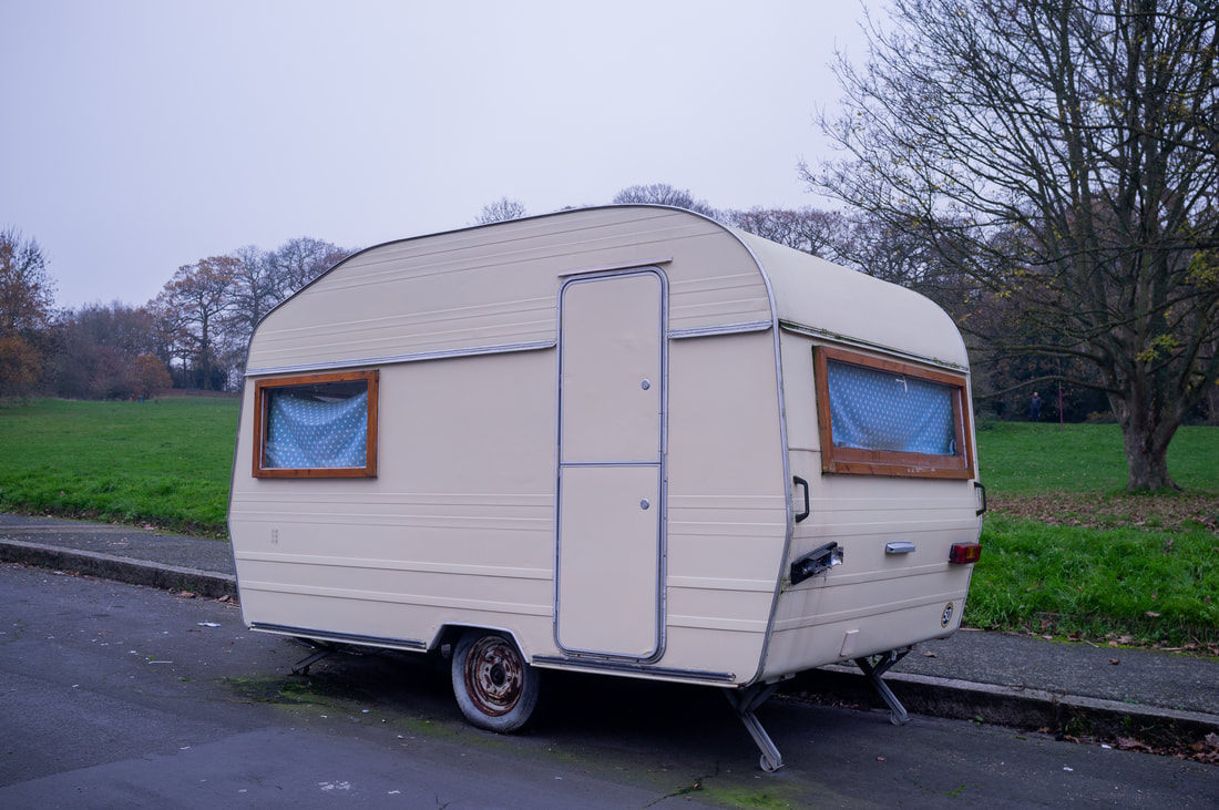
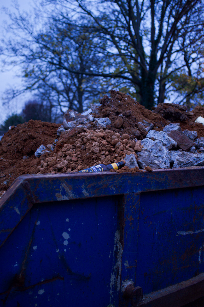
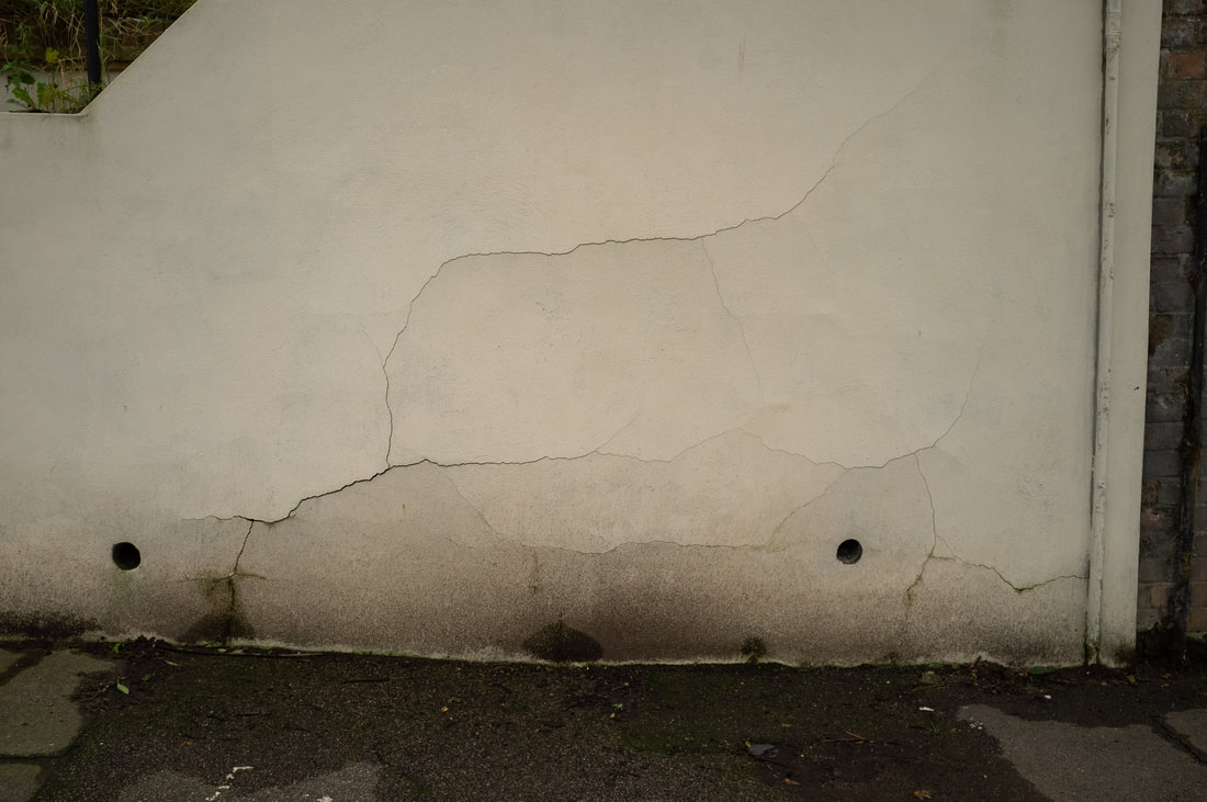
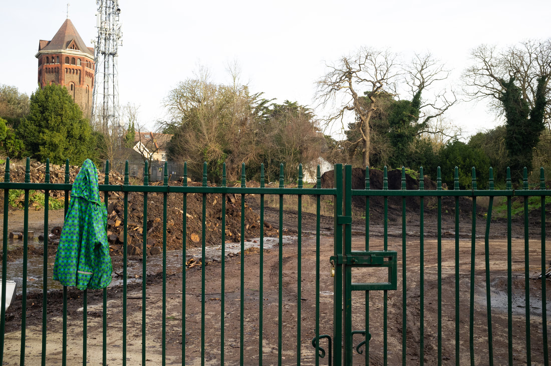
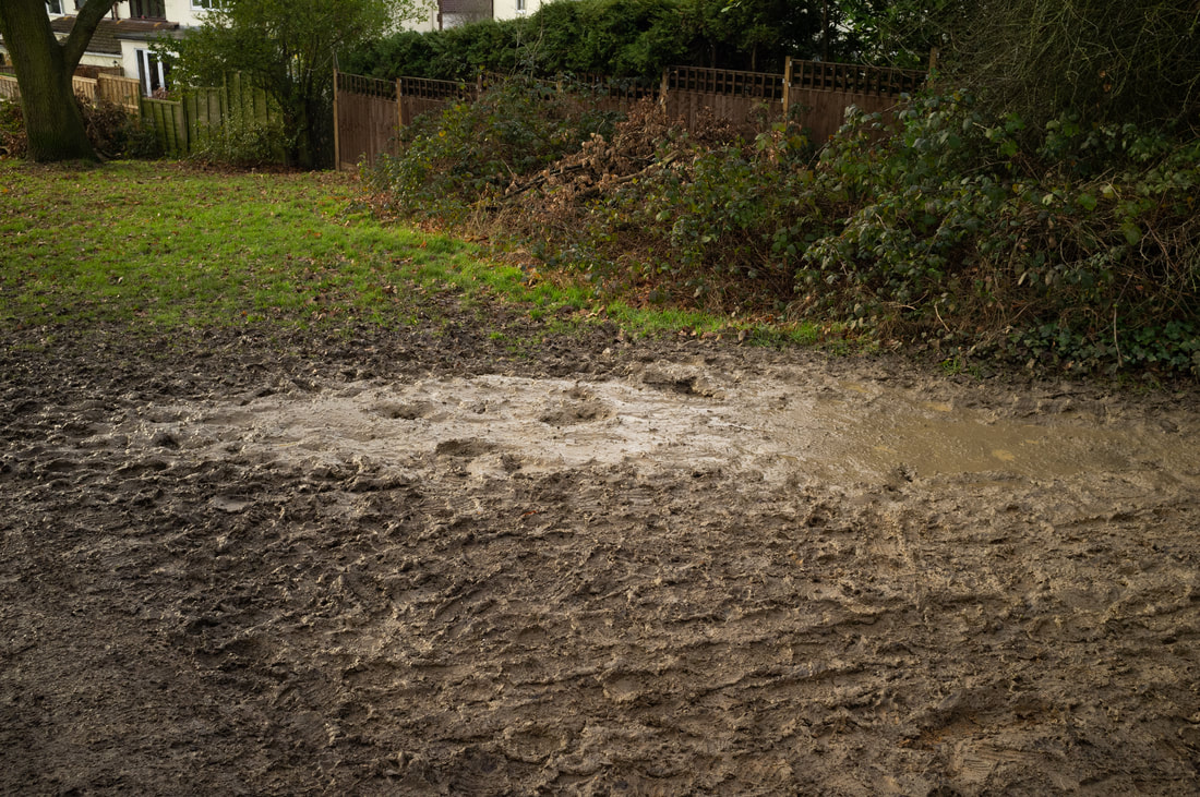
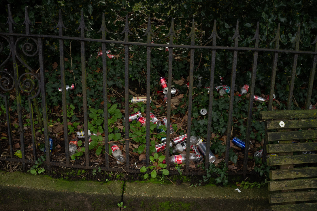
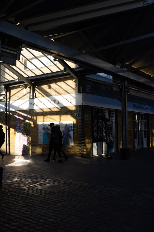
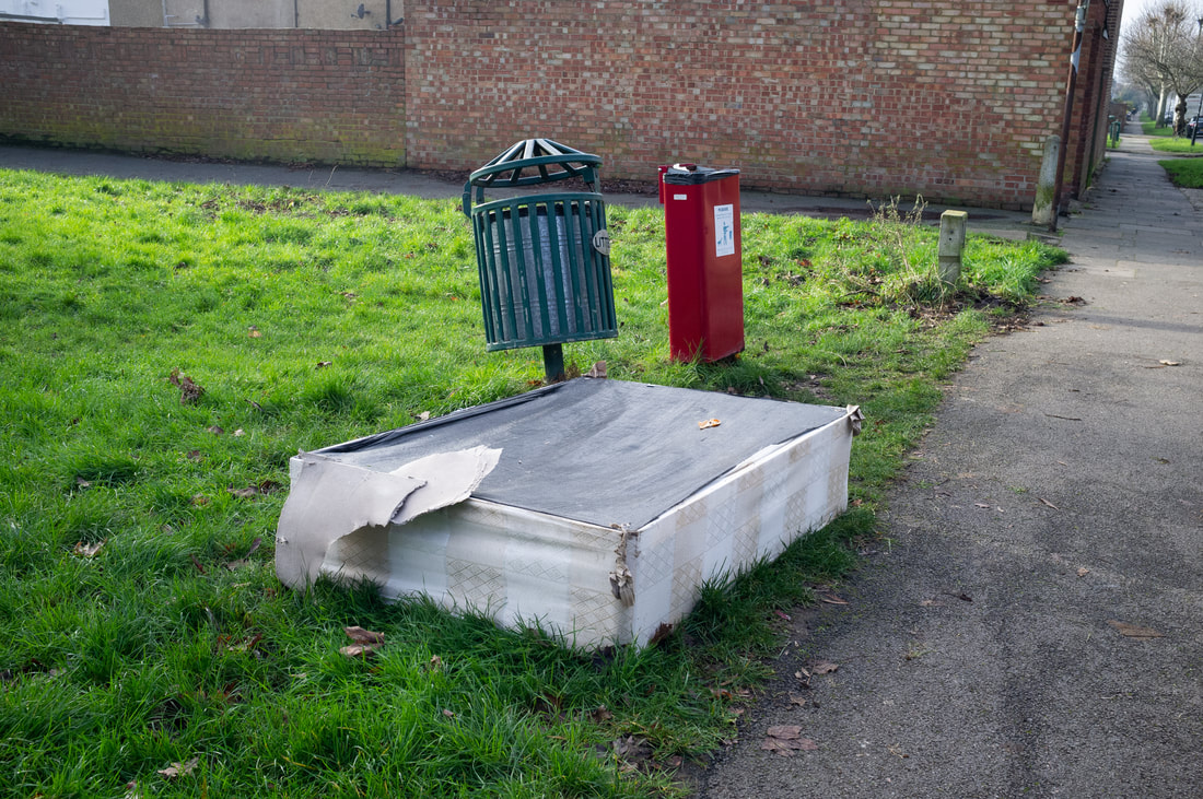
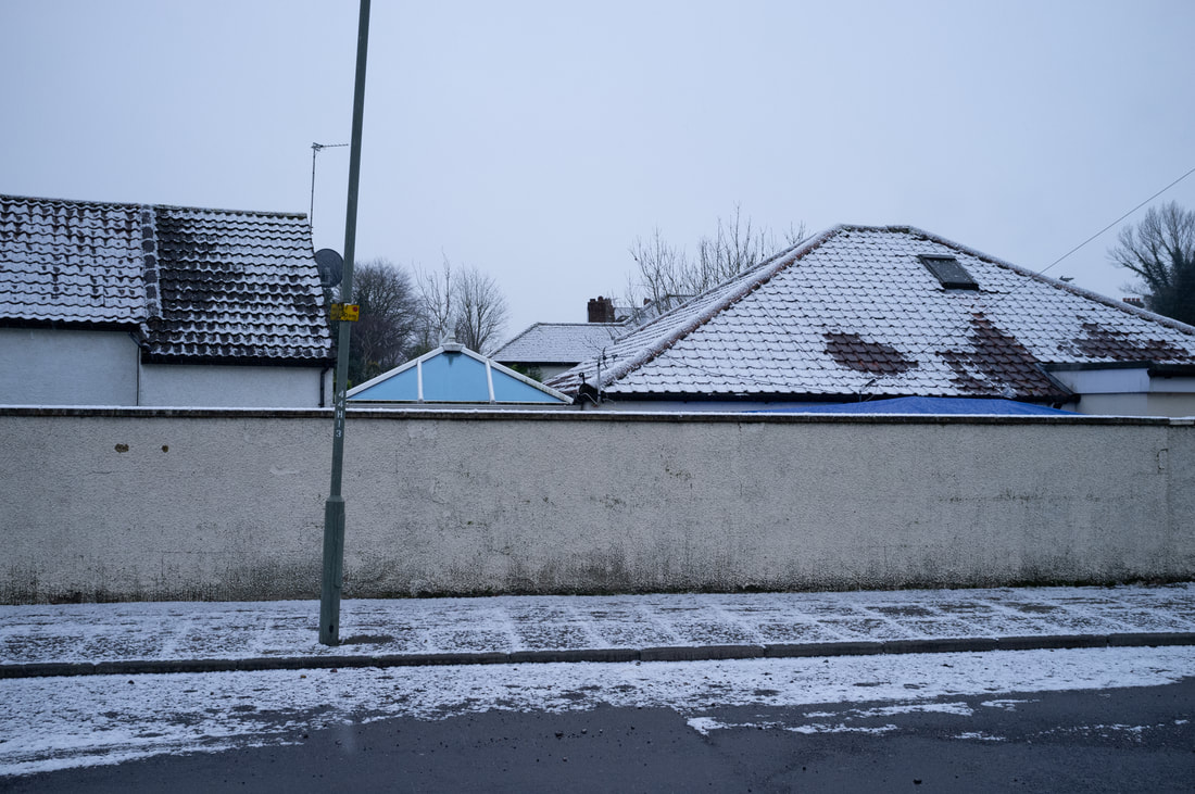
Photoshoot

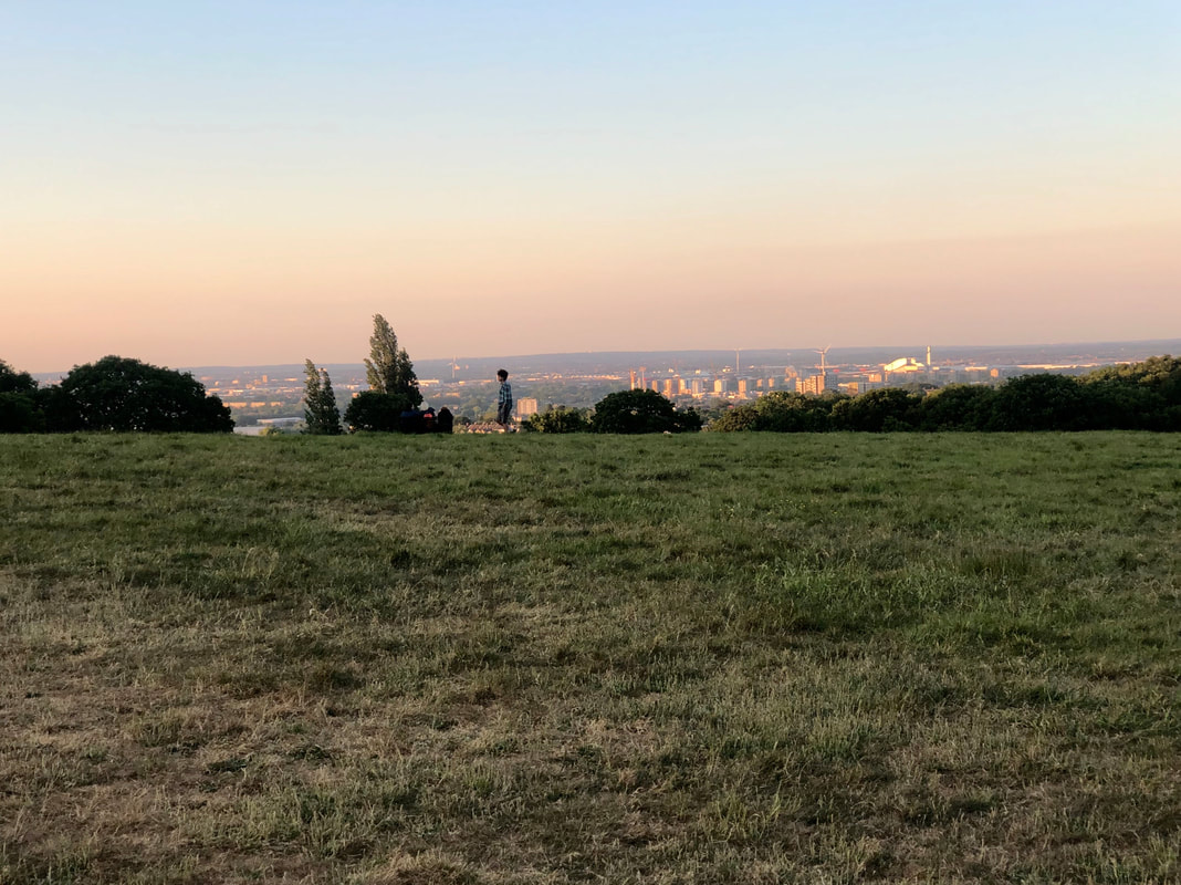
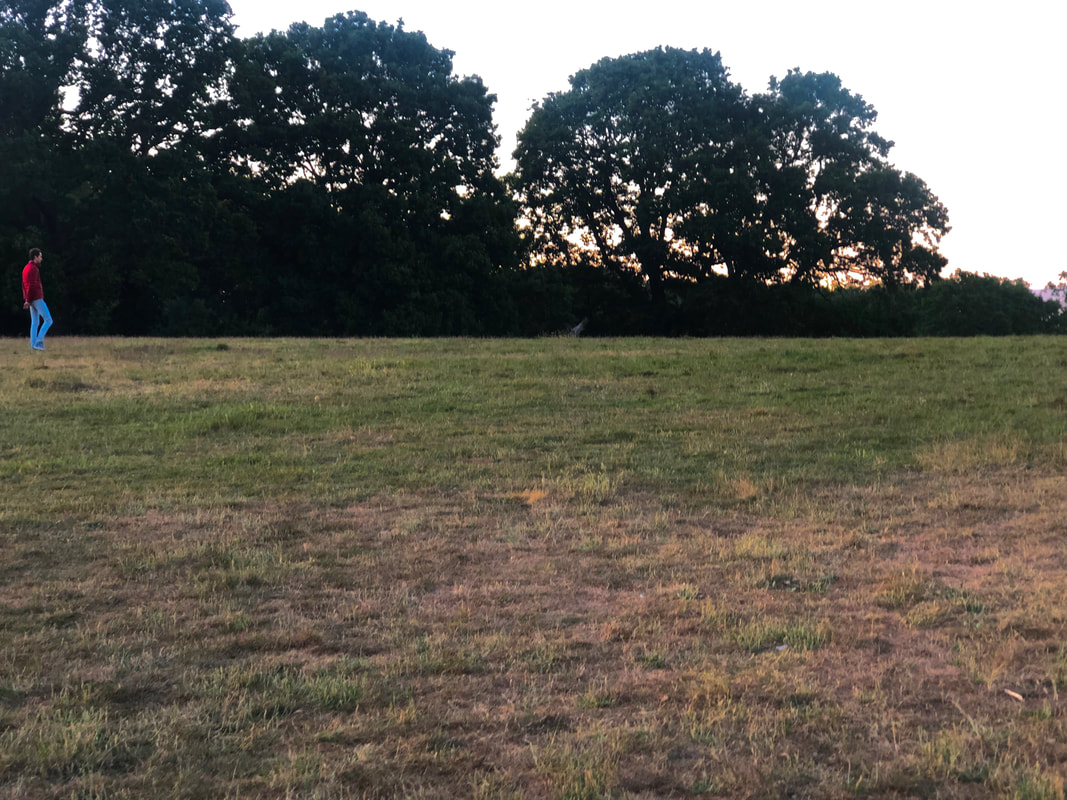

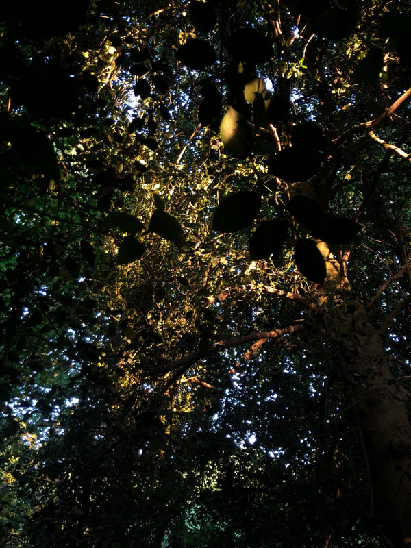
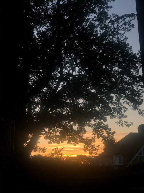
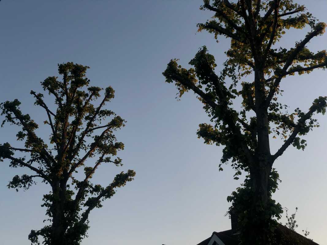
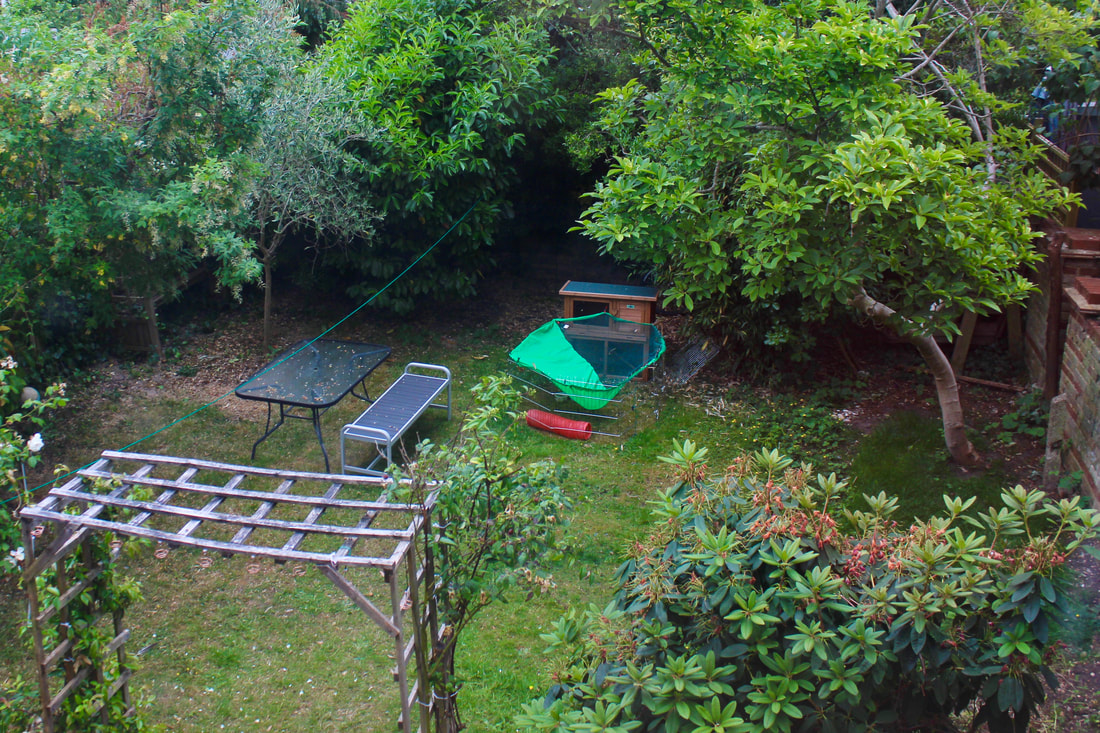


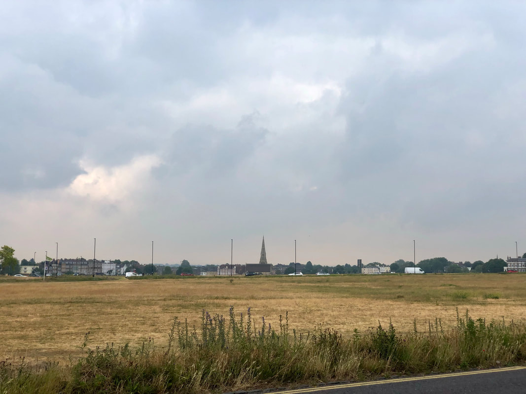
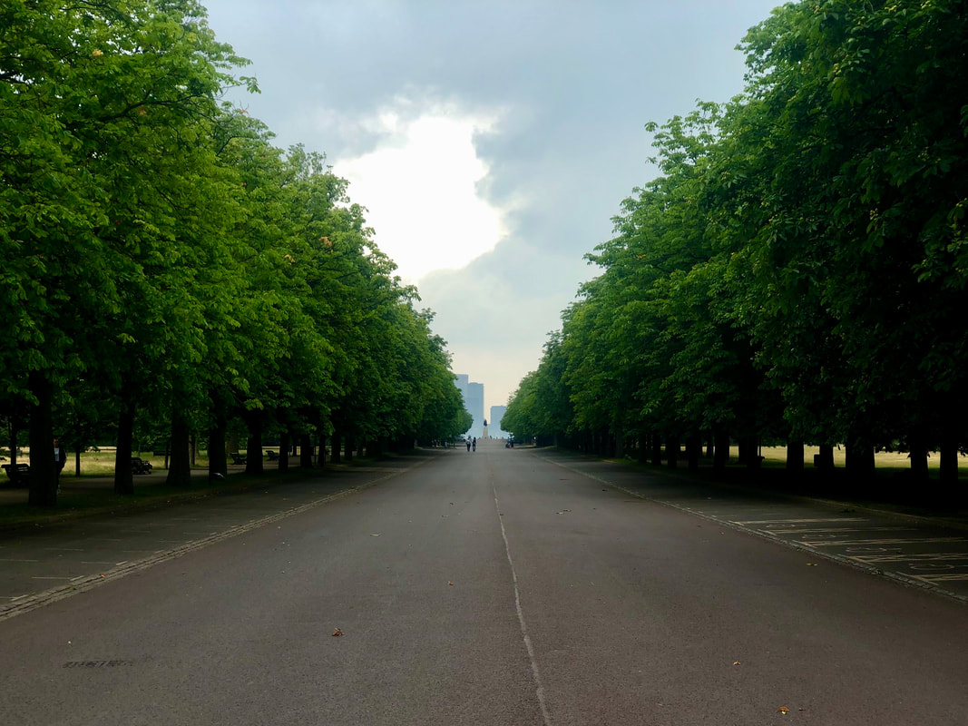
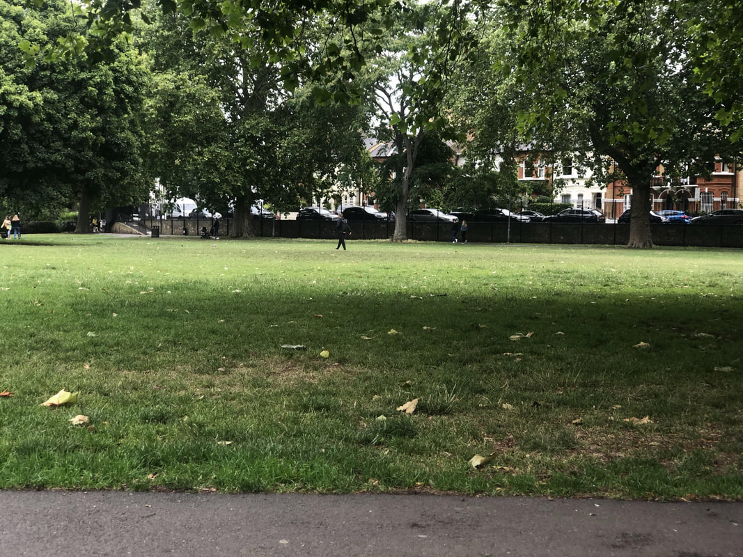
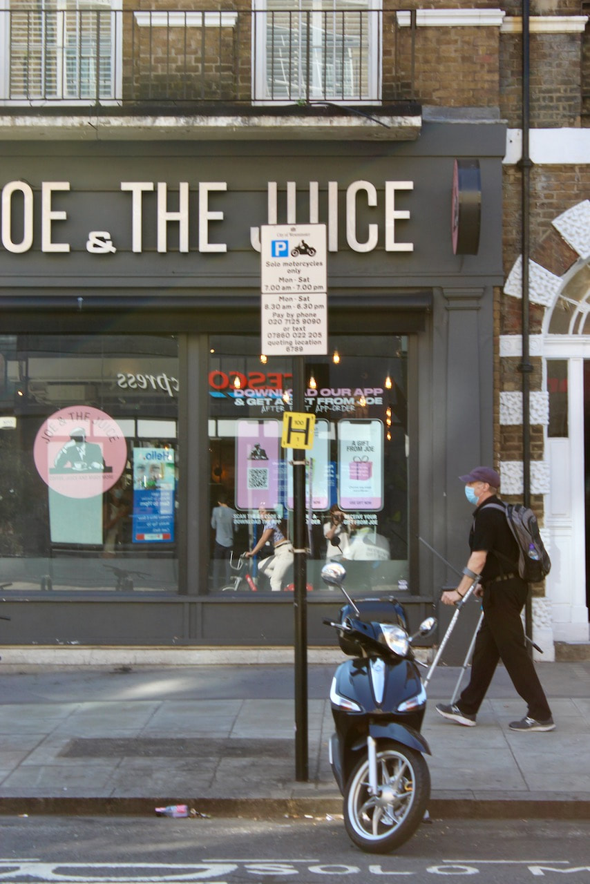
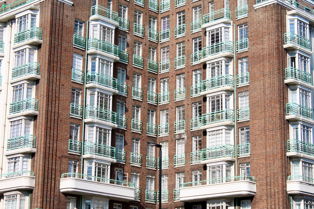
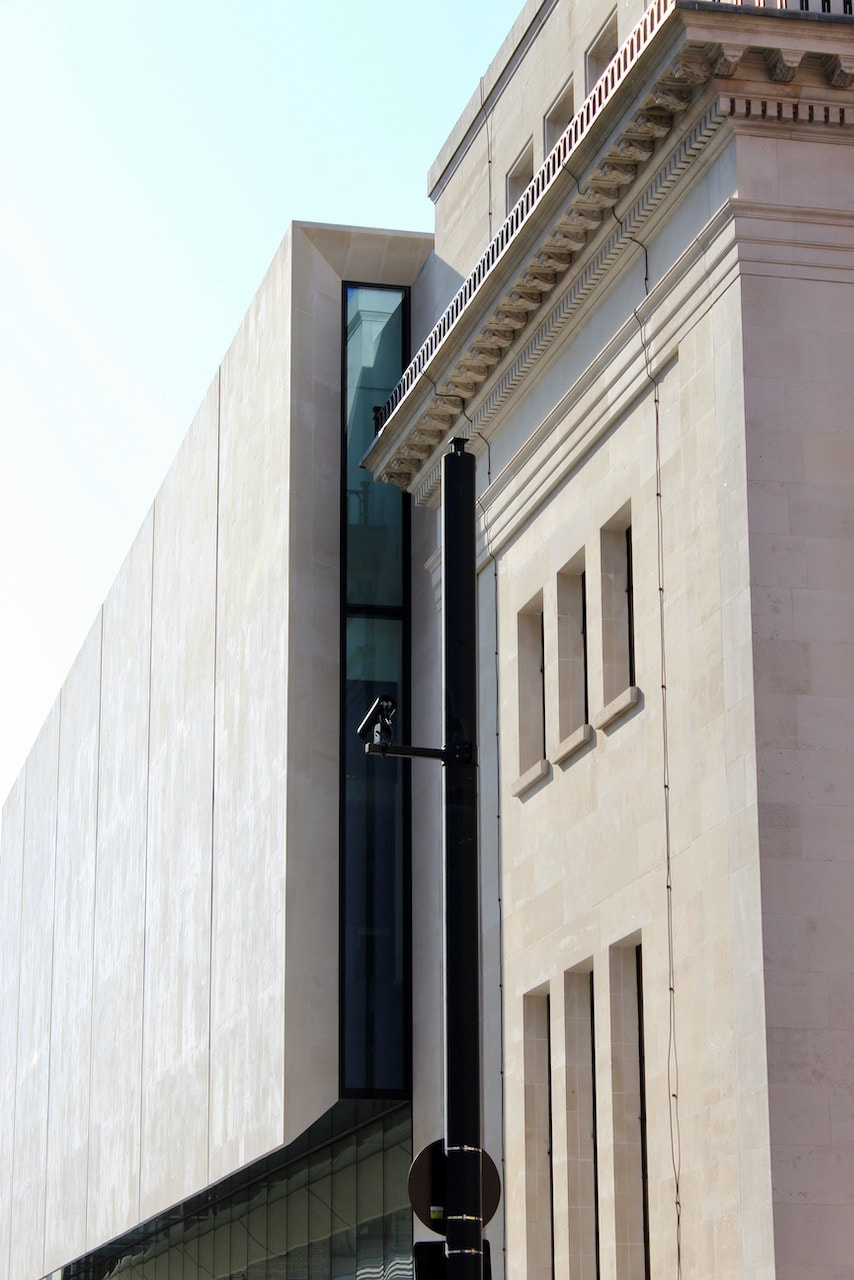
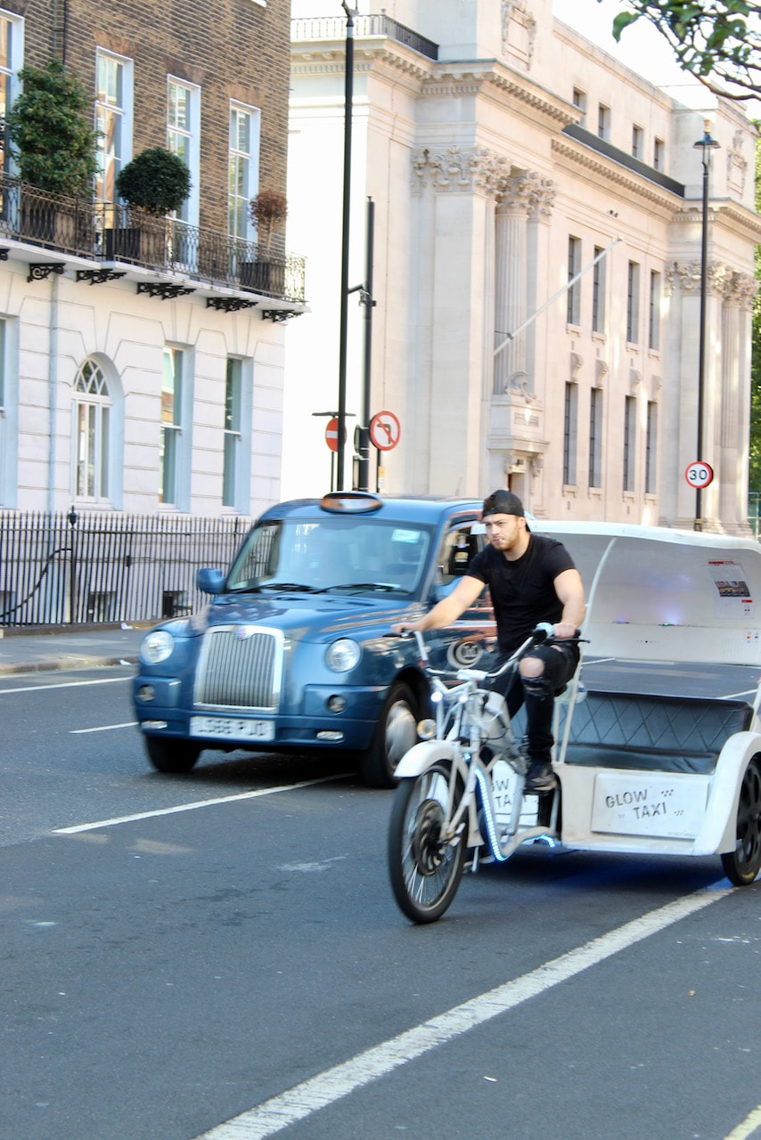
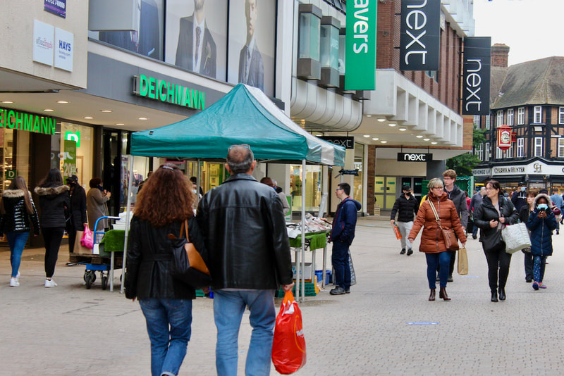
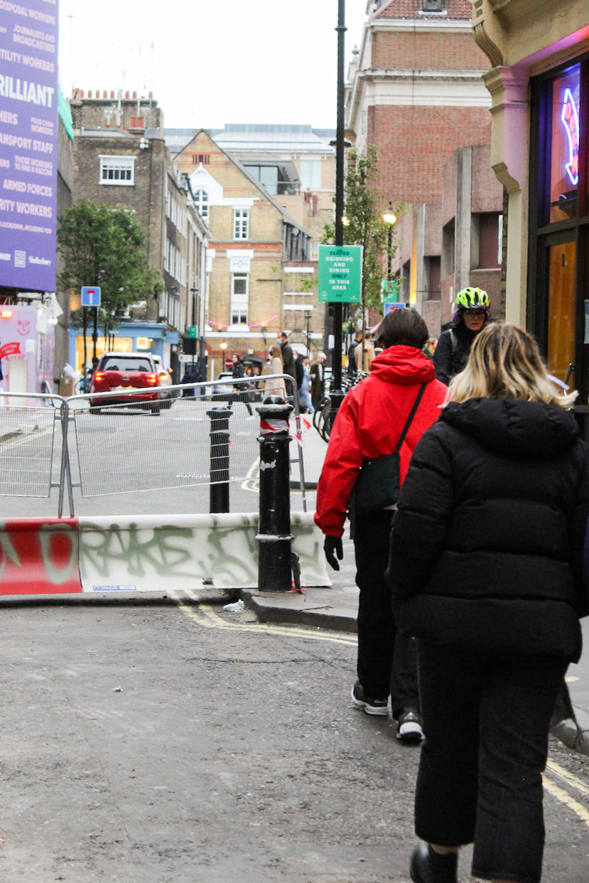
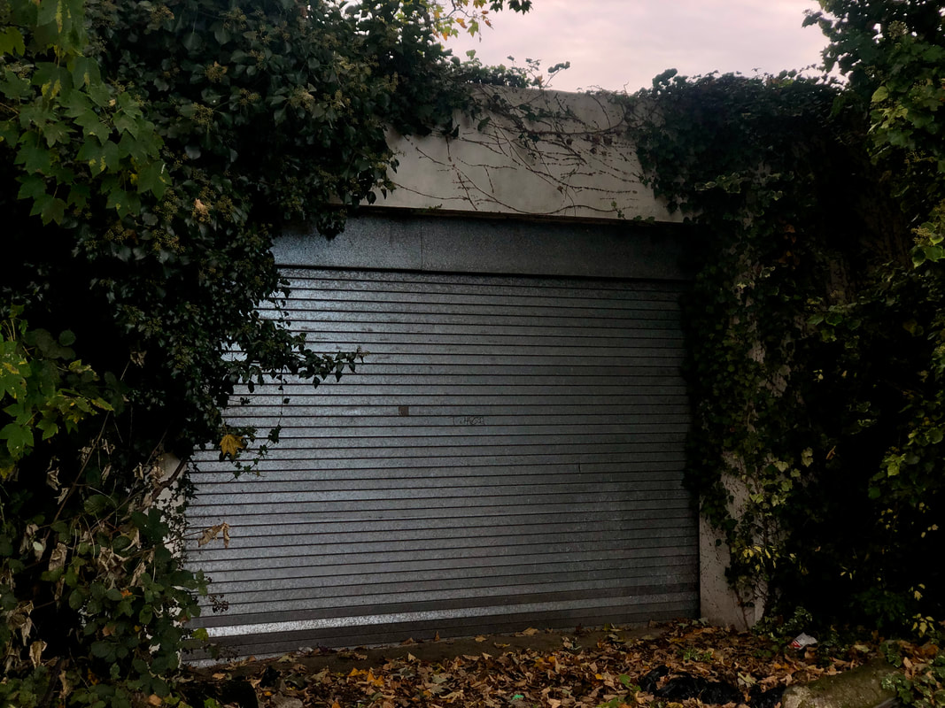
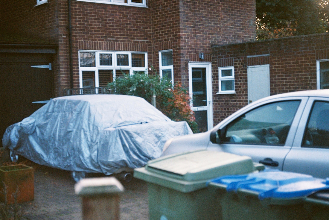
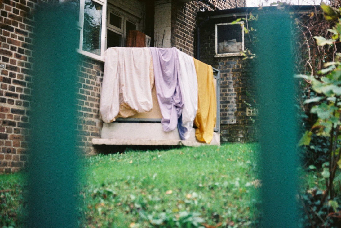
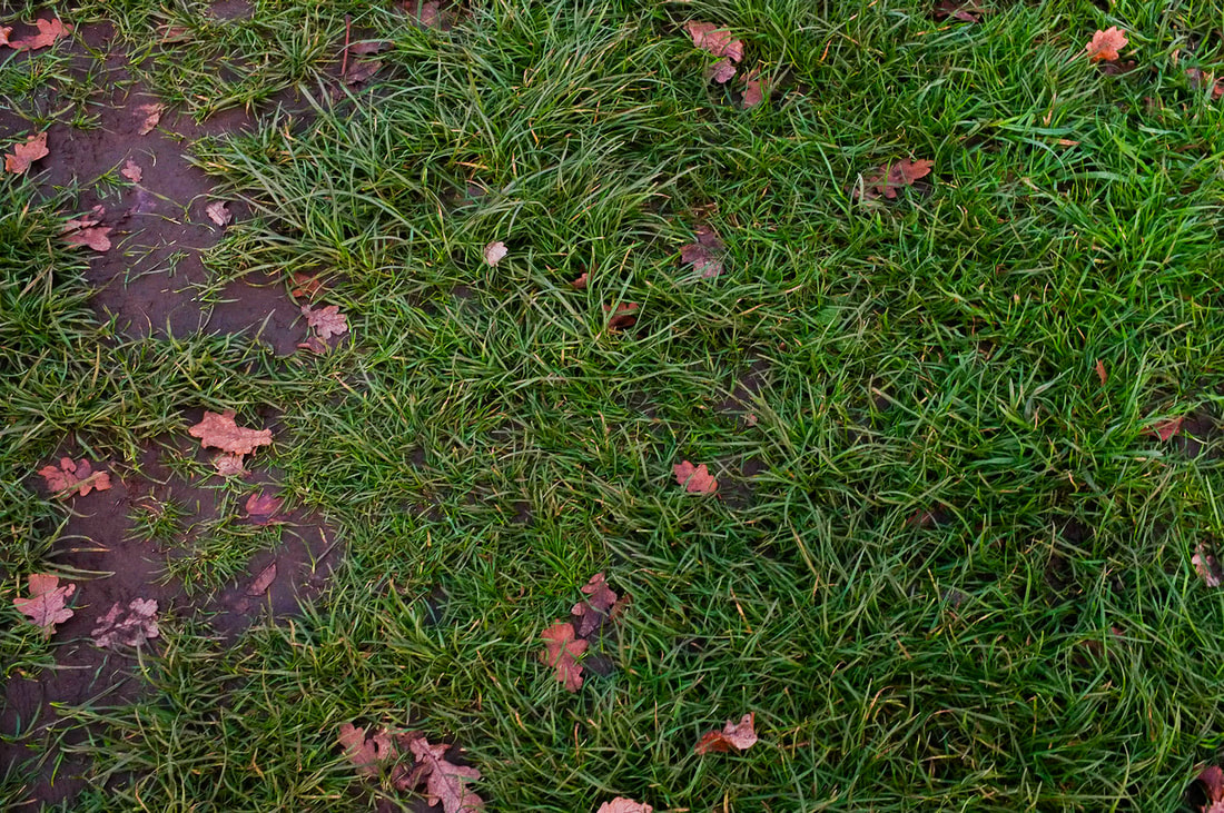
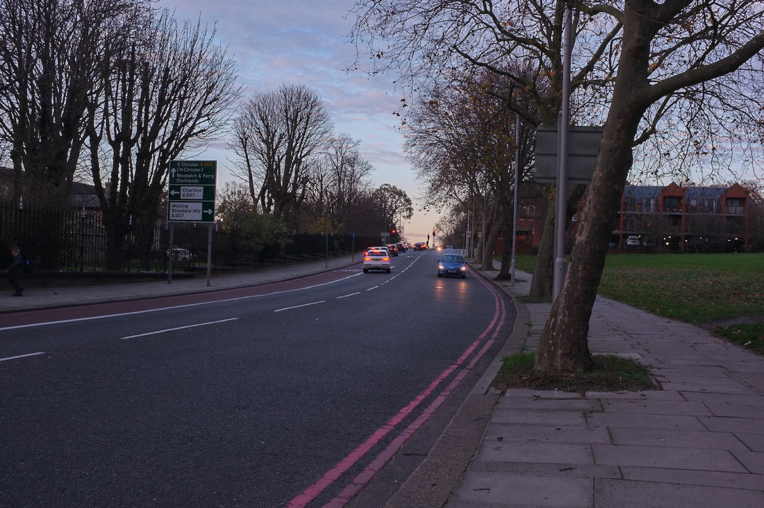
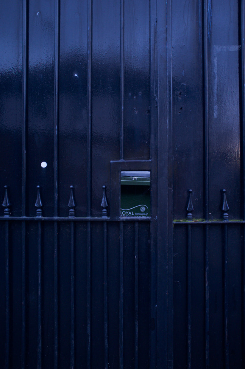
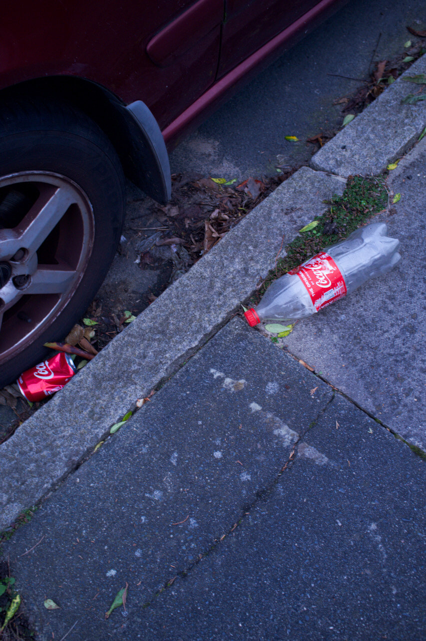
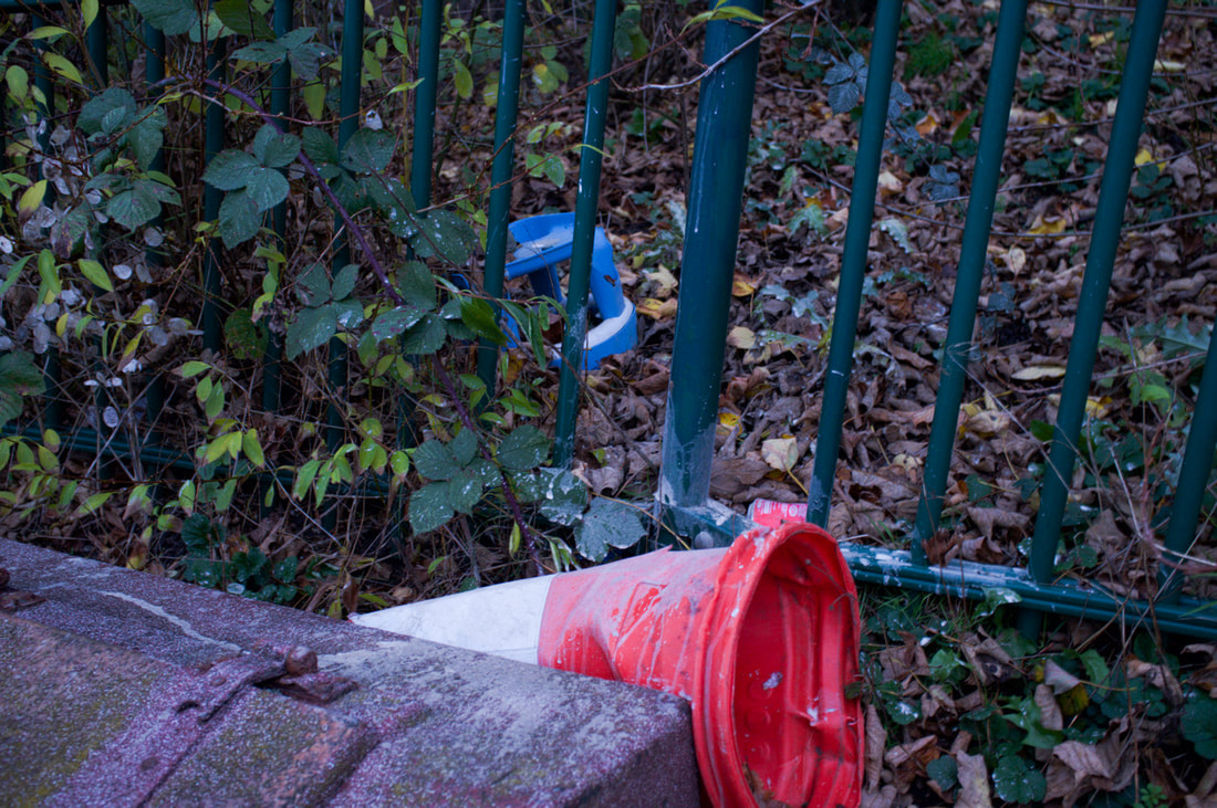
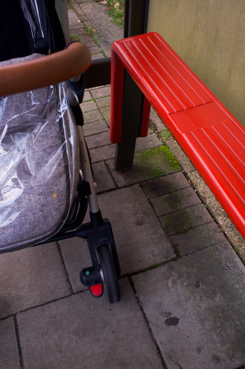
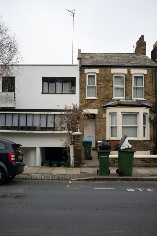
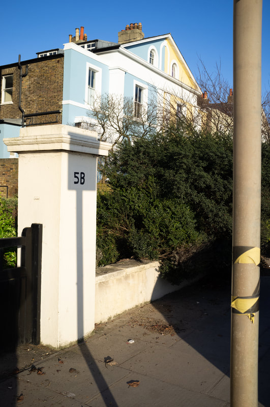
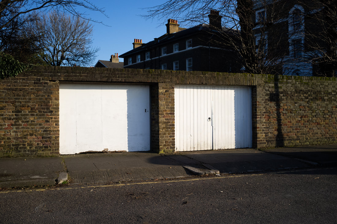
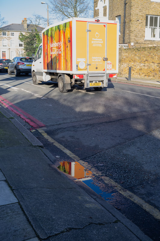
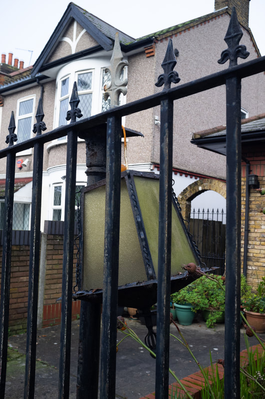
Over a week I had used the opportunity to use the lockdown regulations to go to parks in my local area to take these photos. In these photos I was experimenting with lines, patterns, lines and negative space to isolate objects, such as the two trees in the eighth photo, or follow the main theme of what I want to present through these pictures. However, I do believe I could've done better, for example, with some of the photos such as the close up of the plant, it is too similar and very common, I could've made it more interesting by using different angles and so on to obscure the object even more. I do believe that I would want to pursue photos such as the second to last one and also the one of my desk as I believe both of these photos use lines more to its advantage compared to the other photos. In the fourth photo I believe I follow my theme closer, comparing the lines of nature and human made structures such as the apartments that are obscured in the background of the tree, so I would also like to experiment with direct comparisons within photos too. Having two opposing objects in the image can display my theme and aim better, rather than making it so difficult to see.

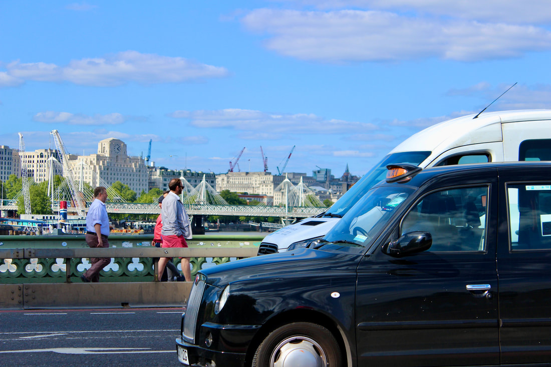
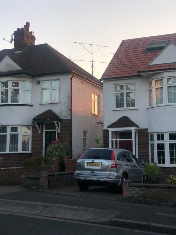
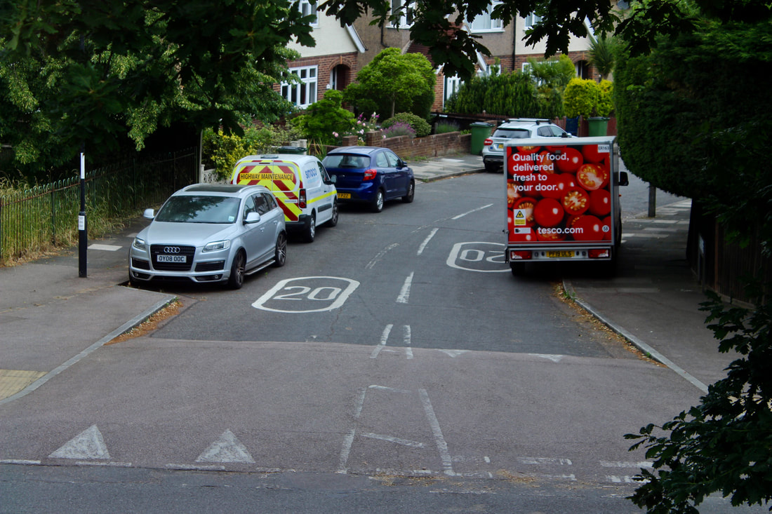
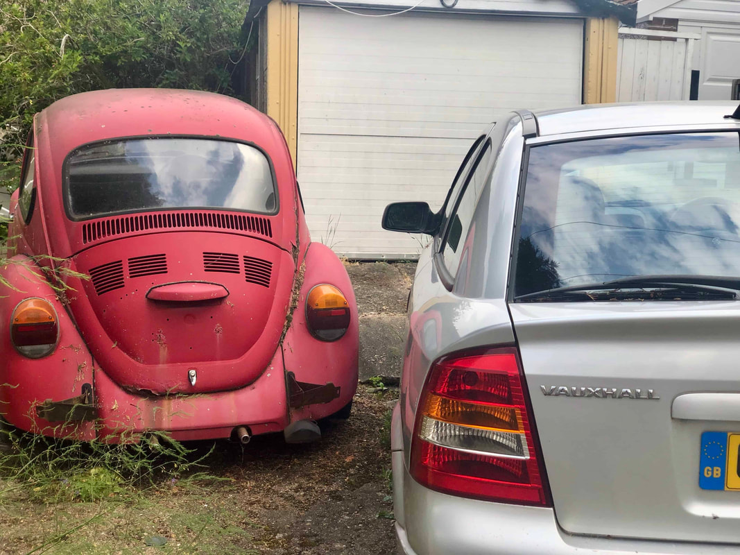
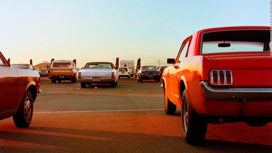
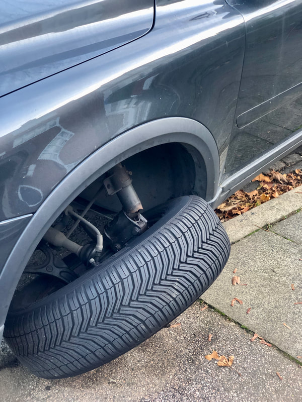
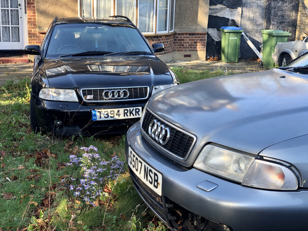
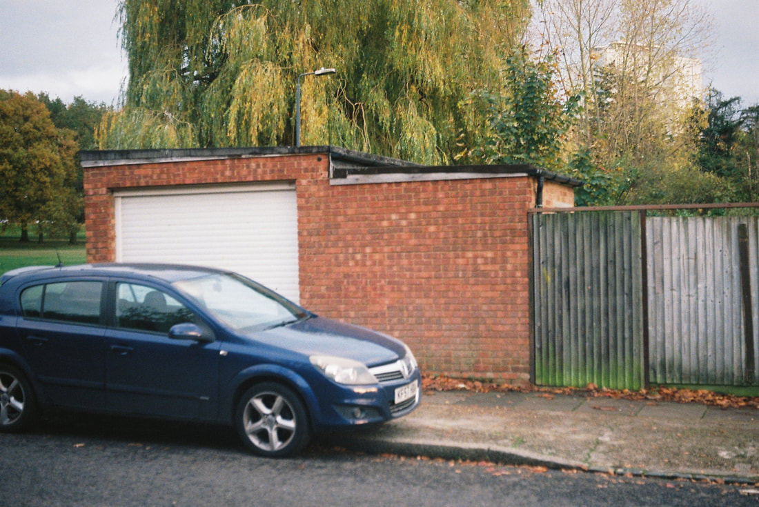
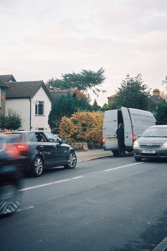
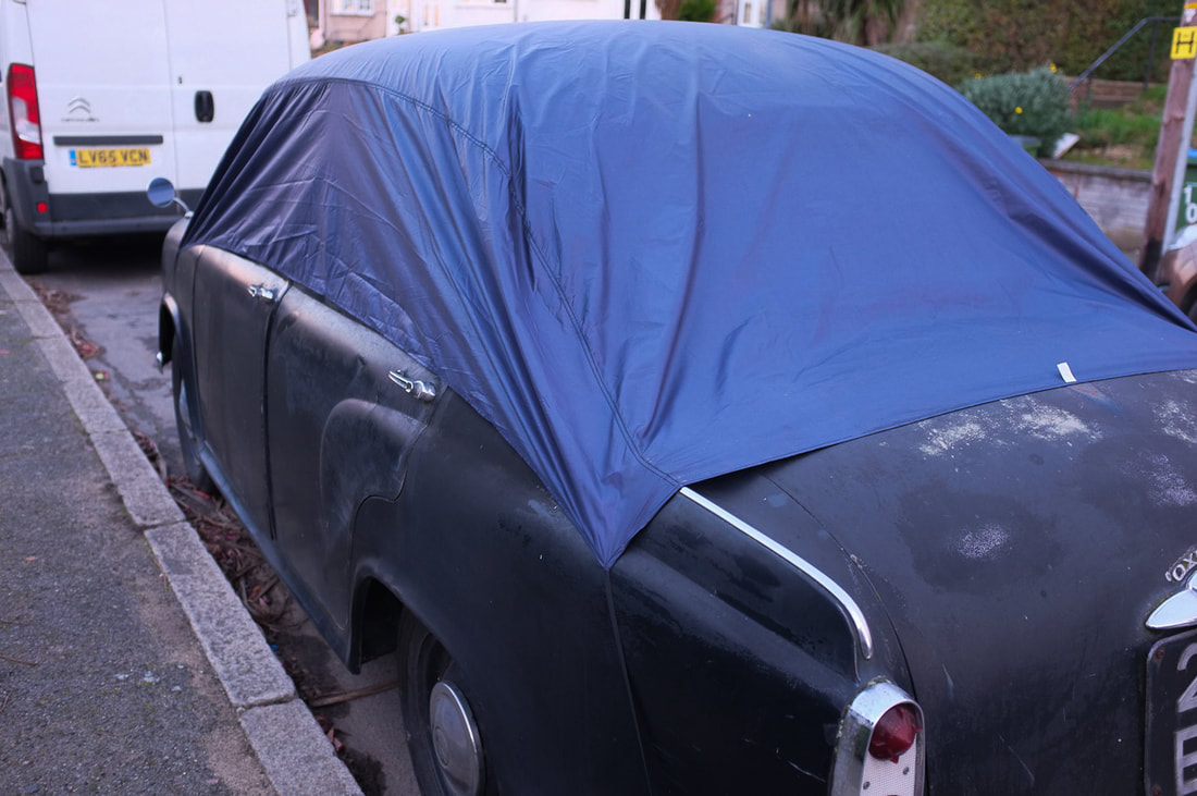
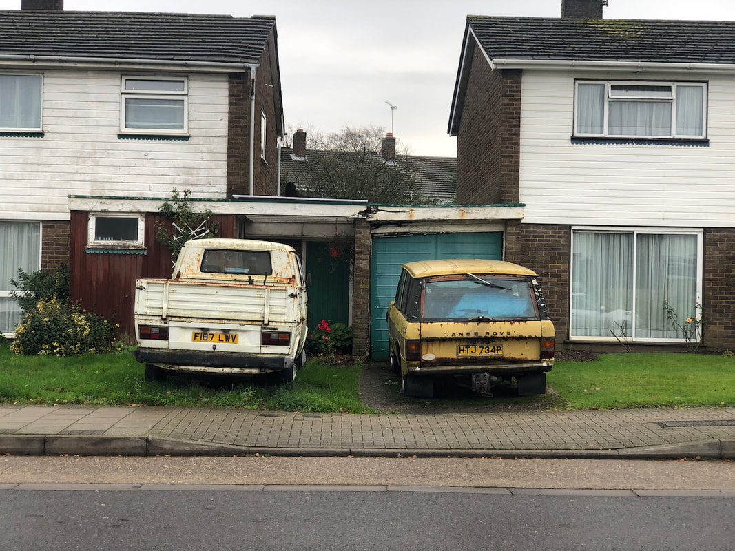
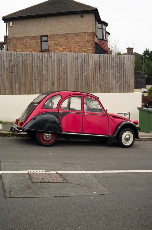
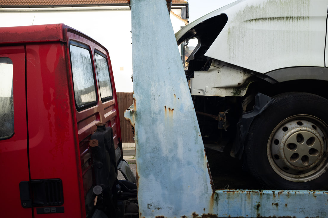
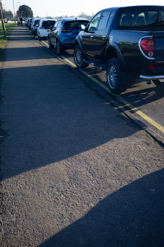
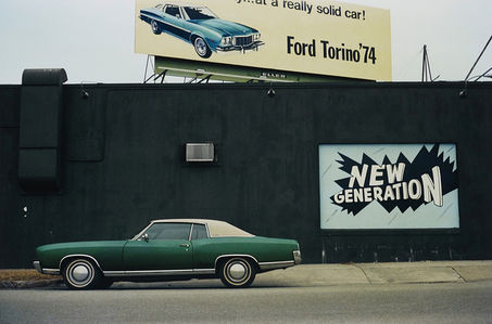
In this photo I believe that I successfully used the composition to display a difference between the two subjects.For example, the fact that the gap is lined in the middle allows for there to almost be a 50/50 of both cars in the shot. Also, the fact that the car on the left is in general different from the car on the left also helps (colour, age and wear). When I was taking the photo I didn't think of the overall theme exactly, however it somewhat fits in what people focus on and how people change with the current climate around them, which I would like to also explore alongside the theme of contrasting nature and the city scapes. So, I would use this as an example of how I could further develop my theme and also find ways of working with it more creatively, as I began to realise I would just repeat and create similar photos.
William Klein Documentary
From what I gathered from the documentary is that William Klein is an innovator. This is described early on in the documentary by showing his pioneering style of street photography. Rather than just finding what other people would find interesting, he used his own initiative to photograph subjects that he found interesting. One example in the part of New York named Harlem, the documentary describes Harlem to be a place that no one wanted to interact with as it was outcasted from the rest of New York. Klein used this to his advantage, showing the ever growing sense of community that this abandonment created, taking photos in barber shops, groups of kids playing with guns, and people in general performing their everyday tasks. He paved the way for later street photographers to use close-ups of people's faces, unusual angles and also using chance as a positive thing that enhances images rather than it being something that hinders them. Later on into his career he used a similar technique of showing off New York and its extremely commercial side by using fashion photography. He would place the models in the street of busy city scapes, far away, to create a sense of business that can only be shown in such areas. He had also experimented with fashion by using films to criticise the media, which was eventually seeped into later works. Through his interest in films, he had met a cast amount of people such as Mohammad Ali and Malcom X to name a few. He carried on using the media and higher-ups in the world in his work, contrasting Ali and the people that had managed him.
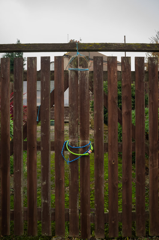
Photoshoot

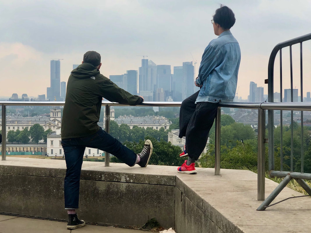
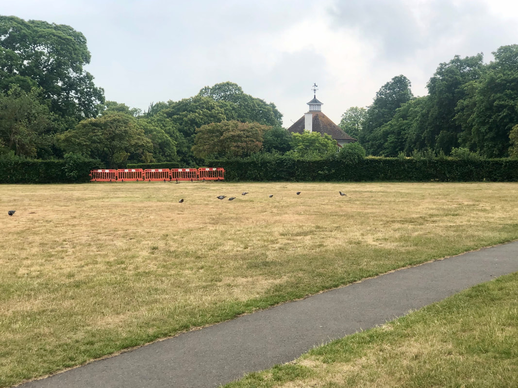

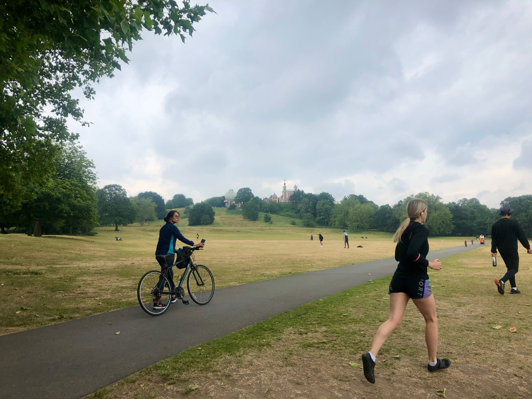


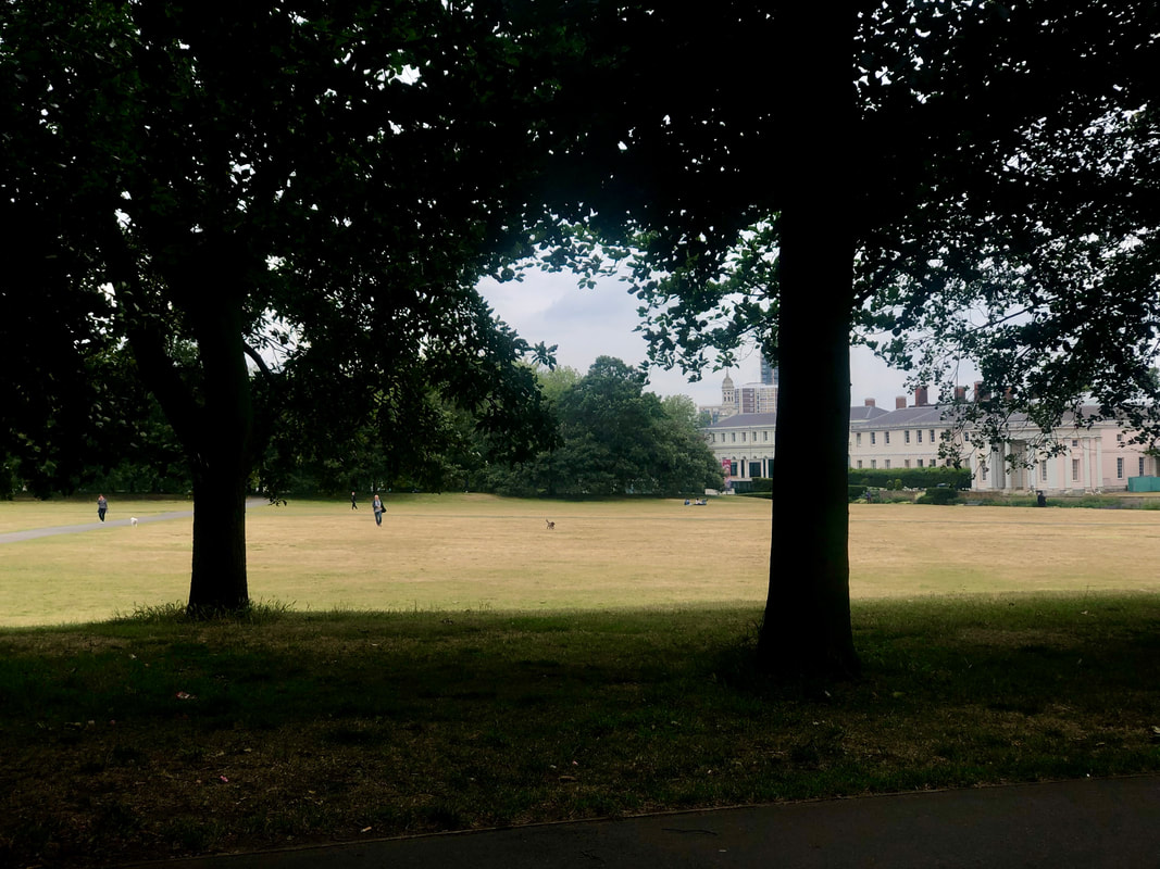
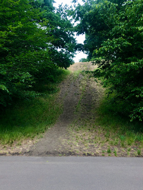
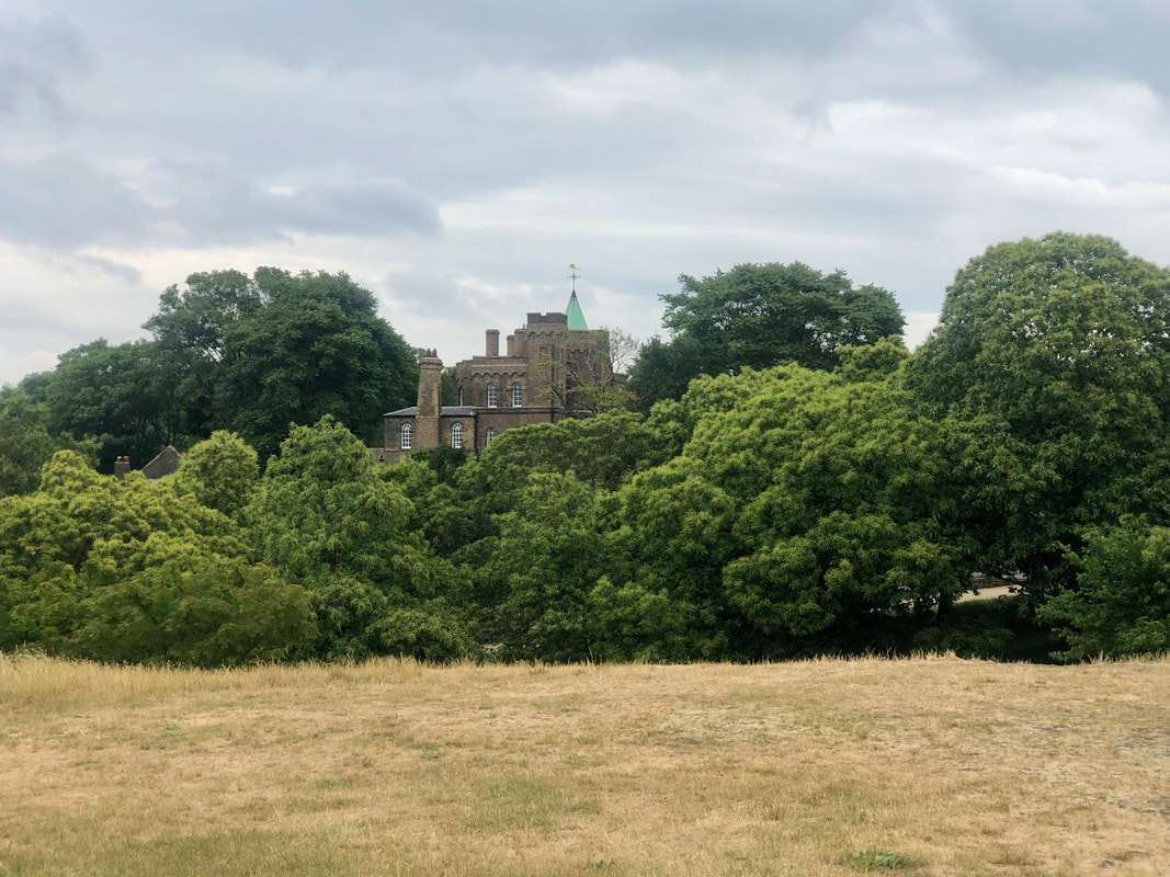
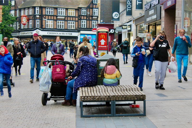
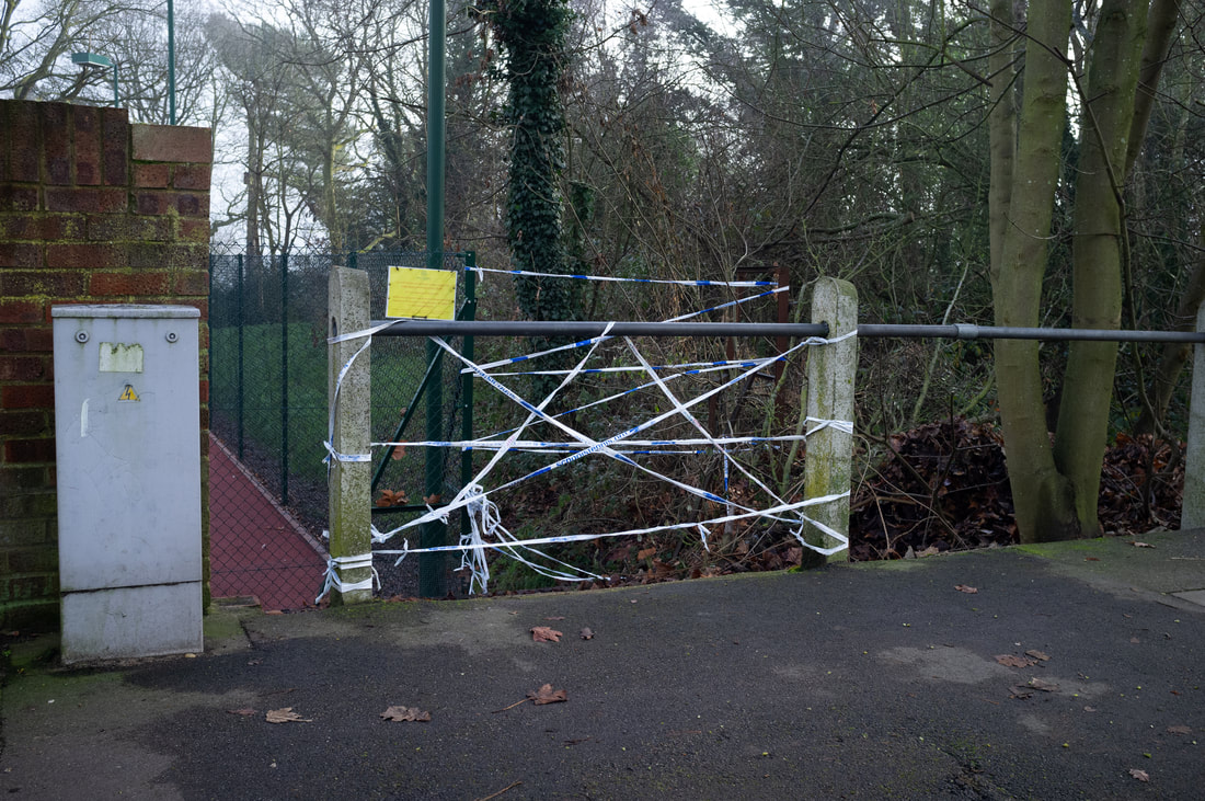
In this photoshoot i had attempted to follow the guideline of my overarching theme, rather than to stray away from it. Most of these photos i had taken in Greenwich Park, as i used the fact that parks are now open to my advantage, and set out the goal to keep my theme of using patterns, lines and so on to show the theme of a contrast between society and nature. In the 22nd photo i believe this is done the best, as the plants in the foreground are colourful and have no distinct shapes or patterns, whereas the buildings in the background oppose this, by the windows in the buildings being patterned the same and them being variations of the same colour. The theme is also strongly represented in the photos that have people in them, as it shows people only moving through the park, not taking notice of the space around them.
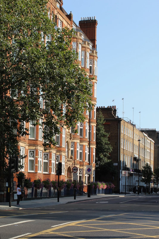
Photoshoot
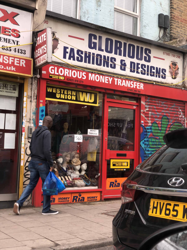
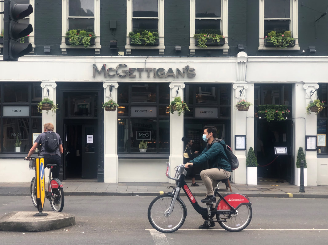
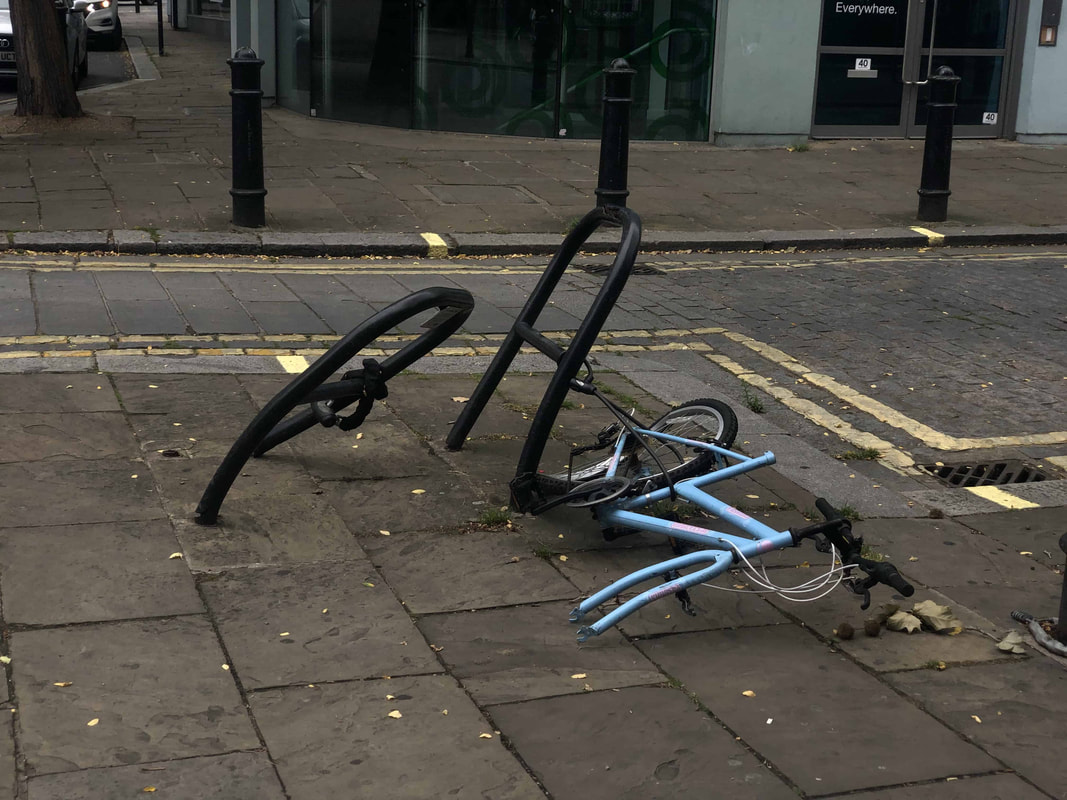
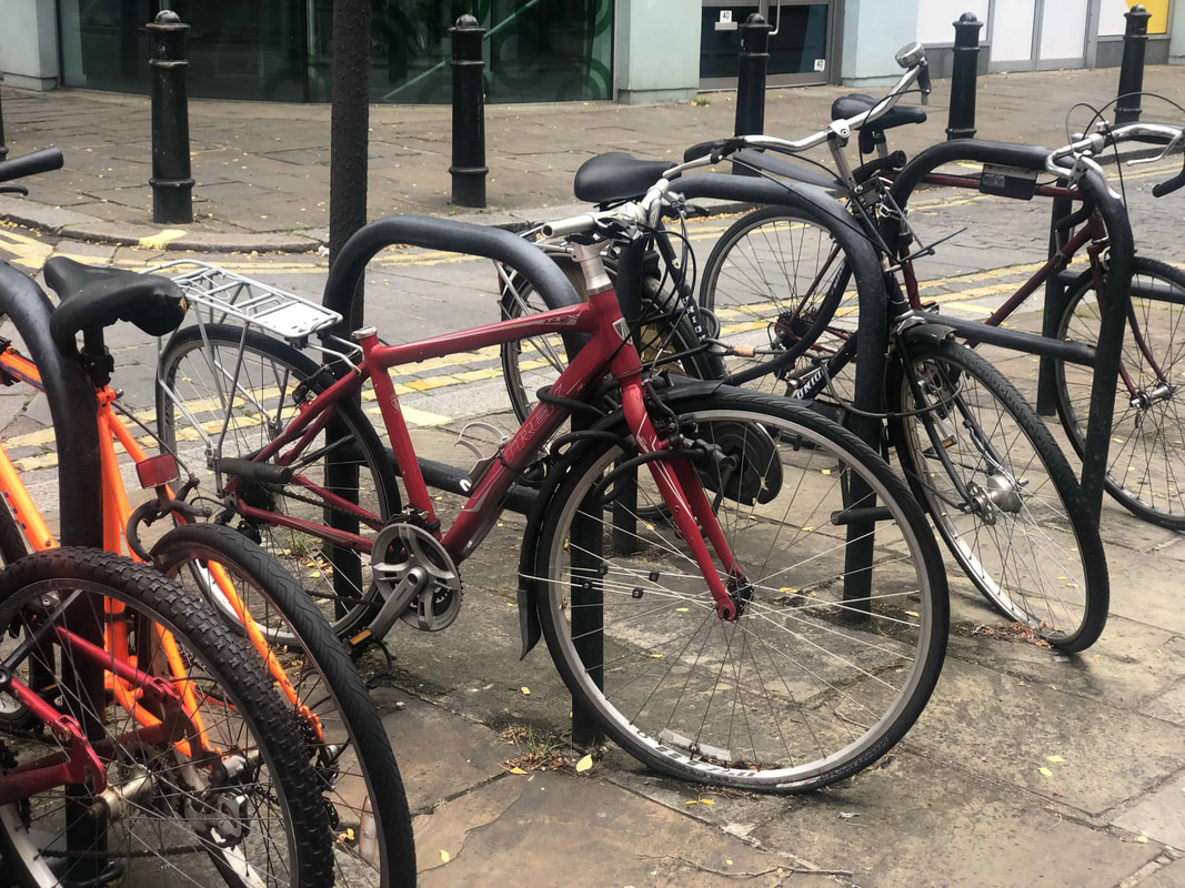
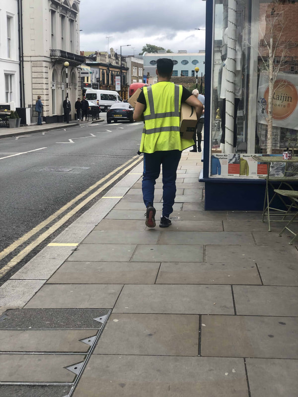
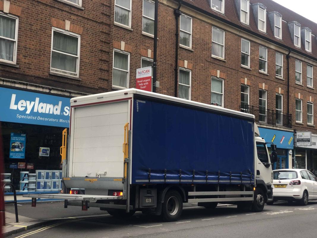
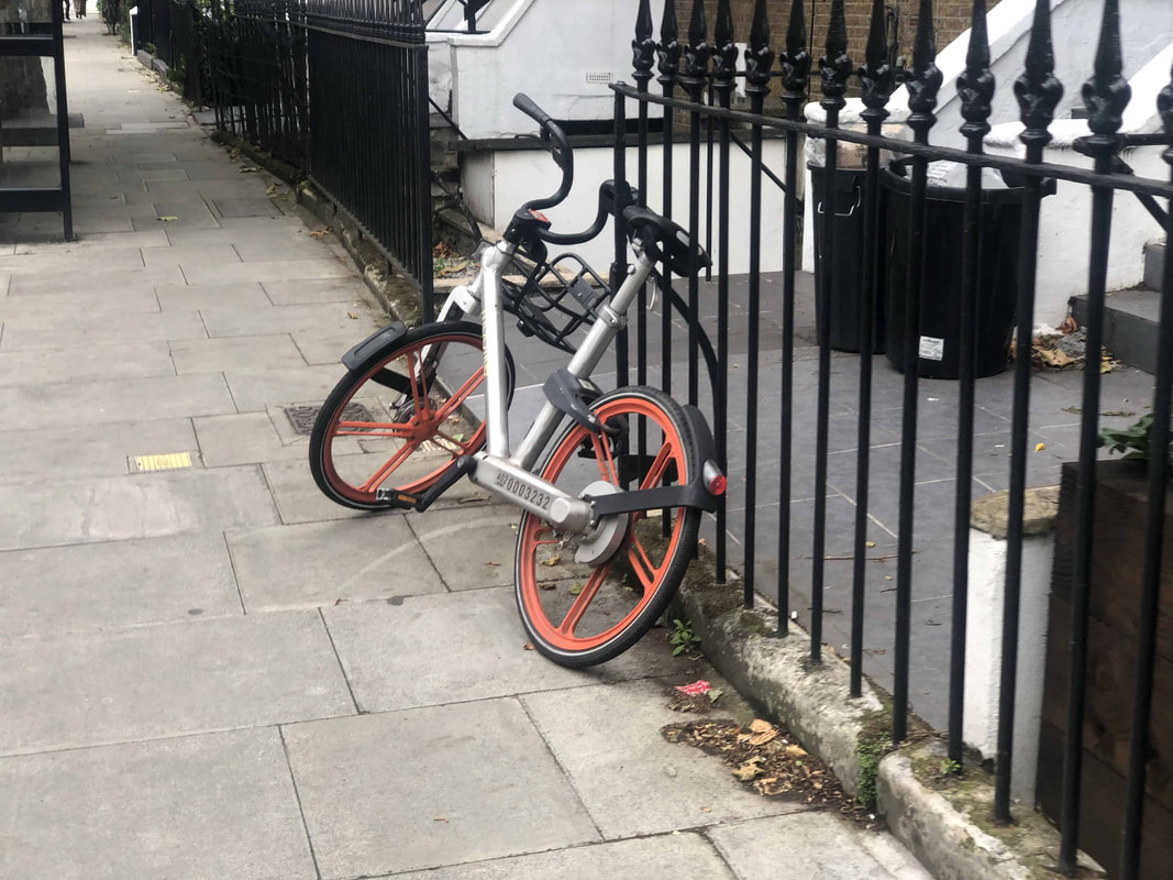


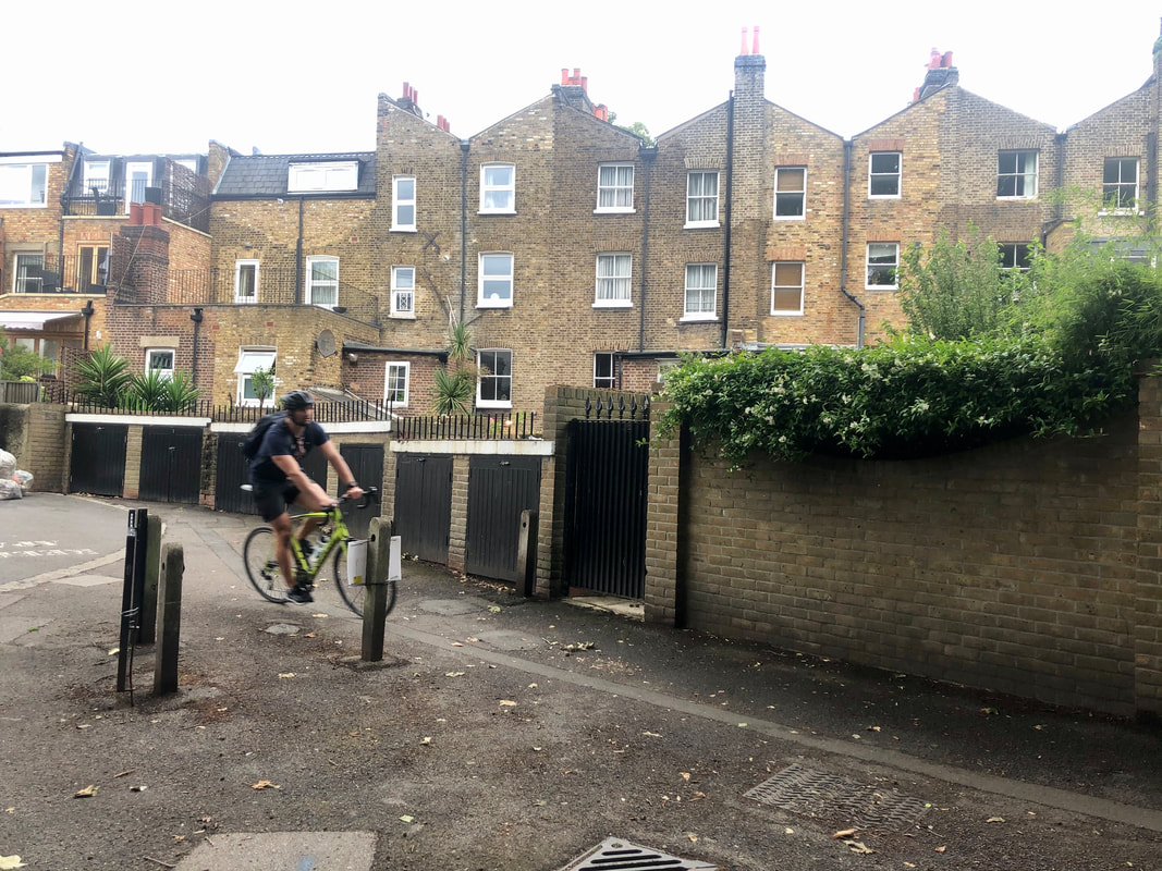
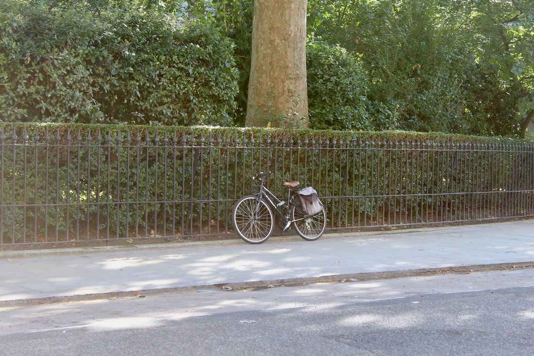
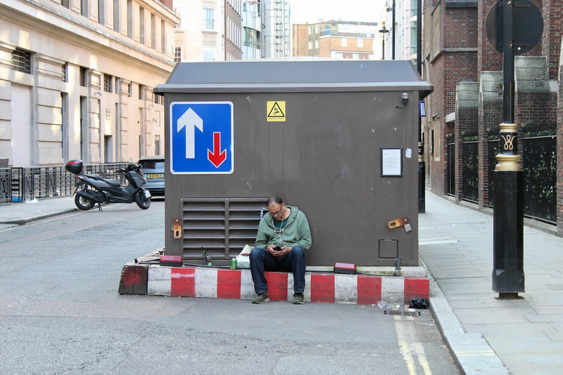
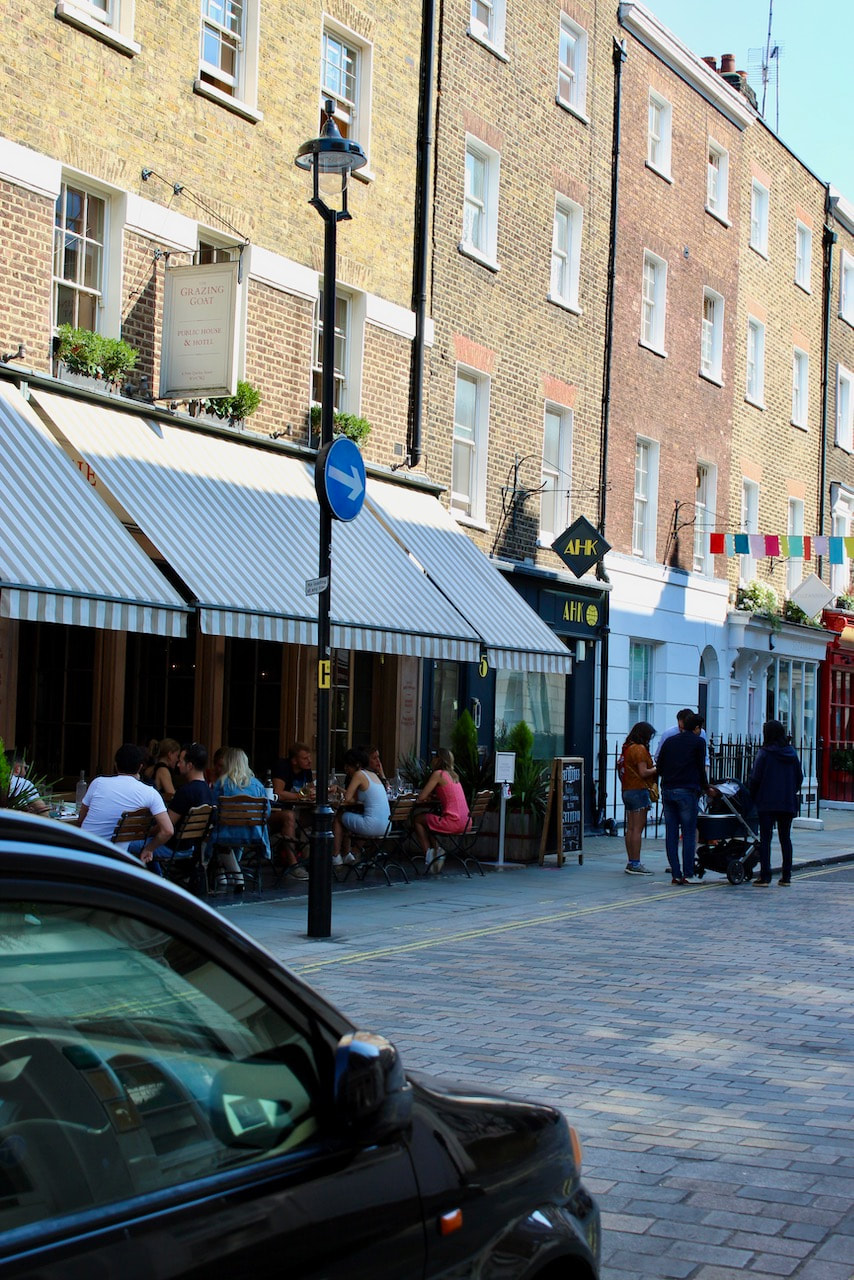
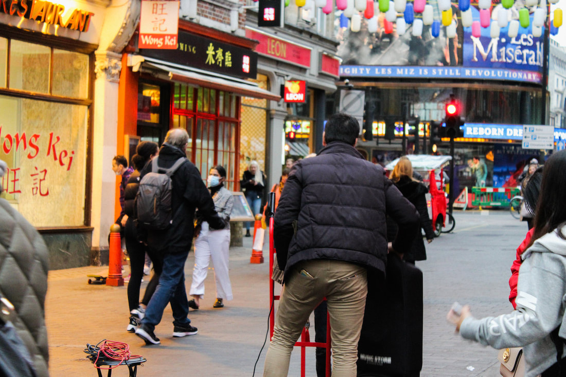
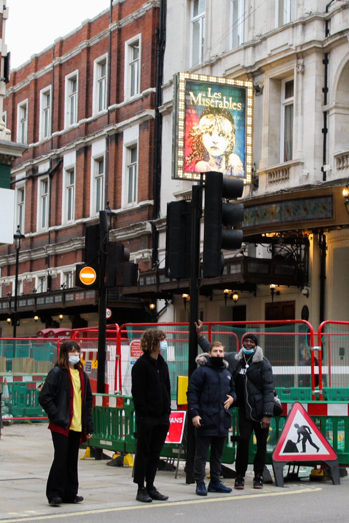
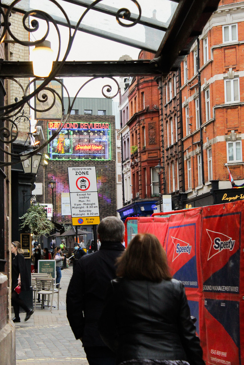
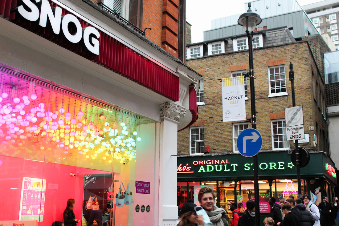
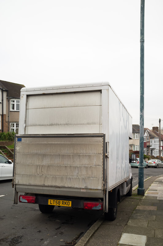
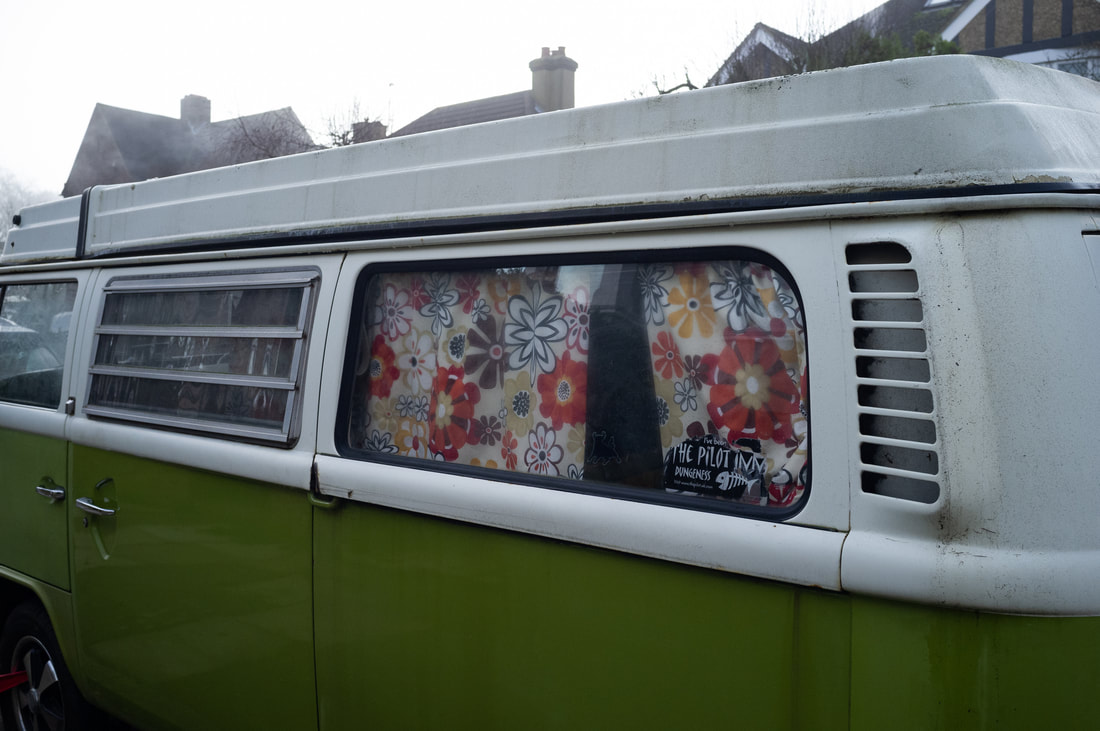
For this photoshoot I had wanted to go to a different area of London (Chelsea) that i had not gone to and try to incorporate the idea of street photography more. For this specific photoshoot I wanted to mainly focus on street photography and leaning towards that more, so i can become more comfortable with it as i have very limited experience in that genre. With the basis of the photoshoot in mind I also wanted to just try to capture normal and everyday objects that capture my eye, and trying to make them interesting or compose the photo in a manner that would make the objects interesting, a common thing I found there was bikes so i stuck with that and tried to take as many photos on bikes there.
Photoshoot


Devon Photoshoot


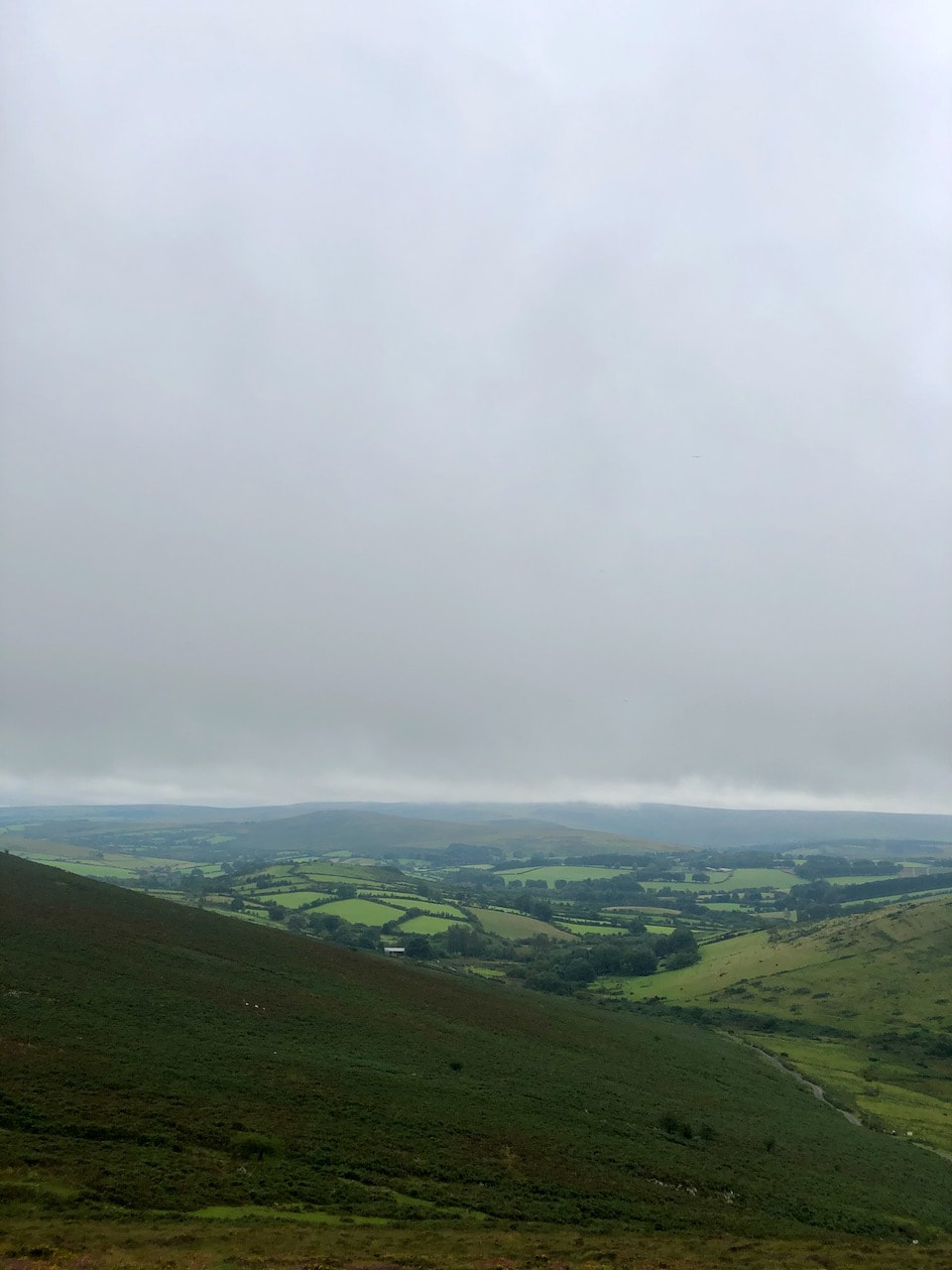
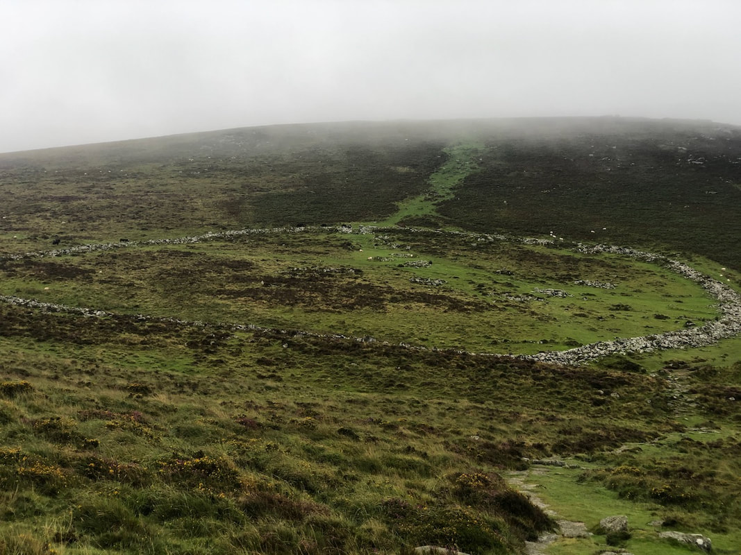

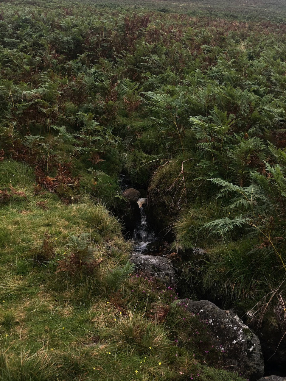
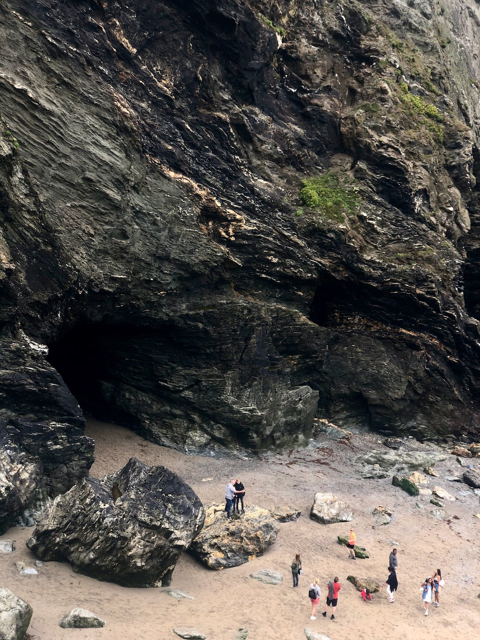
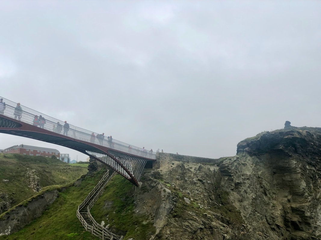

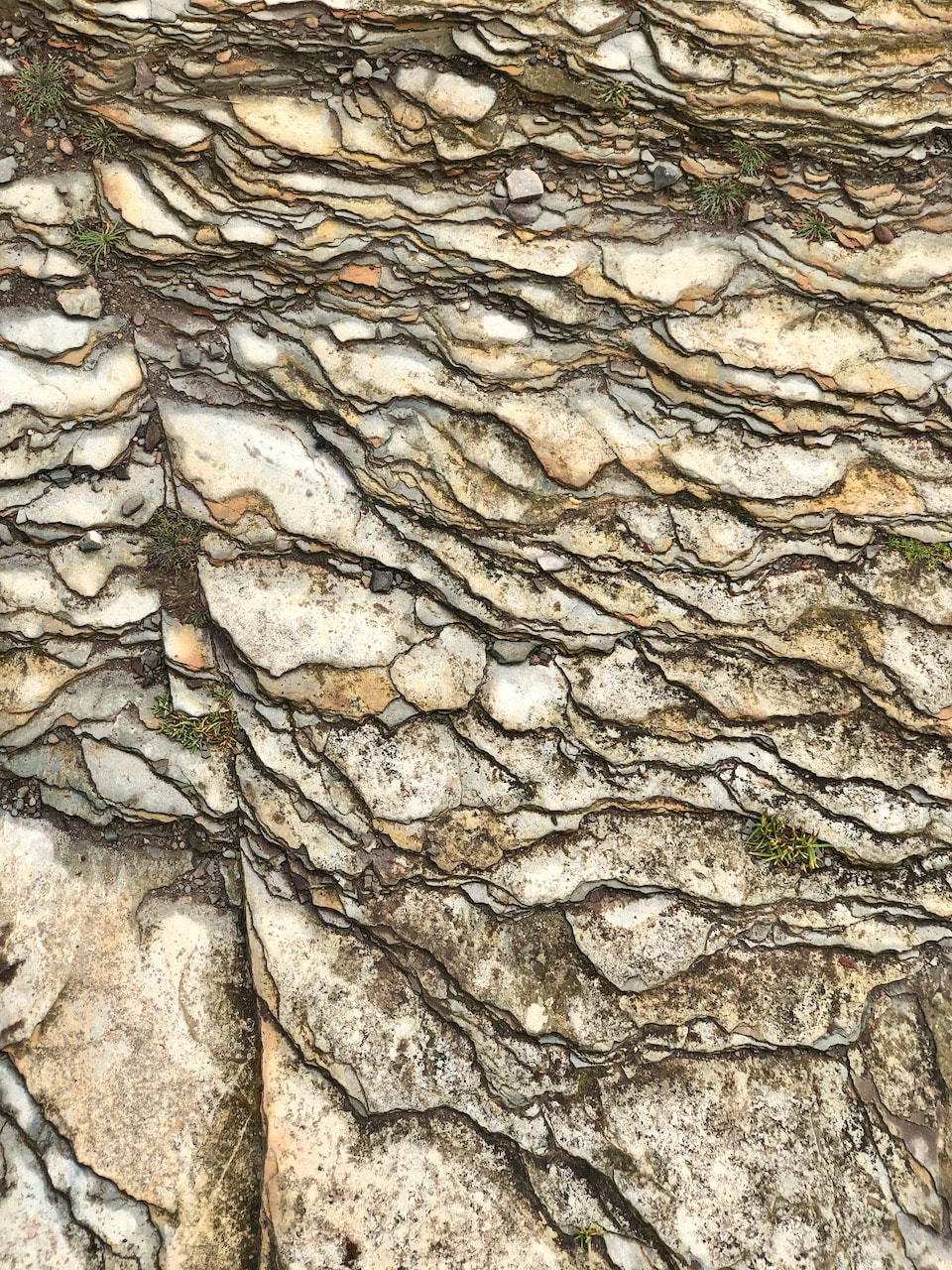
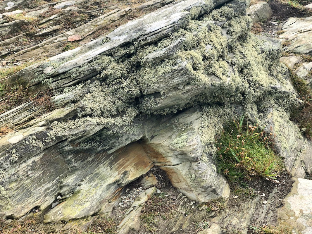
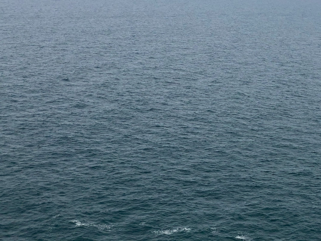
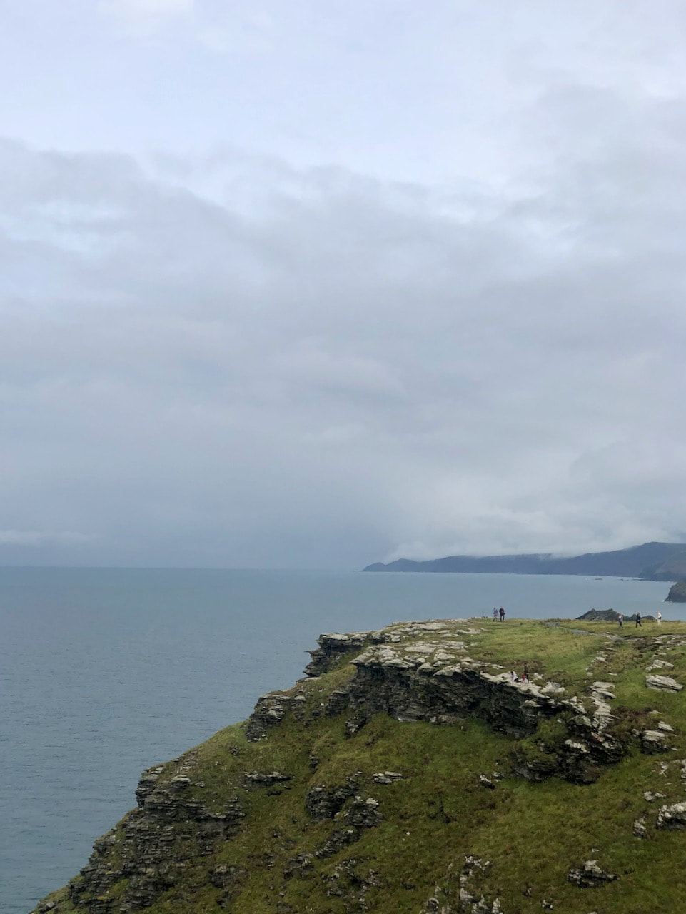
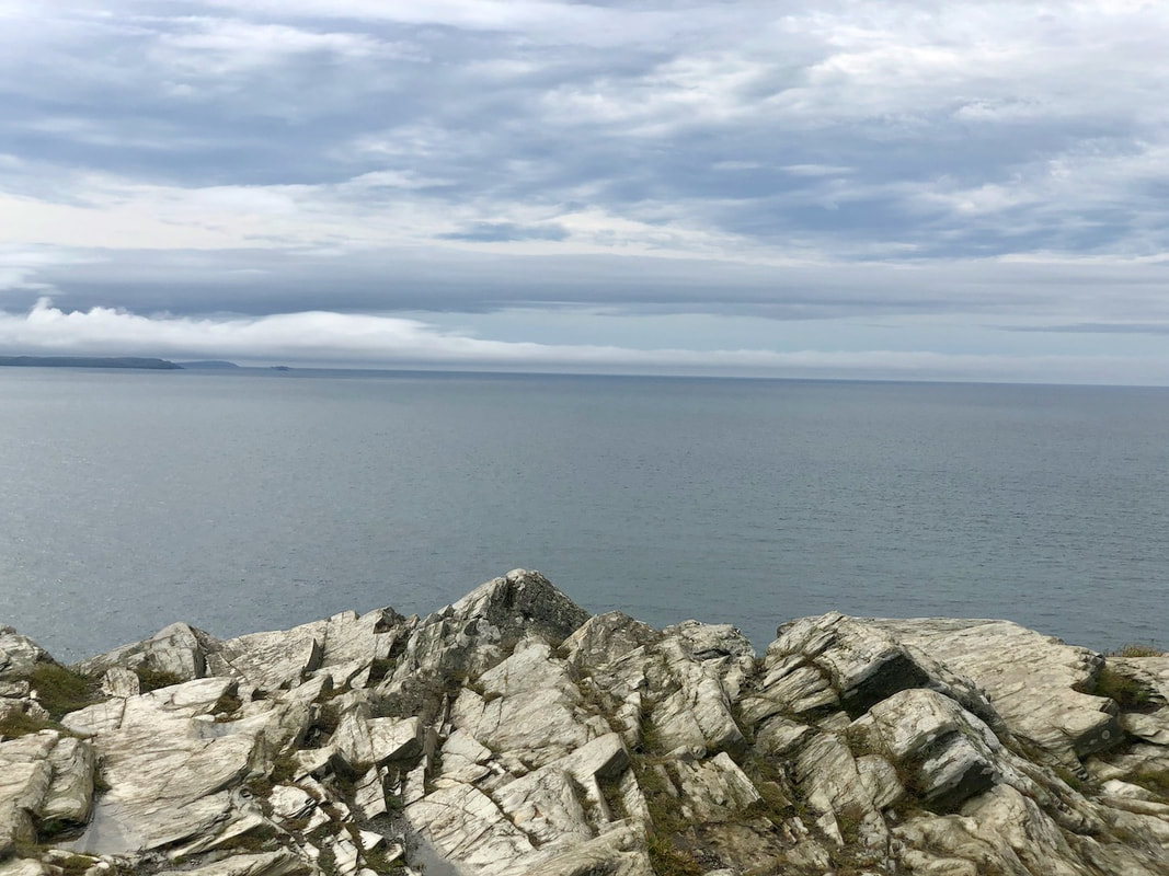
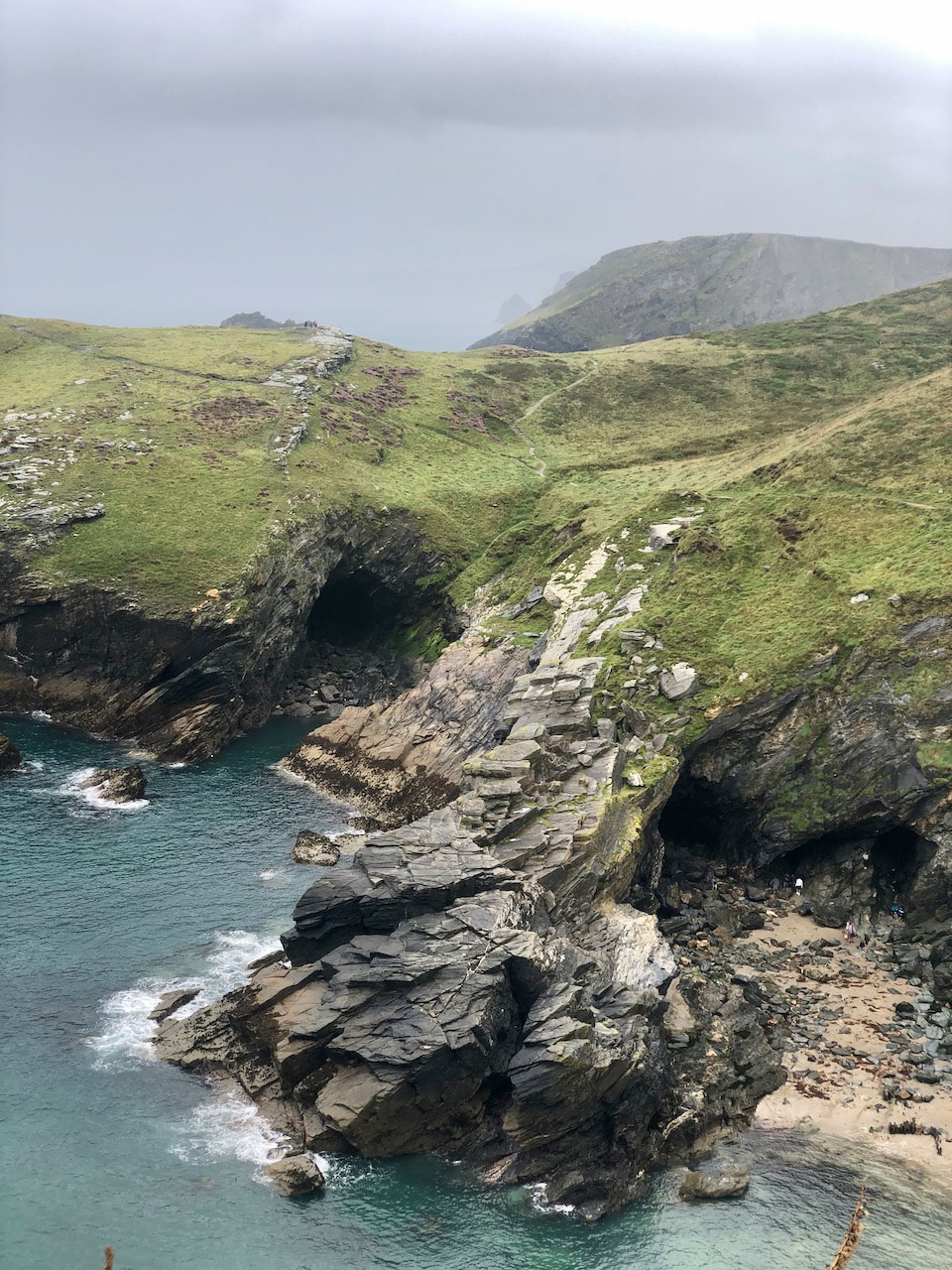
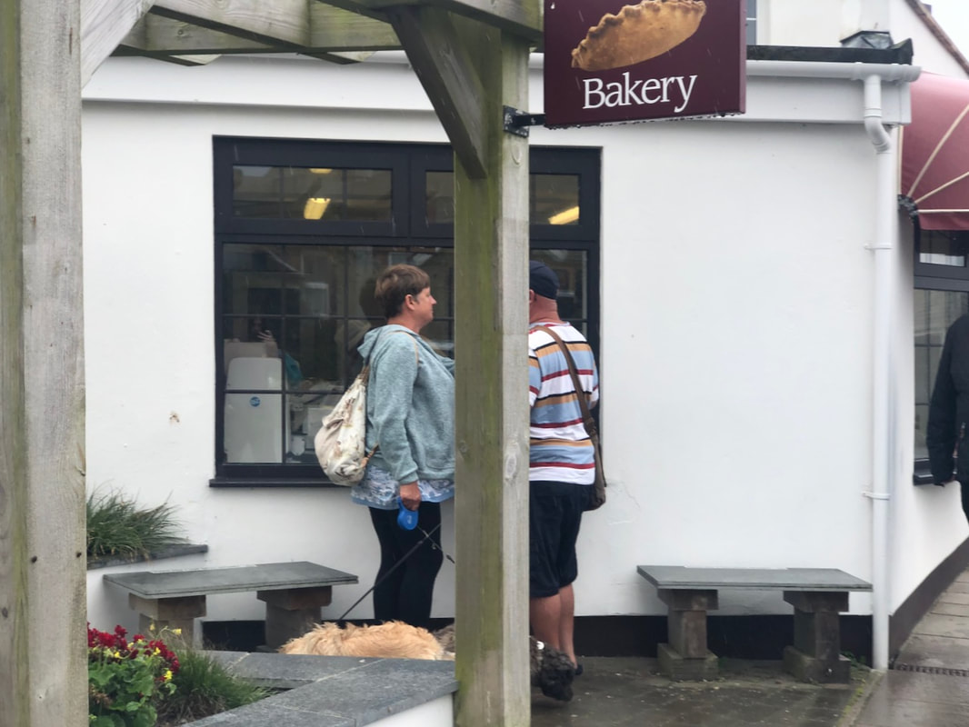


Just like my photoshoot in Chelsea i wanted to try to lean more towards street photography, or just photographing normal objects on my holiday to Devon. I found this to be particularly difficult as i would find myself gravitating towards trying to take photos of grand things, such as the cliffs. But during this photoshoot I had also wanted to focus on colour, which worked for some photos, for example objects and buildings sticking out of a vibrant nature landscape, and for others I found many of the colours in the photos to be "flat" with there being a lot of earth-tones and greys. However if i had done this photoshoot again I would try to do a lot more street photography as I find myself a lot of the time gravitating away from it, however that could be because of the location isn't exactly ideal for it.
Video Experiment
|
|
|
I had gained the idea for this video from a video that I had seen on Youtube, where the photographer would compose a shot as if he was going to take a photo but instead would film it and put all of the videos together. I found this idea interesting as it added more to the experience as most videos the camera would be moving or following a person talking ect, but with this it is just like another layer added to a photo, making it interactive and more immersive. I also think that it helps convey the purpose behind it more, as for me, I wanted it to be calm and neutral and I found it easier to display it in a video as I can add sound and display serenity in a different form rather than a still image.
Photoshoot


Rhetoric of the Image
Semiotics
Semiotics can be understood as the understanding of signs, or signals, what denotations and connotations that can be gathered from the sign. An example of this is a logo from a company, Apple's logo can be seen as an apple (the denotations). However, the connotations of the image being what the logo can portray and or allude, in this case Apple's logo can connote expensive products, technology from the US but also overpriced products and sweatshops. In this case, for photography, each photo can be seen as a sign as something that has both denotations and connotations. The denotations being what is at face value in the image, if there are people, trees buildings ect. The connotations can be what the image can allude, people in a park can allude to it being a weekend or a family day out. This theory can be applied to any photos, even ones with a lack of thought when taking them as they are each signs with wider meanings and understandings.
Denotations and connotations applied to images
As stated earlier, denotations and connotations can be applied in images and photography. In the case of photography it works in that the images' denotations are what can be seen, the connotations are the implied messages or ideas from the image. This can relate to the context of the photo, or it can be separate and distant from the real context and meaning. One example is Garry Winogrand's photo Central Park Zoo, New York 1967:
|
Denotations:
Connotations:
|
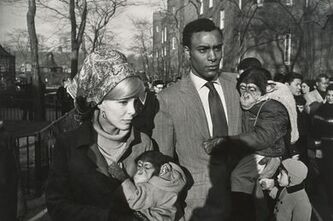
Central Park Zoo, New York 1967
|
The context of the image is in the title, that these two people may be models using the chimps for an advertising campaign. However, without knowing the title, it is a lot harder to gather this meaning, as many other interpretations can be made. One example could be the fact that the woman is white and the man is black, this seems to be a time when couples like this may have been frowned upon in America, so the chimps can be a representation of how their children could be dehumanised and seen as less than human due to the societal climate.
|
Denotations:
Connotations:
|

Panzani advertisement 1964
|
This is image is one from the French brand Panzani, which as shown sells Italian style foods. Roland Barthes speaks about this in his book The Rhetoric of the Image, where he uses denotations and connotations to present how advertisements entice consumers to buy their products. The text itself is French, this presents us tot he fact that the people seeing this are French, which makes the product more desirable in France due to the 'Italianicity' of it, making it seem more authentic. The details in the image also lean towards this traditional Italian value of community and family, for example, the string bag makes it seems as though the products have been bought in a market and have been spilled out onto the dining table which also alludes to the products being as good as the 'real thing'. The name itself also relates to the idea of 'Italianicity' as the name is clearly not French, again, a way to make the consumer feel like they are buying something organic from Italy.
Response
|
Denotations:
Connotations:
|
|
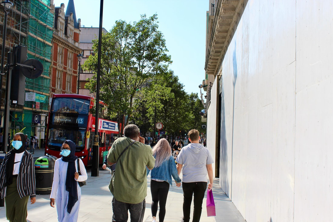
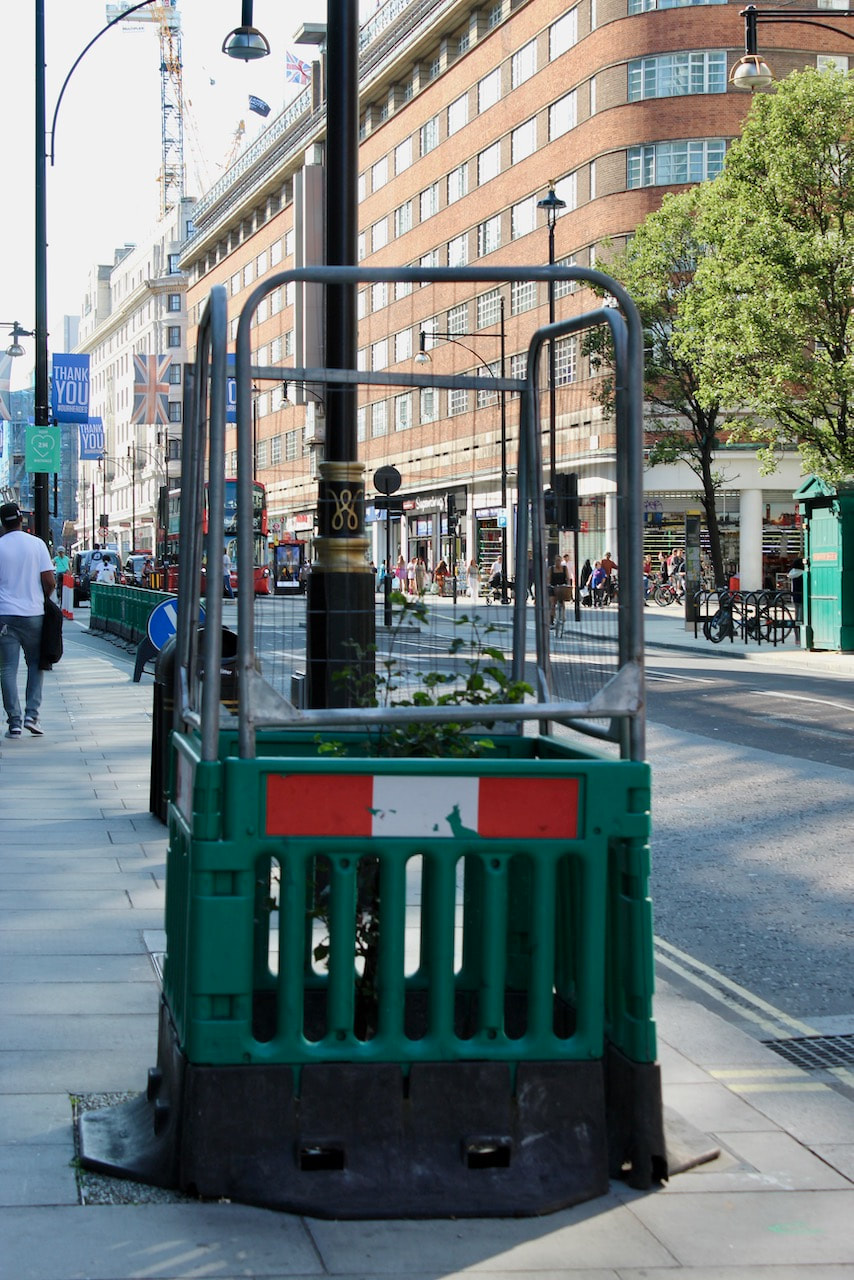
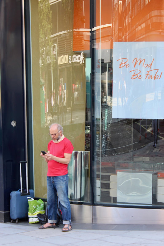
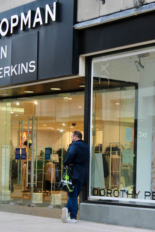
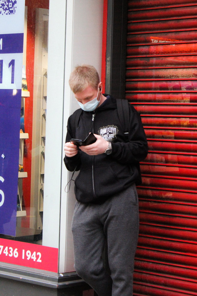
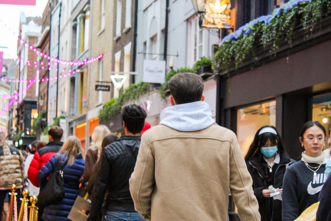
Many parts of the photo skew the viewers perception of the image towards the context of the image. My photo was taken in a photoshoot to document London, it was taken in Oxford street at around 3pm on a Sunday. With this context it adds to why there are groups of people in the background holding shopping bags, however, there isn't any suggestion as to who the man in focus is and what he is talking about on the phone.
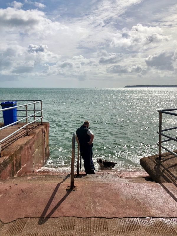
Studium and Punctum
Roland Barthes talks about the theory of stadium and punctum in his book Camera Lucida. In this book he goes into detail about these theories and applies them to relevant images of that time (1980), one example that he uses is Koen Wessing's images from the Nicaraguan Civil War. He compares his reaction to one of the images to another, the first being one of two nuns walking across a road with soldiers sharing that same road, he doesn't find this image moving whatsoever but he realises that he finds it mildly interesting due to the knowledge he has of what is happening there. This idea of common knowledge being applied to photographs and finding some interest from it he names studium, meaning to study. When he looks at the second photo, a group of family and friends walking by a corpse of a child covered by a sheet, he notices small parts of the image that trigger him emotionally, jumping out of the photo to seek the viewer. He names this punctum, meaning a sharp point or tip.
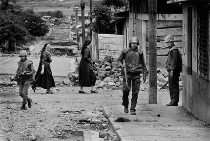
Nicaragua 1979
|
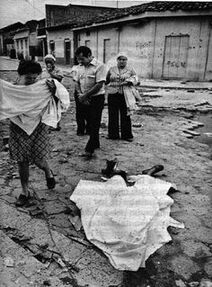
Nicaragua 1979
|
As stated before, the first image didn't have an emotional impact on him, however due to the context of the image and his knowledge of what is happening there it is of some interest to him. The second however has small details that cause an emotion 'wound' as he states: the corpse's once bare foot, the sheet carried by the mother, the woman in the background holding a handkerchief to her nose. These small details cause Roland Barthes to realise that an image can have a profoundly different effect to each individual emotionally.
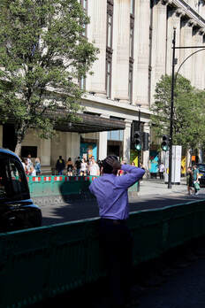
Response
|
|
|
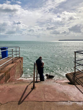
For my image I know that the studium would be the information or common knowledge of it. For me I know that it was taken on holiday in Torquay, a beach town near Cornwall, so I wouldn't have any relevant information of the man in the image except for inferences. For example, he may live there, he may be on holiday, and that the dog is his. The punctum for me would be the way that the man is looking at his dog and the way in which it is looking back at him, it shows a level of affection between them and that the dog sees their owner as trustworthy.
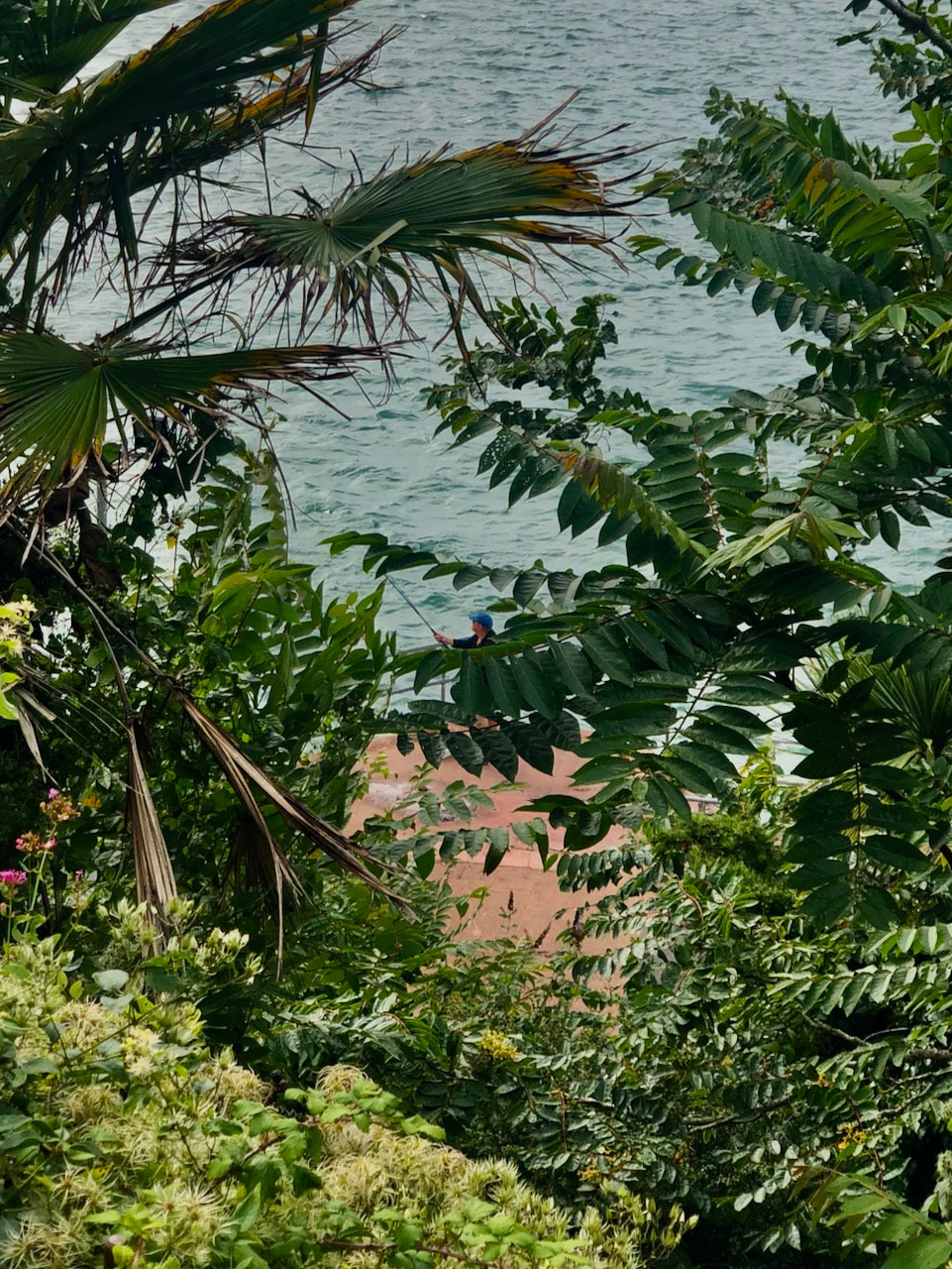
|
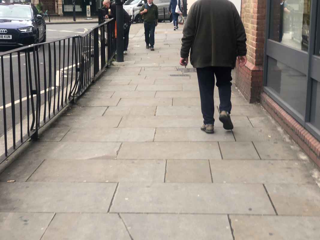
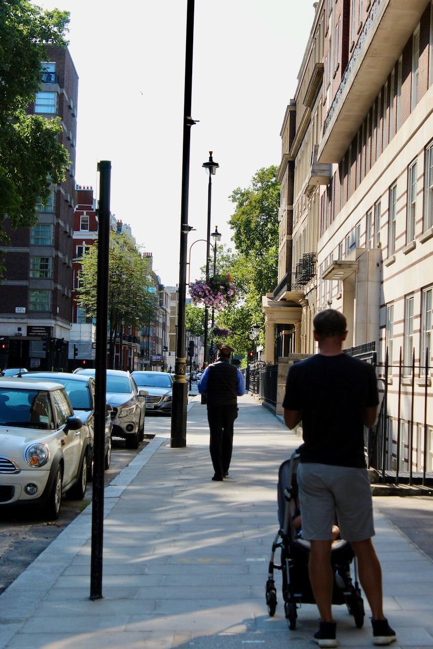
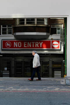
The studium for this image would be the area seeming somewhat wealthy from the architecture in the background and the man's clothing. However the punctum for me would be the way in which the man is walking an his posture. The way in which he is walking creates a calming and relaxed atmosphere to the photo as the man doesn't seem to be in a rush to be anywhere and is rather relaxed in his posture.
|
Diane Arbus and The Ethics Surrounding Her Work
Diane Arbus was a photographer who represented New York throughout its citizens during the late 1950s to 1970. Her work has been deemed as controversial by many due to her interest of photographing the people on the fringes of society, wether it be people who were part of the circus, people with disabilities and transgender people. The most famous critique of her is Susan Sontang's in which she views Arbus to be using her privilege to only visit these people's lives.
|
In her work the theories of studium and punctum can be used in an interesting way. With this image for example, the studium would be the man being very tall due to a form of cancer, the parents and the way in which they are looking, the living room of their house looking fairly wealthy even though they live in a fairly poor area of New York, and also the fact that the man is holding a cane. The puctum could be the ways in which the parents are looking at their son, the mother seems to be looking at him in a form of admiration and love, however the father isn't looking at him in the eyes and looks to be fairly distant from him, maybe even embarrassed. Another aspect could be the fact that the curtains are closed, this could for privacy reasons as the parents don't want the outside world looking at their son.
|
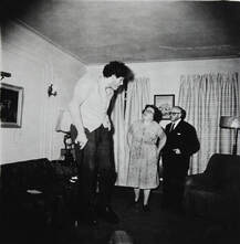
The Jewish Giant
|
Sontag on Arbus
In her article Freak Show, Susan Sontag critiques Arbus' work and, specifically, her way of working. She describes Arbus to be using the camera as a way to do things that people wouldn't normally do, it is a passport for the unknown lives of people that she finds interesting. A term which is used is super-tourist, she visits the subjects lives, however, leaves as she pleases, not adding or taking away from the subjects lives. Furthermore, she explains what Arbus is interested in is morally incorrect. This idea is named as inside/ out, it is idea that a photographer must live with or in the environment of the subject to be able to use them for their own gains, as they are in turn leaving them with something, wether it be money or so on. The outside approach is not making an impact on their lives and merely visiting, as stated by Sontag, they have "no intention of entering into the horror of those images as experienced by the inhabitants of those worlds" .She makes comparisons between the thalidomide babies and Napalm victims and Arbus' interest in "freaks or very ugly people". She makes this comparison showing that there Arbus wasn't interested in ethical journalism but, the people that could be "found", people that didn't have a powerful message or value attached to them.
Sontag further criticises her work but from a socio-economic standpoint and where Arbus is and was raised in society. She states that the fact Arbus was from a wealthy background that she would find a clear fascination to the unknown for her, whereas for many people in New York, this wasn't the unknown to them.
Modern Views on Arbus
Views has since changes on Arbus since Sontag's criticisms of her and also since new exhibitions of her work. Many critics now view her as a problematic figure herself, who sympathised with her subjects and also even found similarities in herself with them. Others also view her as a humanist, someone who was at the forefront of a new type of photography at its conception.
Views has since changes on Arbus since Sontag's criticisms of her and also since new exhibitions of her work. Many critics now view her as a problematic figure herself, who sympathised with her subjects and also even found similarities in herself with them. Others also view her as a humanist, someone who was at the forefront of a new type of photography at its conception.
My Views on Arbus
I believe that Arbus wasn't as evil and predatory as Sontag makes her seem, as she is harshly criticising an anomaly in photography for the time. However much Arbus was involved in their lives after the shutter has been pressed i don't think should take away from the significance of the images now. As now it shows a different way in which people with disabilities and so on are treated, in some sense the images now represent the views and ways in which people prejudiced these people as the way in which the images are taken are that of someone with the views of the people of the time.
I believe that Arbus wasn't as evil and predatory as Sontag makes her seem, as she is harshly criticising an anomaly in photography for the time. However much Arbus was involved in their lives after the shutter has been pressed i don't think should take away from the significance of the images now. As now it shows a different way in which people with disabilities and so on are treated, in some sense the images now represent the views and ways in which people prejudiced these people as the way in which the images are taken are that of someone with the views of the people of the time.
|
This could be used an example to describe the treatment of how disabled people has changed since 1970. People with down syndrome in that era would be sent to facilities as they were viewed as mentally ill. The image itself has an uncomfortable atmosphere around it, this could be due to the lack of visibility of their faces, or the pose of the girl in the middle. This mirrors how people of that time viewed people with disabilities, as uncomfortable to be with and to see. So in turn, this could be viewed in the way that Sontag states, that Arbus is of wealthy background so this is morally incorrect. Or it could be viewed from the standpoint that Arbus is just representing the treatment of these people, wether her views are linked to the representation of them or not.
|
Untitled, 1970
|
Questions on ethics in photography:
When is it not ok to take a photograph?
I don't particularly think that there is a time in which a photo cannot be taken, however, it does depend on why the photographer is taking the photo and what they want to represent by taking it.
Should you always seek the permission of your subjects before taking their photograph?
I think that it is too difficult in some circumstances, if you were taking a photo of a crowded area the photo opportunity would firstly be missed, secondly, would take too long to ask all of the people in that crowd. So I don't think the photographer should always have to ask for permission.
Does it make a difference wether or not you have a personal relationship with the subject of a photograph?
Having a personal relationship to the subject of the photo can add an emotional quality to the image and add a deeper meaning to it. However, I don't think it is exactly needed every time if taking a photo of a person or people.
Can photographs hurt people?
Yes, as it can portray people in a certain light in which they don't want to be seen in.
Is all photography a form of voyeurism?
It depends on the subject of the photo, people can have a fascination of taking photographs of people they don't know and enjoy the feeling of risk in taking them photos.
How responsible is the photographer for the way in which a subject is represented?
A photographer can only see a person in that moment, the photo itself can show the person in a way I which they don't want to be seen, as stated earlier. However, I think if the photo is in public, it is a 50/50 in how responsible the photographer is, this is because the person is in public portraying themselves in that way anyway, where people will see them, the other 50% is the fact that the photographer is choosing to capture that moment.
How much control can the photographer exercise over the ways in which their images are understood by viewers?
I don't think that the photographer has total control over the ways that viewers see their work. I think that it is a low amount as photographs are just a capturing of a moment, where people can make interpretations of the work. However, if the photo has information that changes the interpretation of the image.
Can photographs tell the truth?
Yes and no. They tell the truth for that second the photo was taken, for example, if it was a photo of a model in a studio, there was a model in the studio. However, the truth overall can be subverted and given different meanings.
Inside/ Out
In Abigail Solomon-Godeau's essay Inside/Out she refers to the complications brought up by Susan Sontag around the ethics of Diane Arbus' work. She creates the theory of inside and out by Sontag's criticism of Arbus being a supertourist and someone who has a voyeuristic intrigue to the subjects of her photographs, many of the photos objectifying the subjects and also creating an unsympathetic atmosphere around the image. Solomon-Godeau uses this and names this as the out, the idea that the person is only peeking into the subjects lives. This is turn creates the inside, someone who lives with the subject, creates and emotional relationship to them, and suggestions of engagement and sympathy.
|
Outside:
|
Inside:
|
She further argues wether or not photography can be used as a truth in terms of the theory of inside and outside. She uses various examples of photographers that either stage, have an outside perspective and would have somewhat of a relationship with the subject. The examples are used to emphasise the fact that a photo may not in fact present the truth of the photographer, the image itself doesn't have an opinion or bias however it can be perceived to make the photographer seem so. Nan Goldin is compared to Arbus in that Goldin does actually live with the subjects, Arbus doesn't. She states "it may well be that the nature that speaks to our eyes can be plotted neither on the side of inside or outside but in some liminal and as yet unplotted space between perception and cognition, projection and identification."
Response:

For my images I would say they are more outside, this is due to the fact that when I am taking the photo I'm not walking up towards people and asking for permission or creating a relationship with them before I take the image, and this is evident within the images. The view from the photos are one of being physically distant from the subjects, usually just walking or doing daily activities, and I as the photographer is just capturing them in these spaces. This is most evident in the third, fifth and sixth images, as the subjects are far away from me, and also they are clearly not taking notice of me taking the photo.
Ways of Seeing
John Berger's documentary Ways of Seeing explores the relationship between photography and advertisement and how it effects the people looking at them. He uses the term three dreams, location, sex and skin, each representing an ideal world that the working class of the world want and desire. However, this is a manipulation on life itself, when buying whatever is being presented as the ideal it sets the consumer back economically, and only helps the people at the peak of society. This relates to the idea of glamour, it being that people now desire a life in which to flaunt expensive possessions and move away from the need to work a regular job, not have a sex life and also to be aesthetically pleasing on an outward perspective. Whereas before photography, oil paintings were used to project what the elites had already owned. Berger relates this to advertisements in another way too, using the example of a magazine he shows how a photo of refugees in Pakistan is quickly subverted to a photo of an ideal world, an advert. This is done to take away from the refugee photos and also to tell the viewer to want to strive for the advert and forget about the people below them economically and sociologically.
The Relationship Between Image and Text
|
|
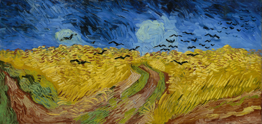
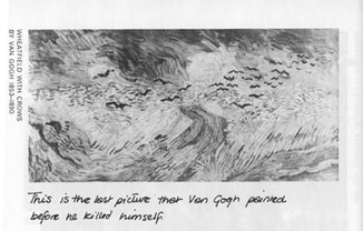
In the book that shares the same name, the relationship of text and image is presented. The idea that text can work in conjunction with the image to add more meaning or even contrast the image, complicating the context of it. The first image here is of a painting by Van Gogh, it seems tranquil, however with text the perception and context changes. The second image now has text underneath stating "This is the last picture that Van Gogh painted before he killed himself", just with the use of words in parallel with the image changes the view of it, now it seems dark and eerie.
Martha Rosler
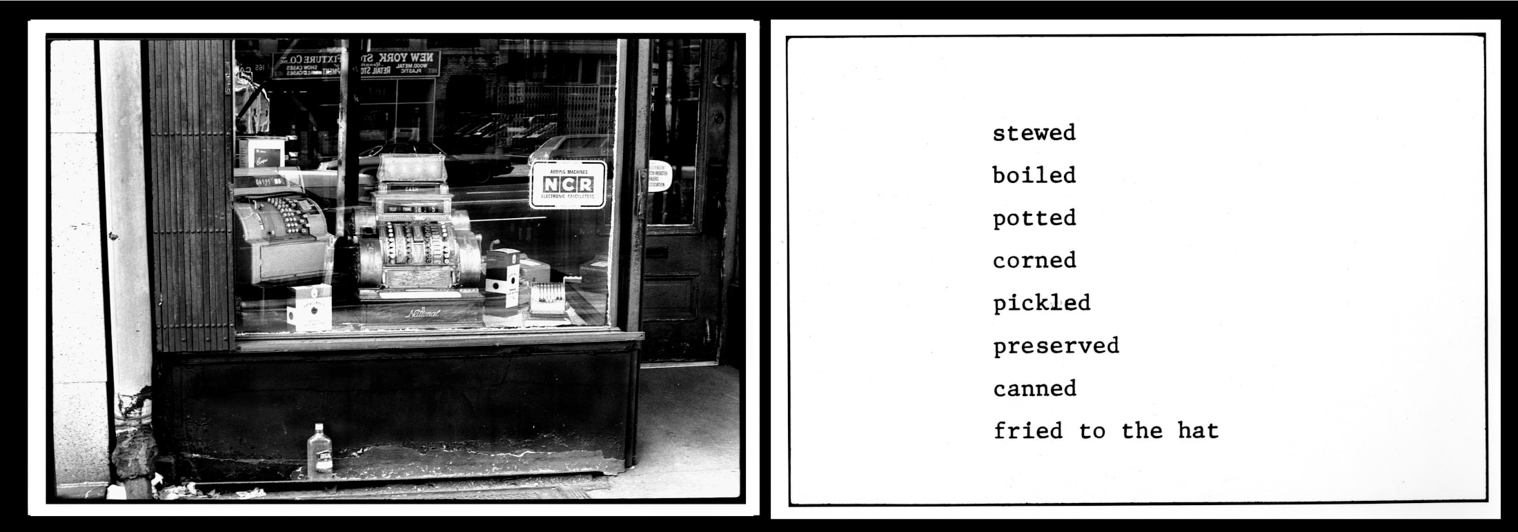
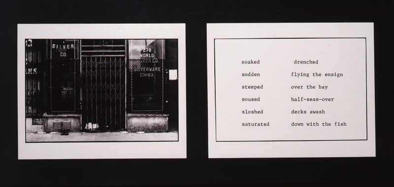
In her project The Bowery in Two Inadequate Descriptive Systems, Martha Rosler wanted to represent the poverty stricken area of the Bowery without criminalising, victimising or misrepresenting the people of the area and the area itself. The images themselves are of shop fronts, doorways, broken bottles etc, and are to work in conjunction with the text that accompanies them. The text is multiple descriptions of being in a drunken state, words like 'soiled', 'plastered' and 'boiled' are placed directly next to the images, implying that they are to work in parallel. She used this technique as she believed that documentary photography doesn't represent areas of poverty in the best of light, not creating a change morally to help these people.
In her project The Bowery in Two Inadequate Descriptive Systems, Martha Rosler wanted to represent the poverty stricken area of the Bowery without criminalising, victimising or misrepresenting the people of the area and the area itself. The images themselves are of shop fronts, doorways, broken bottles etc, and are to work in conjunction with the text that accompanies them. The text is multiple descriptions of being in a drunken state, words like 'soiled', 'plastered' and 'boiled' are placed directly next to the images, implying that they are to work in parallel. She used this technique as she believed that documentary photography doesn't represent areas of poverty in the best of light, not creating a change morally to help these people.

John Berger and Jean Mohr
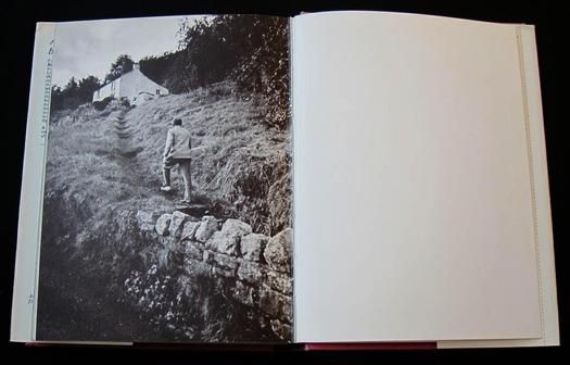
Jean Mohr, the photographer of A Fortunate Man, and John Berger, writer, collaborate to explore the life of John Sassall, a doctor whose work and personal life are blurred as he lives among his patients. Many of the photos within the book are set in the English countryside and display a sense of serenity that comes from such an environment. Throughout the book, Berger's text sets the scene of how the doctors career and his psychological intimacy between him and his patients change in time, at first he is a excited and young. However as the book progresses we see him become some sort of a big brother figure over the patients, becoming more interested in how the illnesses affect them and their families, questioning the meaning of 'good; doctoring. The combination of text and image in the book creates a reflection of the doctor's thinking and life. At the beginning the photos are of hallways, kitchens and consulting rooms, whereas, nearer to the end pf the book, the scenery changes to landscapes.

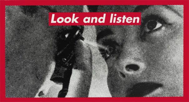
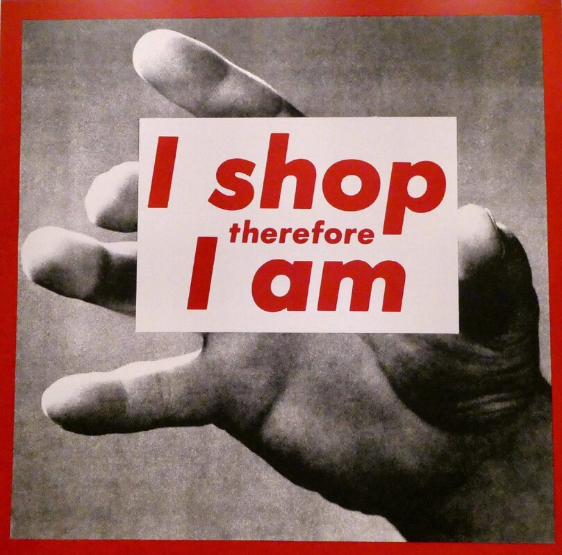
Barbara Kruger
Much of Barabra Kruger's work incorporates the use of text and image in a way that critiques society and its views on feminism, consumerism and individual desires. Similar to John Berger's ideas around advertisements and their promises for better life, she uses images from magazines to compose the background of her art. The foreground would have her recognisable lettering, usually using pronouns to direct a viewpoint to the viewer of her work. Much of the text would be a short and powerful statement that is often critical of what is in the image itself. For example the first image states "look and listen' and is of an optician checking on a woman's eye, the instructive text suggests that in society women are forced to conform to male rules and regulations. An example in terms of consumerism would be the last image, where it states, ' I shop therefore I am' alluding that when submitting to a consumerist, capitalist government, that the consumer is caught up in thinking that they are creating a better life for themselves, however, this is only helping the highest in the social and financial ladder and setting back the consumer financially.

Response:
|
|
|
In this experiment I used the idea of text influencing an image, but with a video instead. In this specific example I used aspects of Martha Rosler's The Bowery in Two Inadequate Descriptive Systems in which she wanted to take photos in a specific part of New York which was fairly poor, and also where a lot of drunk people resided in shops fronts. However, she did not want to take pictures of the drunk people as she saw it as unethical, instead she took photos of the shop front, bottles etc, then accompanied the images with synonyms for drunk people. In my example here, I used the idea of having text describe what would be in the image, but I did it to describe what was already there.
Context and the Importance of It
As explored earlier, photographic truth is not always to be trusted, it can be obscured wether intentionally or unintentionally. It is also volatile, the simple use of words can subvert the image's meaning however, not the context. Context can be viewed as fixed, something that is fact already set in. An example can be Eddie Adams' photo Murder of a Vietcong by Saigon Police Chief, 1968, the photo paints the man with the gun to be the villain and when used for publicity thats how it was also presented. However, with added details and context it becomes known that the man being shot was a captain of a revenge squad who executed dozens of unarmed civilians. Neither of the people when given context or without context are in the right, but it can change the meaning of the image.
As explored earlier, photographic truth is not always to be trusted, it can be obscured wether intentionally or unintentionally. It is also volatile, the simple use of words can subvert the image's meaning however, not the context. Context can be viewed as fixed, something that is fact already set in. An example can be Eddie Adams' photo Murder of a Vietcong by Saigon Police Chief, 1968, the photo paints the man with the gun to be the villain and when used for publicity thats how it was also presented. However, with added details and context it becomes known that the man being shot was a captain of a revenge squad who executed dozens of unarmed civilians. Neither of the people when given context or without context are in the right, but it can change the meaning of the image.
Rebecca Norris Webb and Alex Webb
Rebecca Norris Webb and Alex Webb are a couple who both focus on street photography. What makes them different however is their collaborative endeavours, this is quite rare within photography as many photographers have their own creative vision and don't see a need to merge works with other people. What makes it easier for Rebecca and Alex is that their images are very similar in nature, they like to implement everyday life and present it how it is. Using shadows and colours is a another important factor in their photography, the colours are sharp which, of course, makes the subjects and people stand out in the image, the shadows in the same images hyperbolise these colours. The shadows are used in a specific way within their images that puts the colours at the forefront, this in turn creates a natural contrast in their images.
Rebecca Norris Webb
Rebecca Norris Webb's photos are both similar and different to her partner's photos. The similarity in their photos isn't so subtle in their use of pungent colour being the only real correlation. The main difference in their images is the atmosphere in which is created. Rebecca Norris Webb is visibly more delicate and sensitive in her approach to photography, this can be induced by her background in poetry which has this familiar trait. On top of this, here photos aren't chaotic to the point of photos feeling as if they will spill out, they're subtle in their elegance as images aren't taken in busy public areas, and are rather in cold landscapes, back alleys and towns. The photos that she creates seem more cemented in history and memories, Alex Webb, more in the feeling of the situation and impulse.
Alex Webb
Interview
The interviewer explores Alex Webb's use of colour and how he incorporates that in his process. he describes himself as feeling a moment and scene to capture rather than making it happen. Webb goes on further to describe the lack of planning when going out to take these complex scenes, how what he takes photos of cannot be done without trying to go into an environment with any preconceived notion of it. "I take complex photographs because I experience the world — particularly more and more as I get older — as a very complicated and ultimately inexplicable place", this is clearly demonstrated in many of his photographs, with complex scenes of people playing, walking, or just fulfilling normal daily tasks, without the factor of chance his photos wouldn't be anywhere near to what they are now, chance being the basis for street photography. Further into the interview, he expresses that the best way of street photography is to lack the factor of rationality, and get feelings in what should be captured, adding even more an emotionally complex level to the photographs as they represent his reflection of the world around him.
The interviewer explores Alex Webb's use of colour and how he incorporates that in his process. he describes himself as feeling a moment and scene to capture rather than making it happen. Webb goes on further to describe the lack of planning when going out to take these complex scenes, how what he takes photos of cannot be done without trying to go into an environment with any preconceived notion of it. "I take complex photographs because I experience the world — particularly more and more as I get older — as a very complicated and ultimately inexplicable place", this is clearly demonstrated in many of his photographs, with complex scenes of people playing, walking, or just fulfilling normal daily tasks, without the factor of chance his photos wouldn't be anywhere near to what they are now, chance being the basis for street photography. Further into the interview, he expresses that the best way of street photography is to lack the factor of rationality, and get feelings in what should be captured, adding even more an emotionally complex level to the photographs as they represent his reflection of the world around him.
Response:


I believe that this photoshoot was fairly successful, in that I attempted to use Alex Webb's way of using a somewhat chaotic scene and finding elegance within it. I think that the 11th and 21st photos are good examples of this, as the people and the composition is full, however I tried to pick out a specific detail within them to focus on, calming the shot down. I also think that colour was used well in most of them, examples being photos 3 and 13, where there are very prominent colours represented. However, I do think i need to improve on compositions and actually having the subjects in focus, in the 19th photo the people are blurry and out of focus, and with the last photo I had pointed the camera to low to the floor so the viewer can't see the broccoli in their shopping carts.
A Change in Focus
I feel as though the street photography is fairly hard, for me, to sustain for a whole project. With this in mind, I feel that moving towards taking photographs of everyday moments/ things on the street could be a good direction, as I can explore the importance of such moments within daily life and how photographing them manipulates them in some sort. Whether it is contextual, the act of taking a photo of something instantly suggests that there is an importance, or aesthetically, taking a photo of such moment can accentuate the beauty of it. Furthermore, doing this with the formal elements of photography in mind can help me to explore the aesthetic aspect of taking these types of photos.
William Eggleston
William Eggleston is the known pioneer of colour film photography as a respected form of fine art. Unlike many of the photographers of his time, he was interested in the local area and documenting the everyday banal within it. The photographers of the time were transfixed with black and white street photography, mainly based in the busy streets of New York. Breaking this mould, Eggleston's use of colour has inspired many of the modern day photographers who use it, the British photographer Luke Saxon being a good example. The images have been praised for their subjects, the boring, and bringing an elegant attention towards them. This can be viewed as a Eggleston exploring the viewpoint of the photographer, the fact that once having a camera in hand, his way of seeing the world changes. He is now the observer rather than the experiencer of the normality of life. He very rarely mentions his images and their meanings behind them, this may be due to him wanting the viewer to have their own view of the image and forming their own understanding.
Response:


Festival in a Box
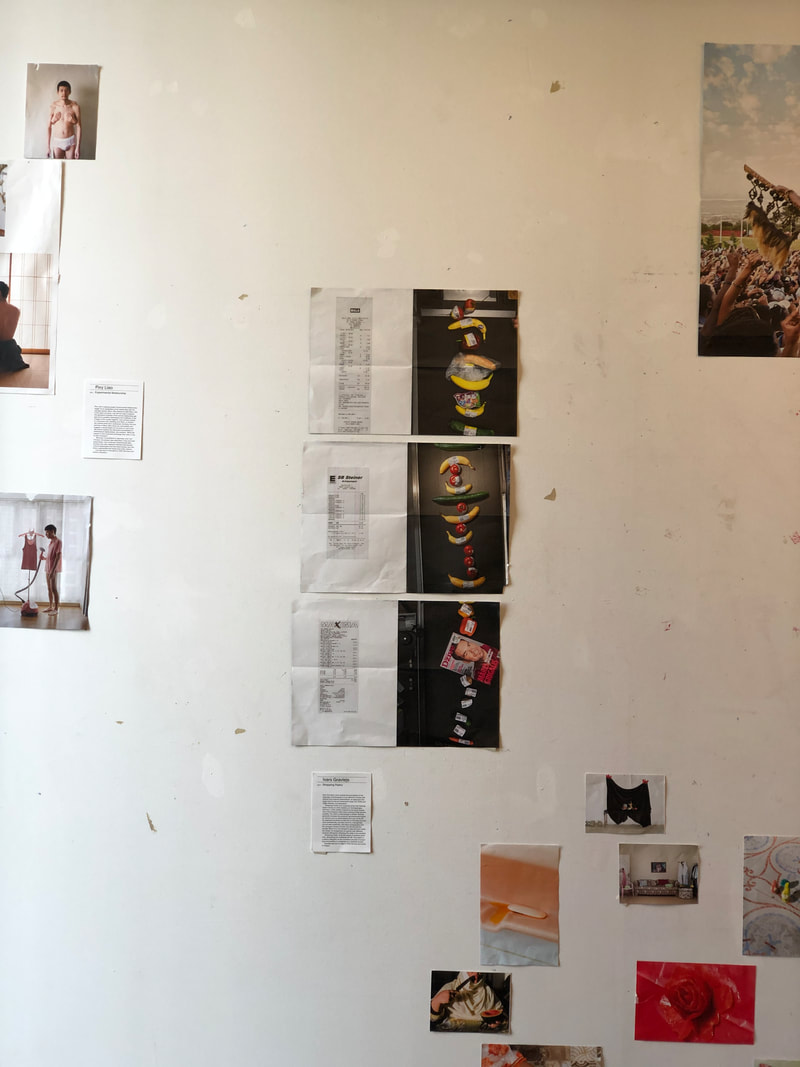
Due to the coronavirus the Photoworks festival took a new approach. The title, Festival in a Box suggests what it is, what would've been the festival has been put in a box with the images printed out in different sizes. The aim of this is for the people who receive the box to exhibit the work in their homes in their own way, and these would be submitted to Photoworks. Our task in class was to do exactly this, we would work in twos having one artist each, then corroborate with the rest of the class for deciding the placement and approach in displaying the work. I had Ivar Gravlejs' work to display, which was photos of supermarket goods on a conveyer belt with a photo of the receipt next to it. The work was originally going to be people's reaction to their receipts, however, evolved to goods based on their price and visual beauty. The items are organised so they can be read as the receipt. Using this, we thought it would be interesting to put the images in a line as if all the items were on the same conveyer belt, and put the card that describes the work in line with the receipts.
The Photographer's Eye
John Szarkowski brings up multiple points throughout the extract on the impact photography has had on popular forms of art that had come before it. For example, painting is compared to photography through their differences in the time taken to make the piece. photos are quick and momentary whereas, paintings are a longer process that can be manipulated more easily by the artist. He bring up five main points of interest:
The Thing Itself
He states that the first thing photographers learn is to work in the actual, the real world. Rather than creating their best works, it is to capture the best moments however, the photos that are conceived aren't in fact reality and that they are only a moment of reality. In addition, he argues that the public believed that photos were cemented in reality, the camera displayed the factual truth and our eyes played an illusion. He also states that 'the image would survive the subject, and become the remembered reality', this argues that the photo would outlive a memory as it was perceived as reality.
The Detail
Szarkowski argues that photographs cannot tell a coherent story due to the nature of photos being only a small moment in time. This means that the images themselves are only a jigsaw piece to something larger, and that if photos cannot 'be read as stories, they could be read as symbols' as they show objects in a light never seen before. He also argues that photos dont explain what's happening without extensive captioning, they make the story real.
The Frame
Photos aren't made, they are selected. The person taking the photograph has the decision to leave things in, and take things of the photograph by framing. If subjects are framed in a certain way, relationships can be created between them, even if there wasn't one in the moment. For example, if two people are in a photo framed to be next to each other, there is bond created photographically between them.
Time
Another point of interest that Szarkowski brings up is the fact that photos are a parcel of time, the time being the present of when the photograph was taken. And that photography skews to the past and future, in that the past is when the image was taken and the future being when you can view it. The photographer has an interest in slicing time into sections based on the composition that they found at the time.
The Vantage Point
In the final point Szarkowski goes into detail about how images that are created can give an unexpected view, a sense of the scene while not giving away details of the narratives behind the image. Photographers work within the space they have, this can distort the subject through foreshortening, light and so on.
The Points Applied to William Eggleston
Each of these points can be applied to the work of William Eggleston and the way that he works. He doesn't work in a studio or an environment in which he can change and manipulate, most the of the time he goes out onto the streets and photographs what is there without changing anything about the subject. Many of his images are viewed as something that the viewer has to work out meaning from, this relates to the fact that they are a parcel of his present and the images cannot create a visual story that can be simply understood. He also carefully and interestingly frames his images, to leave important things in and unimportant things out, the subject is clear and obvious. Relating to the vantage point, he works wihtin the spaces that he has for that given moment in which he sees the image flash before his eyes, often creating interesting view points in the images.
The Points Applied to Visual Diary
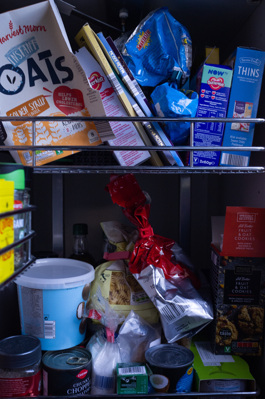
In my recent photoshoot some of the points can be applied to them. An example being the thing itself, I only worked with the objects within my house without manipulating them or moving them to suite how I wanted them to be.
The Thing Itself
He states that the first thing photographers learn is to work in the actual, the real world. Rather than creating their best works, it is to capture the best moments however, the photos that are conceived aren't in fact reality and that they are only a moment of reality. In addition, he argues that the public believed that photos were cemented in reality, the camera displayed the factual truth and our eyes played an illusion. He also states that 'the image would survive the subject, and become the remembered reality', this argues that the photo would outlive a memory as it was perceived as reality.
The Detail
Szarkowski argues that photographs cannot tell a coherent story due to the nature of photos being only a small moment in time. This means that the images themselves are only a jigsaw piece to something larger, and that if photos cannot 'be read as stories, they could be read as symbols' as they show objects in a light never seen before. He also argues that photos dont explain what's happening without extensive captioning, they make the story real.
The Frame
Photos aren't made, they are selected. The person taking the photograph has the decision to leave things in, and take things of the photograph by framing. If subjects are framed in a certain way, relationships can be created between them, even if there wasn't one in the moment. For example, if two people are in a photo framed to be next to each other, there is bond created photographically between them.
Time
Another point of interest that Szarkowski brings up is the fact that photos are a parcel of time, the time being the present of when the photograph was taken. And that photography skews to the past and future, in that the past is when the image was taken and the future being when you can view it. The photographer has an interest in slicing time into sections based on the composition that they found at the time.
The Vantage Point
In the final point Szarkowski goes into detail about how images that are created can give an unexpected view, a sense of the scene while not giving away details of the narratives behind the image. Photographers work within the space they have, this can distort the subject through foreshortening, light and so on.
The Points Applied to William Eggleston
Each of these points can be applied to the work of William Eggleston and the way that he works. He doesn't work in a studio or an environment in which he can change and manipulate, most the of the time he goes out onto the streets and photographs what is there without changing anything about the subject. Many of his images are viewed as something that the viewer has to work out meaning from, this relates to the fact that they are a parcel of his present and the images cannot create a visual story that can be simply understood. He also carefully and interestingly frames his images, to leave important things in and unimportant things out, the subject is clear and obvious. Relating to the vantage point, he works wihtin the spaces that he has for that given moment in which he sees the image flash before his eyes, often creating interesting view points in the images.
The Points Applied to Visual Diary
In my recent photoshoot some of the points can be applied to them. An example being the thing itself, I only worked with the objects within my house without manipulating them or moving them to suite how I wanted them to be.
Peter Fraser
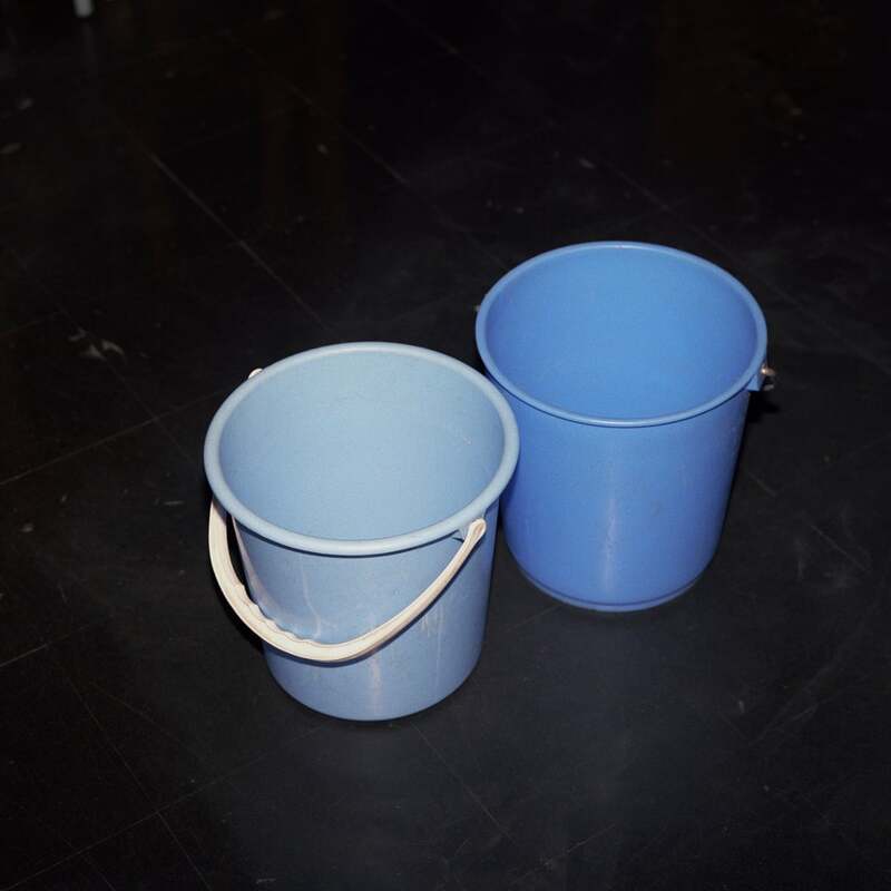

Watching a short film at the age of 7 that showed a couple picnicking, the imaginary edge of the universe, then the atoms that made up skin, Peter Fraser has since had a relationship with the idea of the mundane and how there's more to it than is visible to the human eye. This has been most apparent throughout all of this work. There is seemingly no relationship between the images, however, once understanding his interests in the atomic make-up of things, it becomes evident that this is the relationship, the exploration of everything being made out of the same things. His images make the viewer, just like William Eggleston, find relationships within the mundane to link them with other photos. In addition, the images force us to view normal life and appreciate and contemplate it more than just walking through the environment or just ignoring it, like many people do on a daily basis. The best example of this is his photo of two blue buckets. From a glance, the image is seemingly boring and nothing is interesting within it. However, it is the subtle differences in the two buckets that are interesting, the different shades and one having the handle and the other one not. This is of specific interest to me as many if any wouldn't even be interested in them, but his photographic eye caused him to take that photo.
Luke Saxon

Taking inspiration from the pioneers of colour photography in the 1970s and 80s, Luke Saxon represents the everyday and banal of England, more specifically the north. His interests stems from the use of colour in such a way that the images seem painted, he finds complementary colours in scenes that wouldn't usually be noticed, details that would go by someone without an eye for capturing such scenes. These points of intrigue gravitate me towards his work, as well as him being a photographer based in the UK. Many of the great colour photographers that hyperbolise the quotidian are firstly photographing in America, secondly photographing in the 1970s. Of course that doesn't mean I can't use the likes of William Eggleston and Stephen Shore as inspirations and guides in this investigation, however, to see someone from the UK able to capture the same atmosphere in a place dissimilar can help me more with my photography as the environment in which I am taking photos if far from the spaces that captivated the 1970s greats. In Luke Saxon's work it can help me understand to find scenes of the banal and not aspire to something that cannot physically be introduced, due to my circumstances. More on his work itself, he explores new areas and towns that he has not been to and photographs this experience. His main enjoyment from photographer is similar to Alex Webb's in a sense, he is an observer of the everyday, not Luke Saxon living the everyday.
Response:


Photoshoot


Koyaansiqatsi- Life out of Balance

This experimental film is considered to be significant in multiple ways. There is no dialogue: this is considered to be done due to the director, Godfrey Reggio, suggesting that words cannot be sufficient for describing the state of the world now. The state of the world being humans now live technology, rather than use it. It has now become such a dependance for everyday survival, even when walking in the city at night technology surround us through streetlights, cars and so on. This message is accentuated through the techniques used by Reggio. For example, time-lapse hyperbolises the way people move within cities, making them seem automated to a system placed before them. Furthermore, the use of slow motion allows the viewer to experience and absorb all of the information that is being presented. The film is also a part of a trilogy, Powaqqatsi and Naqoyaqatsi.
Powaqqatsi- Life in Transformation

As a sequel to Koyaanisqatsi, Reggio explores the same theme however, in a different part of the world. Exploring the effects of a Western modern industrialist lifestyle on third world countries who are the ones forced to feed that certain way of living. In similar vain to its predecessor, there is no dialogue and a mix of different film techniques, but unlike Koyaanisqatsi this isn't used to represent the business of modern life. Instead, it praises older, more traditionalistic ways of living as it doesn't spoil the Earth as western ways do.
Photoshoot

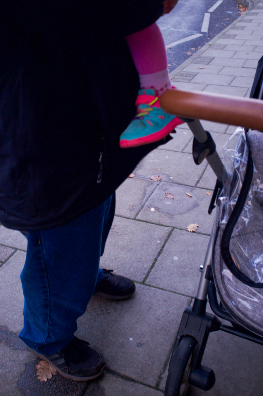


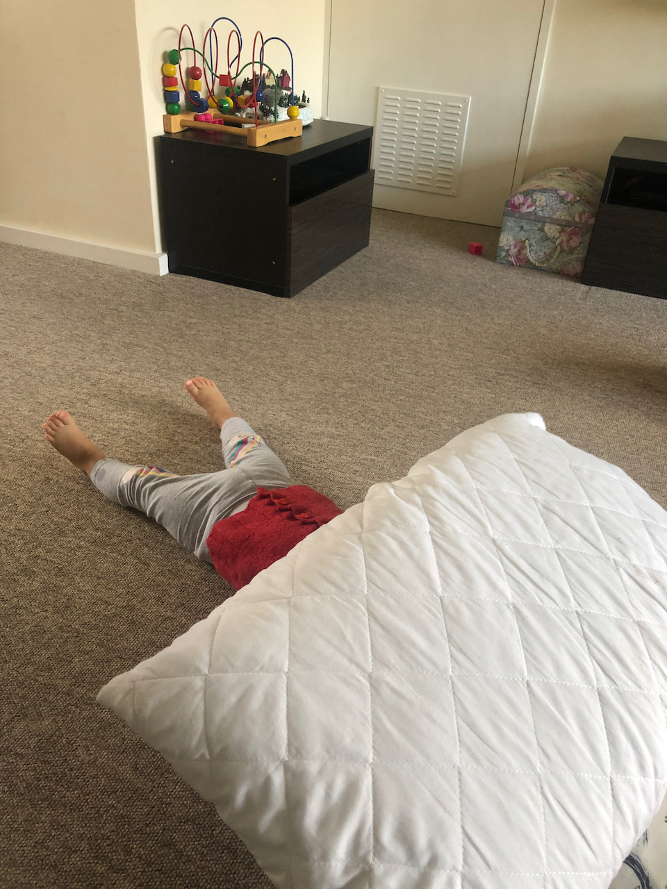
Unlike some of my previous photoshoots, I attempt in this one to project me and my family life through the images and my everyday scenarios that we share. For example, going to the shops, walking down the highstreet and my relationship to my sister. This shift in focus causes me to be more spontaneous in taking photos, snapshot like, to capture certain moments that I find interesting. However, the eye for taking such banal photos has to still be in place, for example, I still focused on composition like with the last photo, I didn't want to show her face but still represent her personality. Furthermore, I still focused on colour, the 13th photo being an example, the contrasting coloured clothing of my dad and sister represent them in different ways. And also the 32nd photo, with noticing the red and blue of the tape and the button.
Photoshoot


Photoshoot


Solaris
Solaris, a Soviet art film directed by Andrei Tarkovsky, is based on the 1961 novel of the same name. In viewing the film, it accentuated my appreciation for long shots that establish a key moment during films. Furthermore, it helped me to understand the importance of composition, as when previously making films myself I hadn't focused on composition nearly as much as I should have. Therefore, from watching this, I am going to attempt to focus a lot more on composition within the short films I want to further explore, also use such compositional techniques within my photography.
Photoshoot
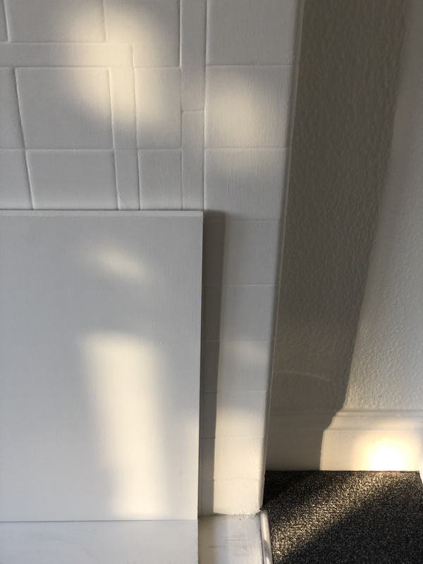
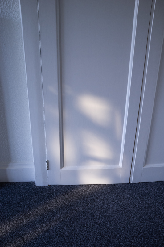
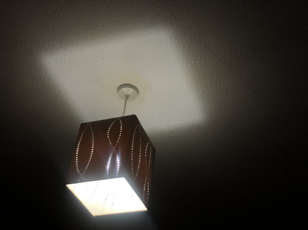

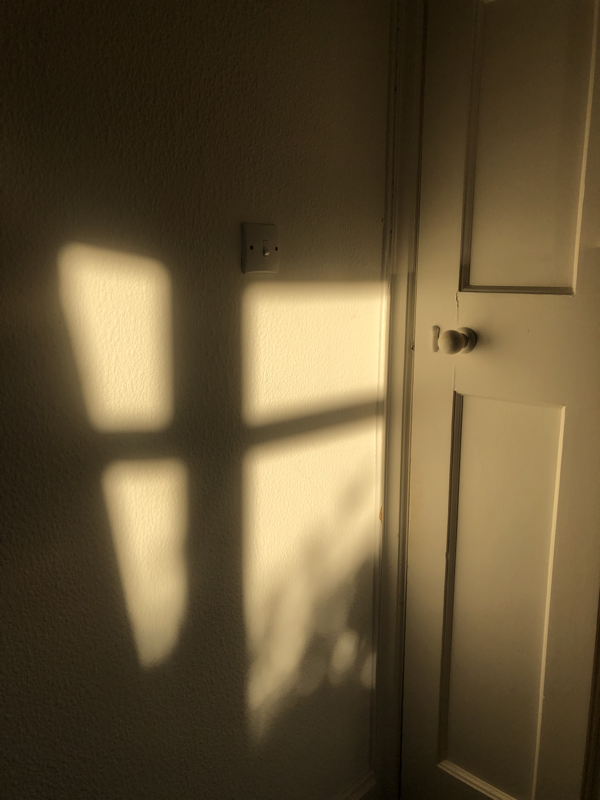
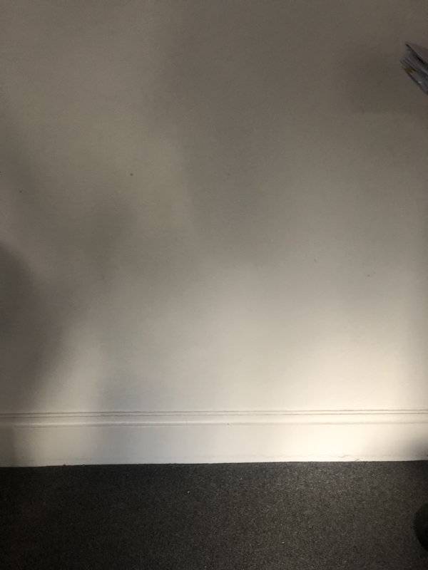
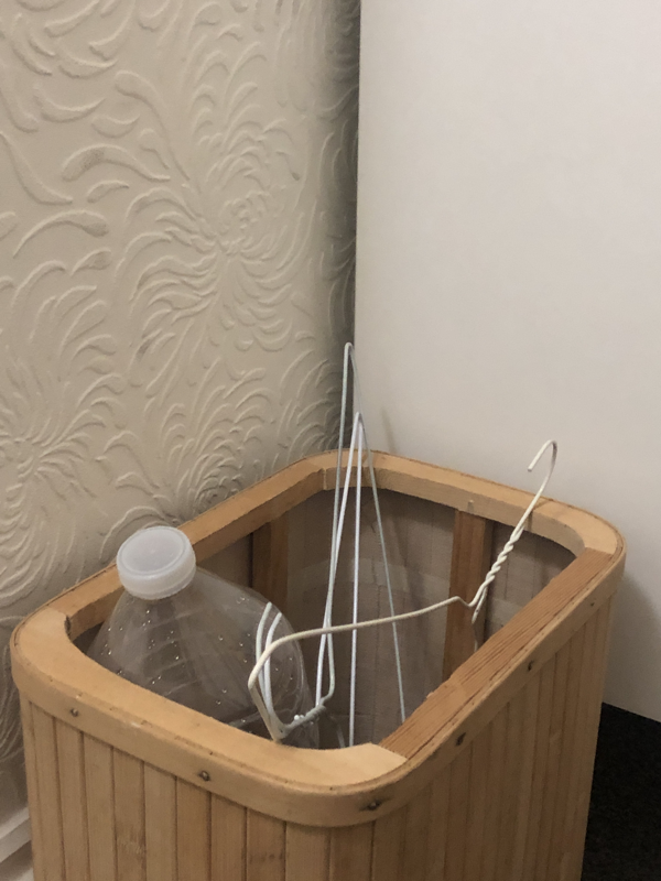
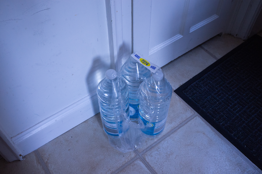

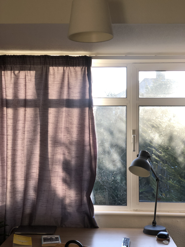
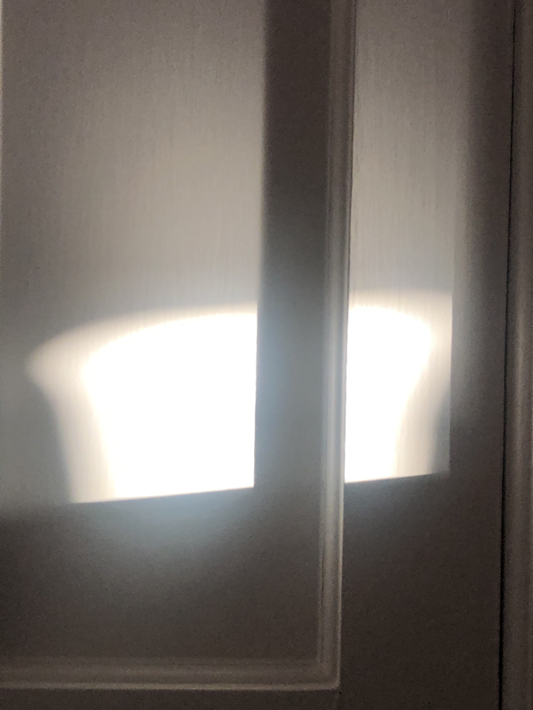
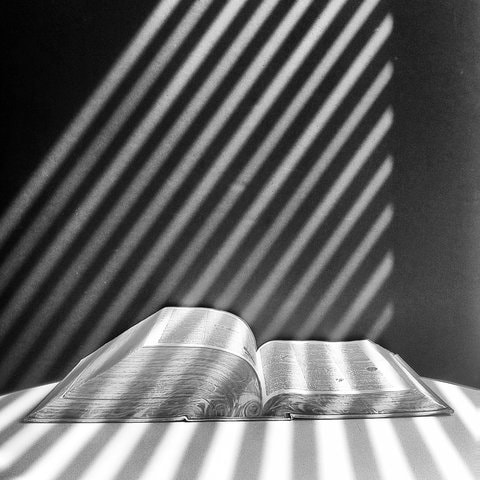
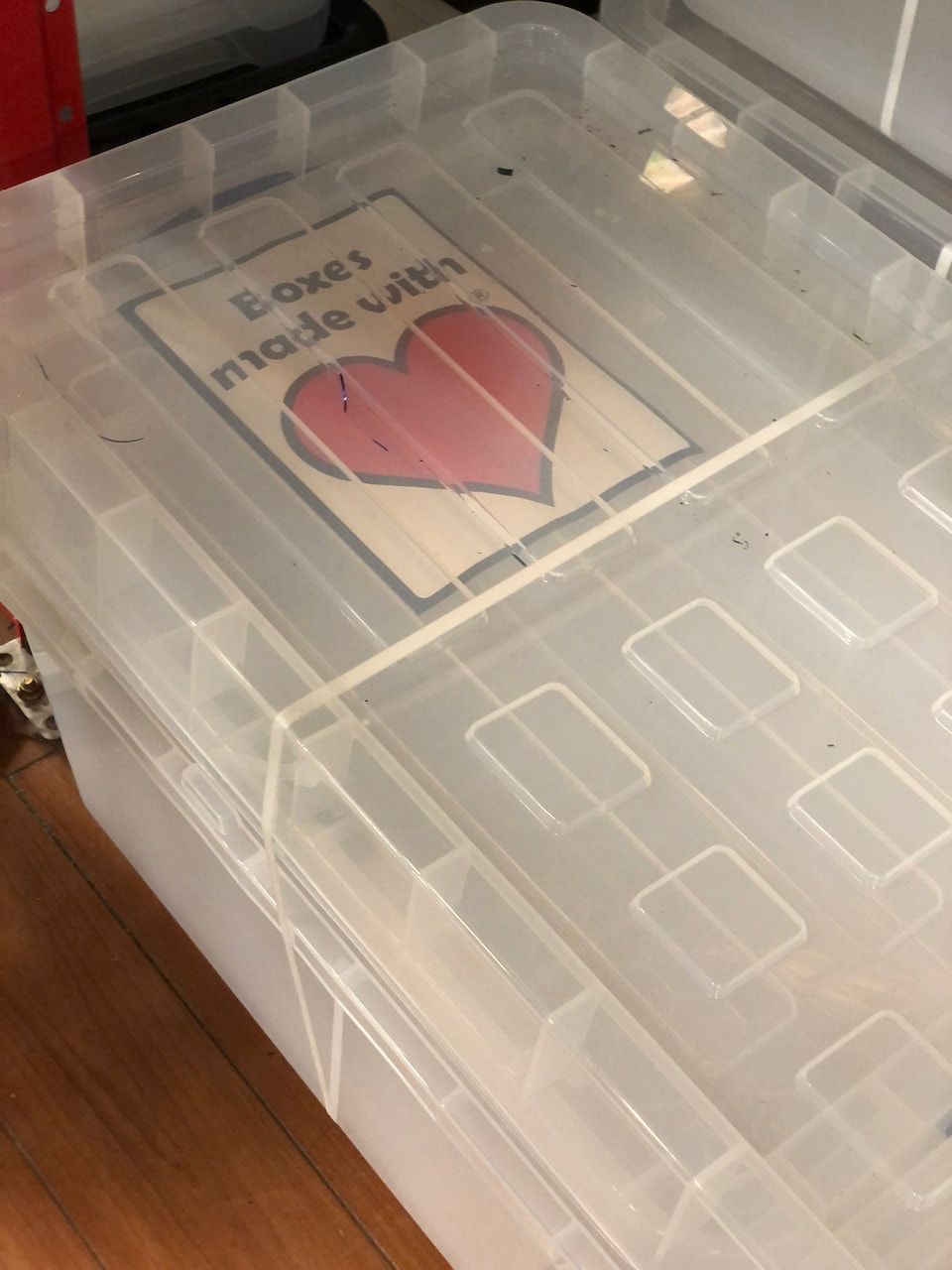
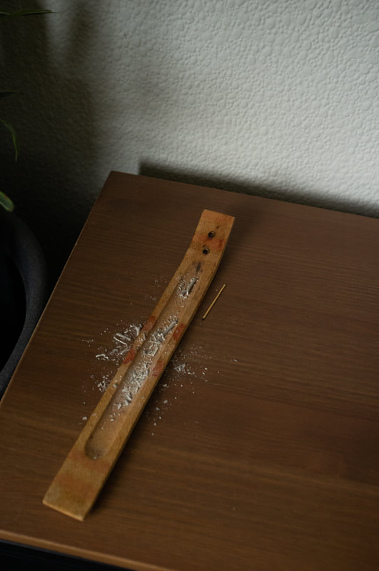
With this photoshoot, I wanted to focus on the my everyday inside the home, rather than going out and photographing whenever I am not inside. This photoshoot has allowed me to focus more on shadows, lines and shapes due to the fact that when I am photographing outside, these moments stand out more than inside my own home because I constantly see this normal objects and moments. Furthermore, photographing inside has allowed me to focus more on certain elements that I usually wouldn't, for example, shadows being the main subjects of the photo and not just a supplementary feature of the final image. When taking these photos I had kept Kathy Ryan in mind, she focused on shadows and lines in her book named Office Romance. In this she focused on the architecture of the New York Times office building, and how the architecture is imposed on the inside. I attempted to recreate this idea through projecting myself and my family through the photos, using the elements that Kathy Ryan had explored in her work.
Photoshoot


Photoshoot


Feedback and Crits
The process of the crits I found useful in gaining an outsider perspective of my work. The crits allowed me to understand this perspective as everyone would comment on each others work, allowing for different interpretations of it and advice in moving forward with each other's investigations. Personally, I found the feedback interesting as I got suggestions of trying to combine the personal everyday, which I explored for a short while, and my other focus of everyday moments outside of my house by using diptychs. I may explore this further but I feel as though taking photos inside is too much of a limitation. I feel this may be better suited in a video format as it can leave a fair bit more experimentation and creativity, whilst also exploring a different medium which I want to start focusing more on. Furthermore, I want to explore the style of filmmaking in La Jetée in that they’re still images coated with sounds. Also from watching some scenes from Toshio Matsumoto films where he explores diptichtial filmmaking. I feel as though I could merge La Jetée’s style of using stills and the diptychtial film making of Toshio Matsumoto could be an interesting combination.
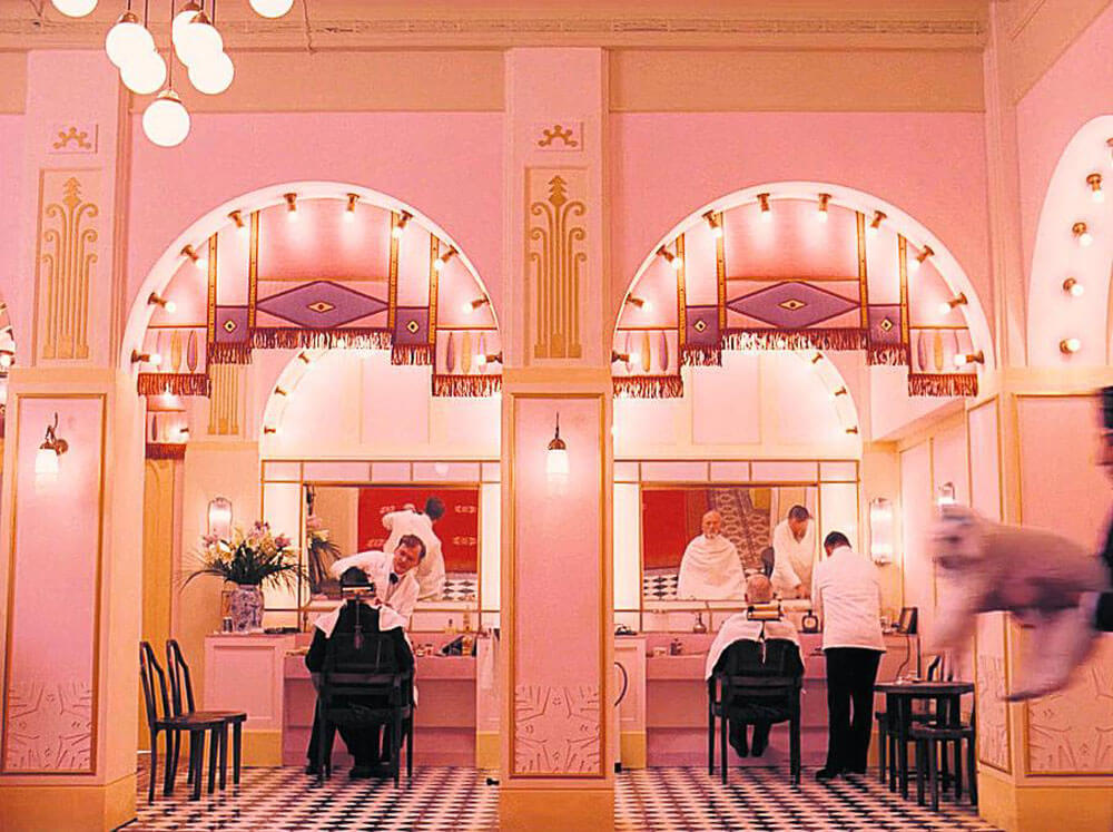
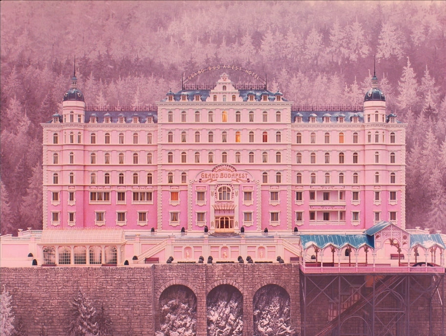
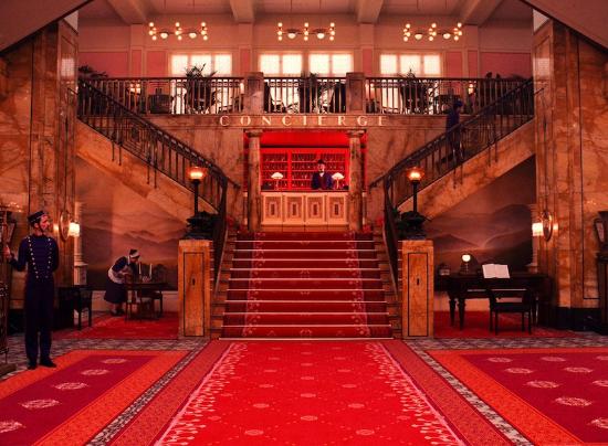
Planimetric Composition
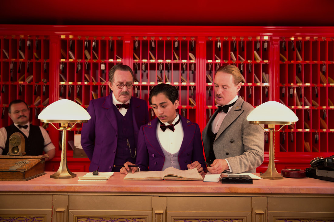
Planimetric composition, a term coined by David Bordwell (in this article), is a specific type of shot that is used predominantly within filmmaking. This shot hasn't been as widely recognised as in my opinion it should, the aesthetics of this technique are specific and leave a distinct imprint on the film when used. It consists of the camera being perpendicular with a surface, for example a wall, the actors also move perpendicular or in parallel with the surface in the background, which adds to the immersion of the technique. This style of filmmaking leaves the scene looking staged, and far from what is usually attempted within films, naturalism. Straying away from naturalism leads the viewers to feel as though everything in the scene is perfectly constructed by the director, for the director. A director who has become synonymous with this is Wes Anderson, more specifically in The Grand Budapest Hotel. Wes Anderson's implementation of the style allows the film to feel playful, however this is further accentuated by the use of colour, and story-like without feeling overly realistic, or realistic at all.
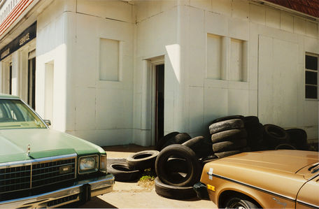
Even though this is a filmmaking technique, it has been used within photography. For example, Walker Evans, Stephen Shore and William Eggleston, have used planimetric composition, whether intentional or not. This adds to the photography of their respective eras, Walker Evan's 1930s portrayal of American life, Stephen Shore and William Eggleston with their interpretations of colourful 1970s America.
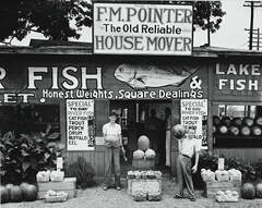
Walker Evans, Roadside Stand Near Birmingham, 1938
|
Stephen Shore, Meridian, Mississippi, June 1972
|
William Eggleston, Untitled
|
My own examples of planimetric composition:

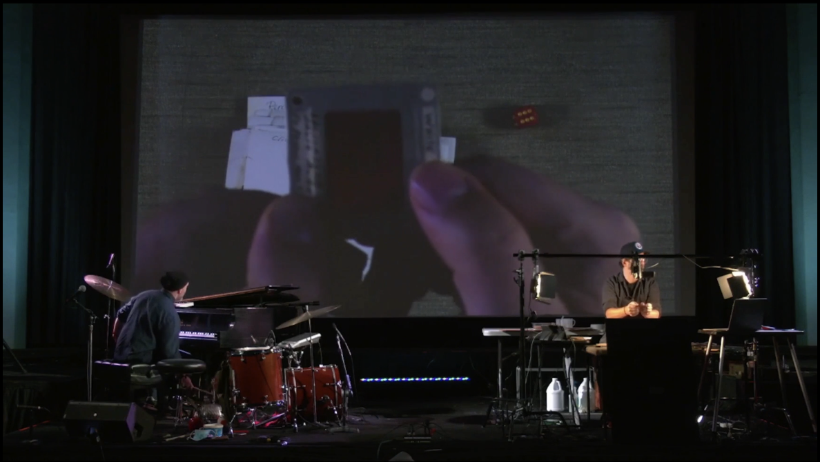
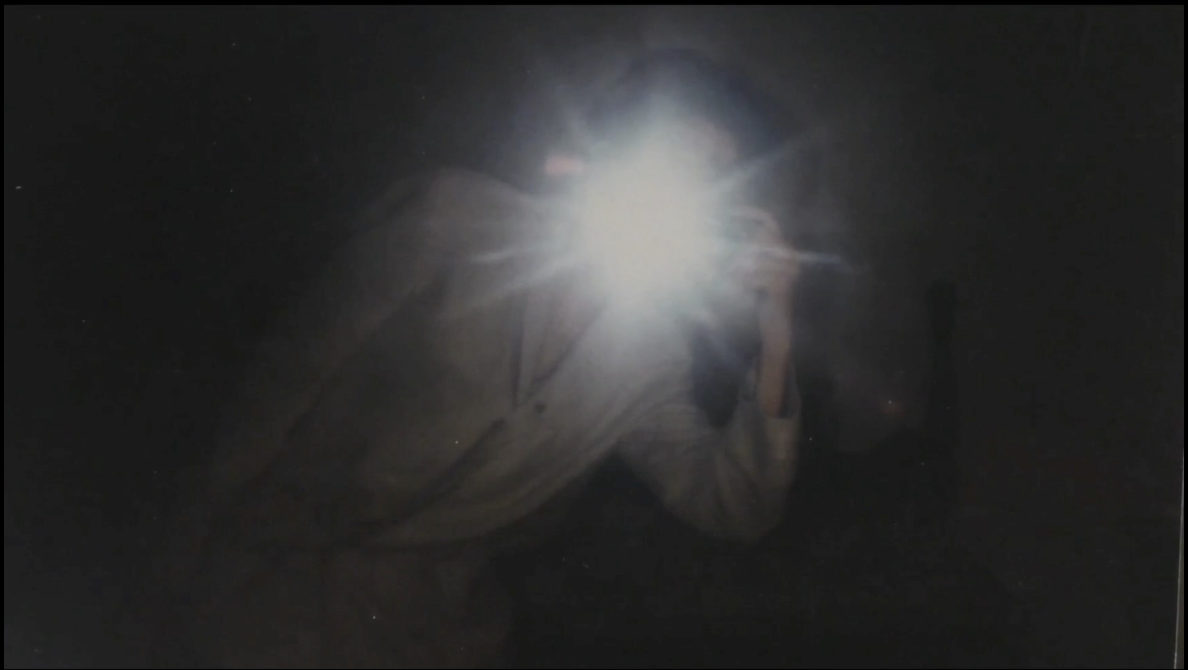
The Palms

Notes made on second viewing:
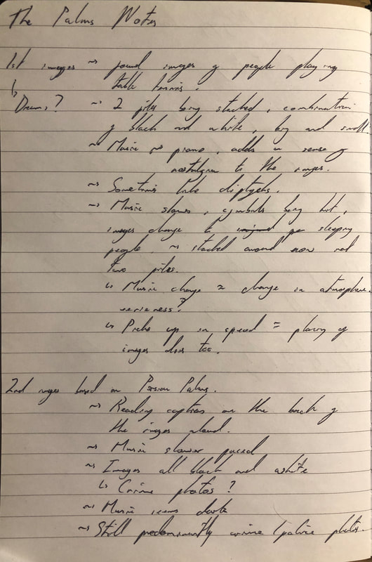

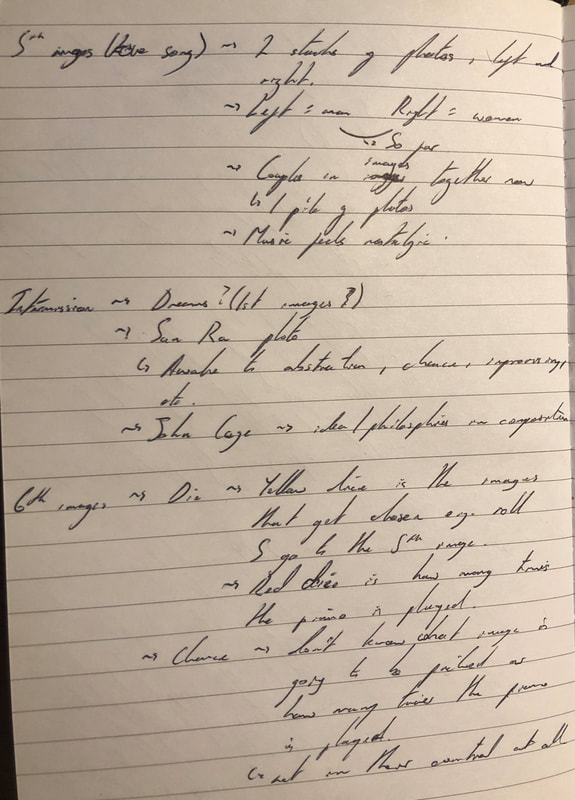
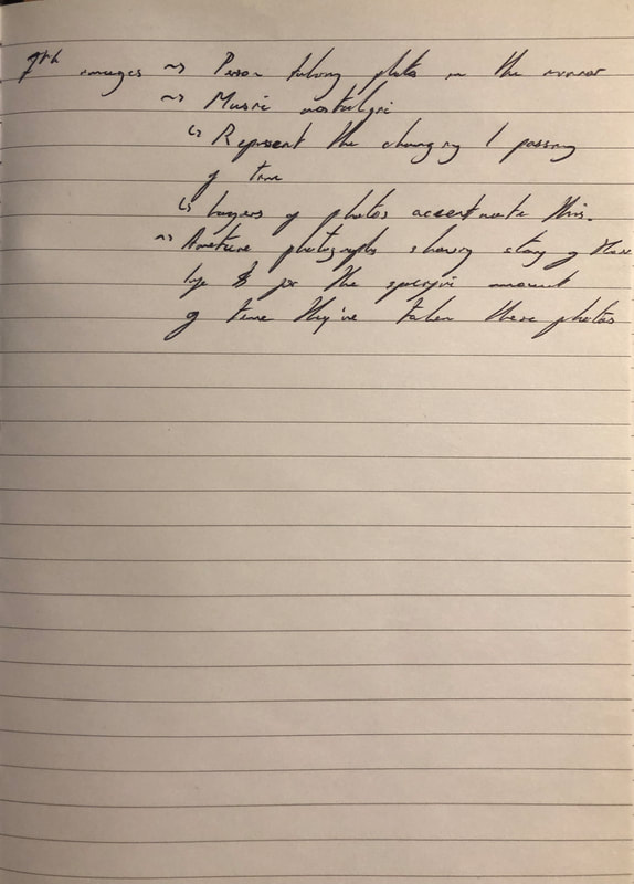
Throughout the performance there was a constant stacking of found images, done by Alec Soth, accompanied by live music performed by Dave King. The merge of art forms was interesting, as much of the time the music emphasised or even at times created an atmosphere which correlated to the images. For example, the last song was fairly nostalgic, the photos were all from one person, taken in front of a mirror, presumably over several weeks. The use of layering for this one had a distinct effect, it showed that the last day was gone and hidden by the next day/ moment the photo was taken. The music, therefore, added to the feeling of time passing. Furthermore, one of their songs incorporated chemicals with the photos which pulled the colours from the paper. This song could be interpreted to be a fading of memories, the music adding to this with it being eerie and slowly growing in both speed and use of instrumentation. This symbiosis of the music and images is most evident in the song dedicated to Sun Ra and John Cage. They use chance interestingly, using two dice, a yellow and red one, and whatever number is rolled the amount of images and times the piano is played is that number is carried out. For example, the yellow die corresponded to Alec Soth changing the images, therefore if he rolled a 2 he would skip 2 images. The red die corresponded with Dave King, so if he rolled a 6 he would play notes on the piano 6 times. Also, I found the use of amateur photography interesting, as at least for me, I could find connections from my life to some photos, however, they also present an interesting side of photography. This specific side of photography forgets about the formal elements and chooses to focus on the memory and save it on a piece of photo paper.
Photoshoot

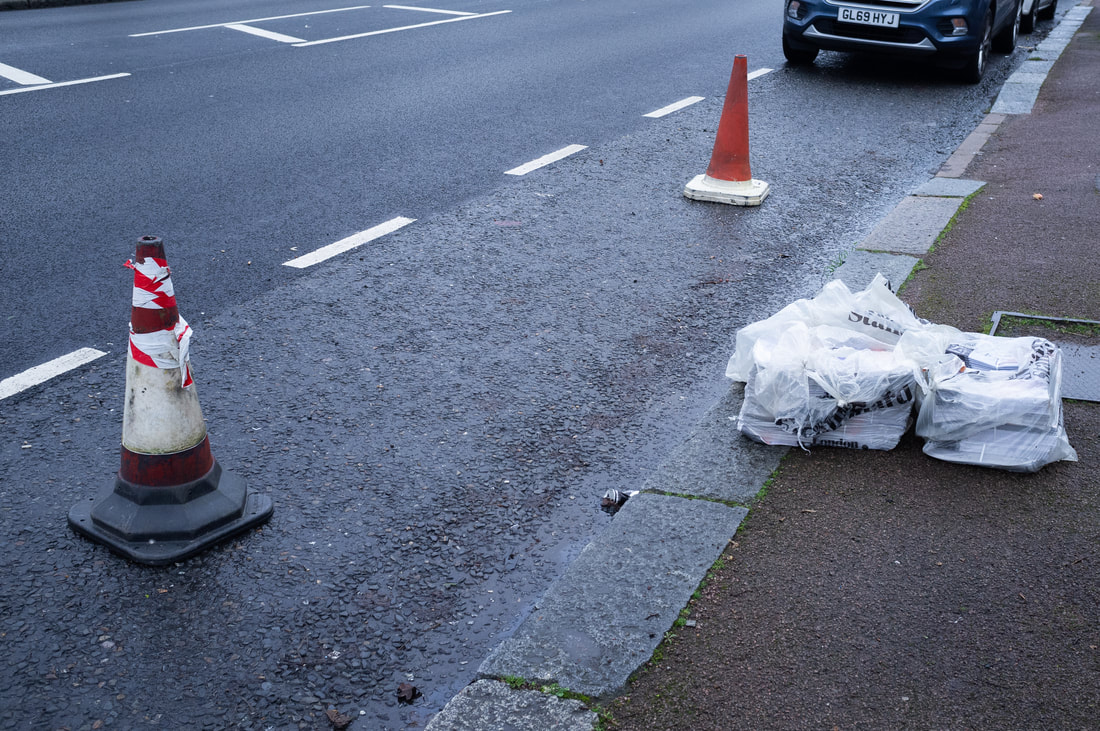
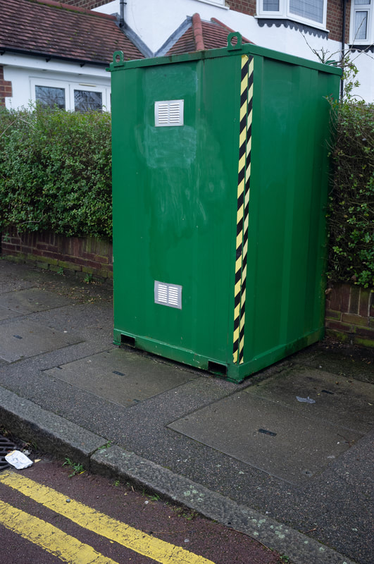
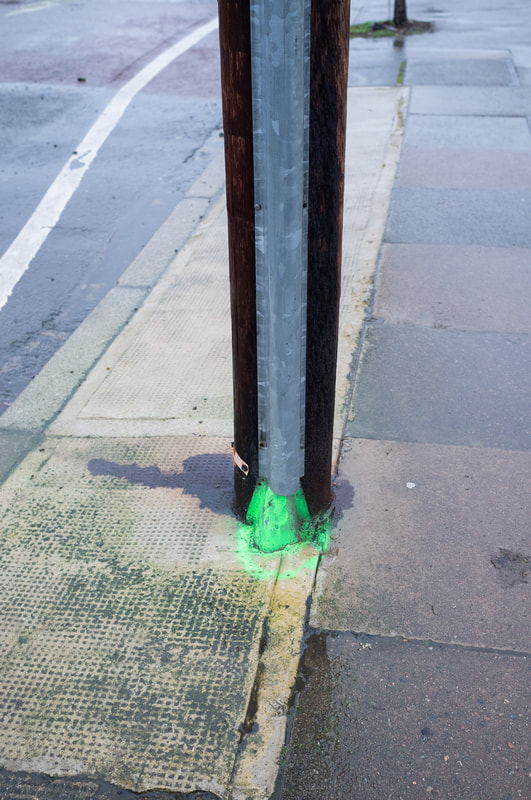
Diptychs
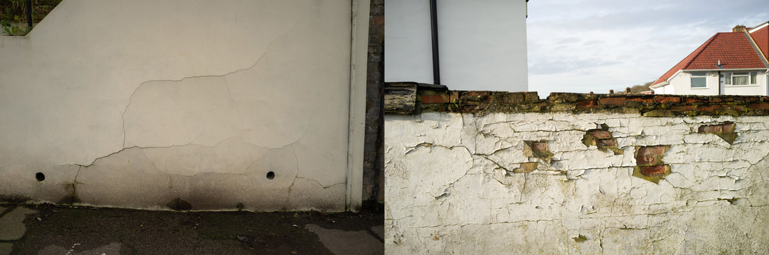
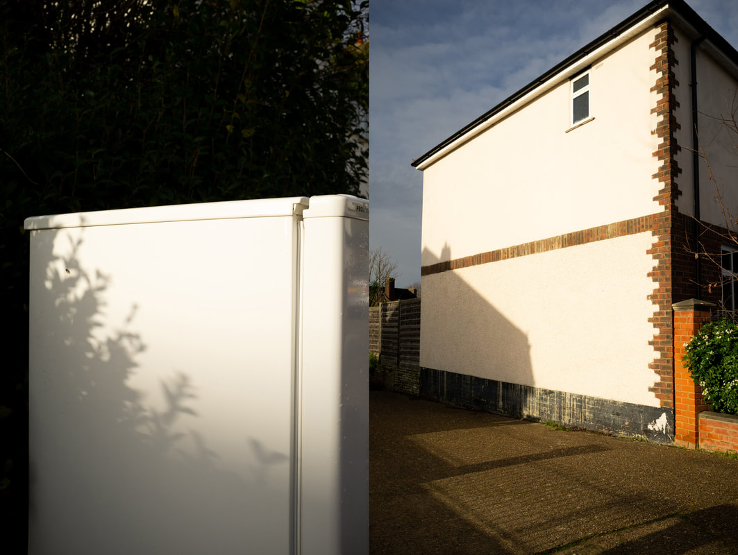
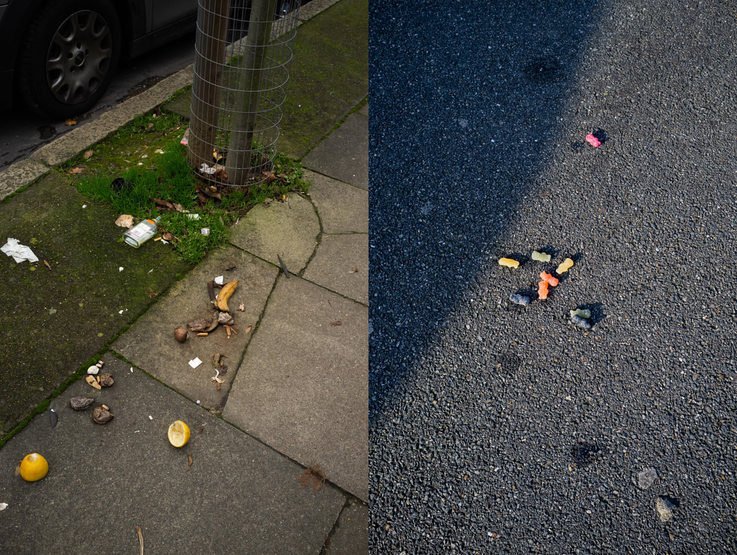


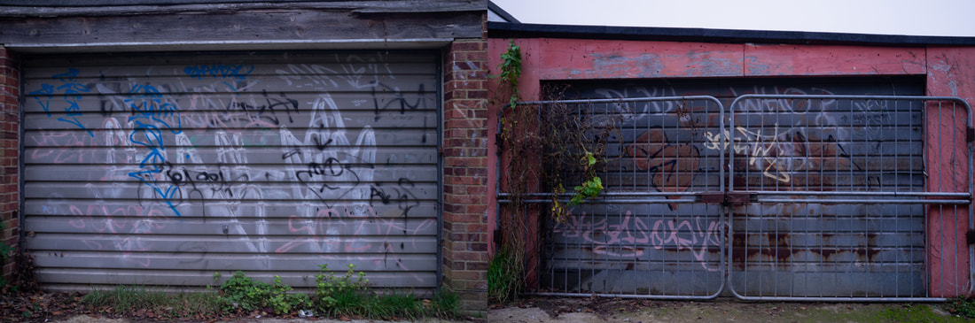
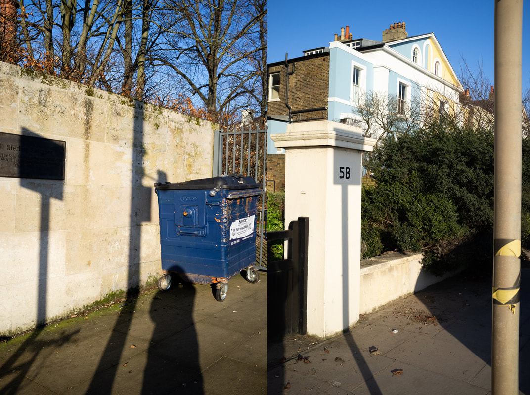
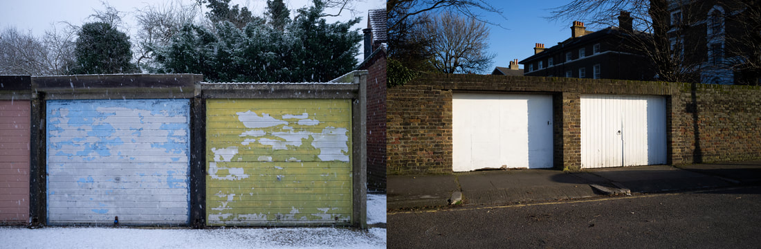
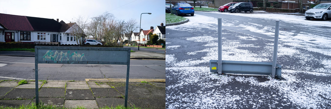
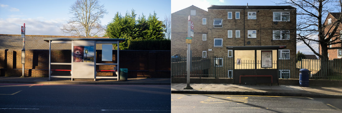
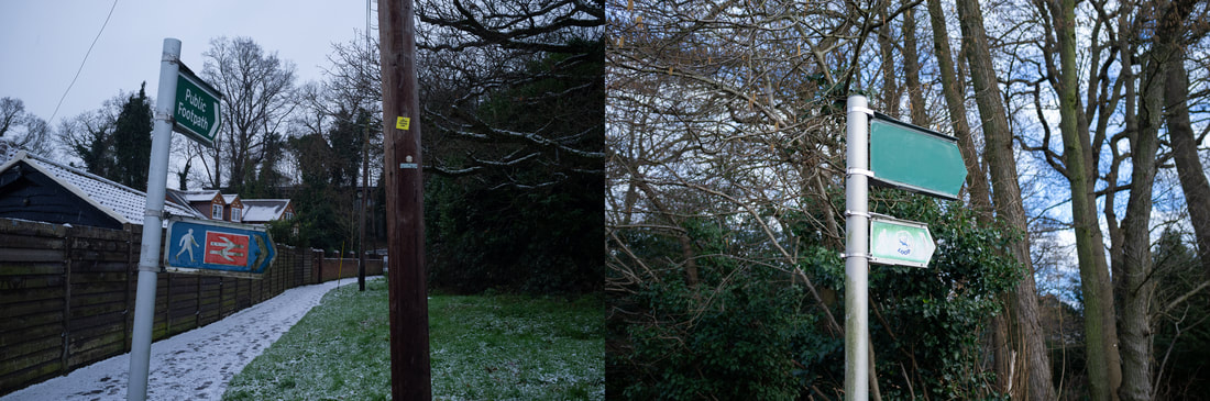
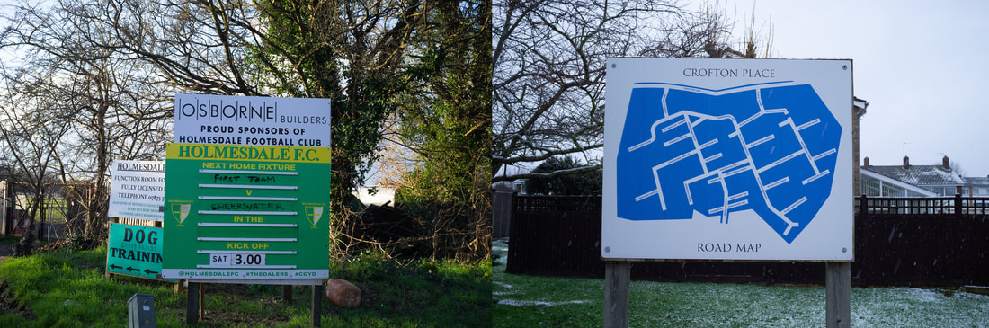
I had taken the idea from the feedback from my work to use diptychs. However, instead of using it to combine the home everyday and the outdoor everyday, I wanted to use diptychs to accentuate the formal elements in these photos. This combination I think was fairly successful in that the commonalities between the photos become very apparent.
More video experimentation
Still image (first draft):
After watching La Jetee I wanted to attempt a still image video. My other videos from earlier seemed like they were still images due to the minimal movement in them, so it seemed a natural progression from what I was experimenting with before. However, I don't think that the final outcome had been too successful, this is due to the fact that it becomes harder to stay attentive after a while due to them being still images. In La Jetee this is overcome by the images moving, so I might try this in my second draft. Furthermore, I found it hard to pair audio with the video. I also found some inspiration from The Palms performance, in the mixing of audio and images and attempting to create a certain feeling through it.
Still image/ diptych (second draft) - Laura El Tantawy response:
Laura El Tantawy's use of photos, video, sound and music in her video In the Shadows of the Pyramids is an intriguing and mind provoking way of exploring multiple mediums of art. Within this specific video, she had photos from her project which is centered around her endeavoring on a journey back to Egypt due to one of her family members had past away. During this time, she felt as though he had to escape the family event, in escaping she went to the streets to take photos. This led her to focus more on the state of Egypt during the 2010s, and how it has changed since she had left for America. The video captures this sense of escape, and family matters, through the use of street sounds and music which is used to add another layer of chaos to the the blurry and close up photos of people on the streets. Furthermore, her use of commentary adds to the narrative that underpins her project, by describing her feelings and what she was seeing whilst there. The still images is also very interesting, as notionally a short film/ video would use moving image to convey the themes she was exploring. Even though they were still images, the movement of the street scenes could be felt due to the sensory immersion of the sound.
With Laura El Tantawy's video in mind and my first draft of a still image video, I wanted to capture the sense of ambience that she had used. Therefore, I stuck with using the vinyl sound to add a sense of depth to the already atmospheric ambient music that had accompanied the video. I doing so, it added a layer of repetitive-ness to the changing of the images. In addition to this, the vinyl sounds had also gave the feeling as though you could hear your own heartbeat whilst walking through these scenes. The music itself I feel coupled the sound too as the music (How to disappear completely- Seraphim) was part of an album to help people with insomnia to sleep, therefore, it is meant to be relaxing and in the background to some extent. The images themselves are a combination of old and new images, doing this made me search for elements of the images that link together. To improve this video I feel as though making it fade in and out would be less harsh, as the mood of it is fairly calm and relaxing (I have done this in my third draft- here). Furthermore, I want to make a longer version of this, in combination with the diptych video, by this I mean having some moments being purely photos, some two videos next to each other and a combination of both at times. However, I would need to find out how to keep it engaging for the whole video, I could do this through incorporating sound, different types of music and the use of moving image.
Photoshoot
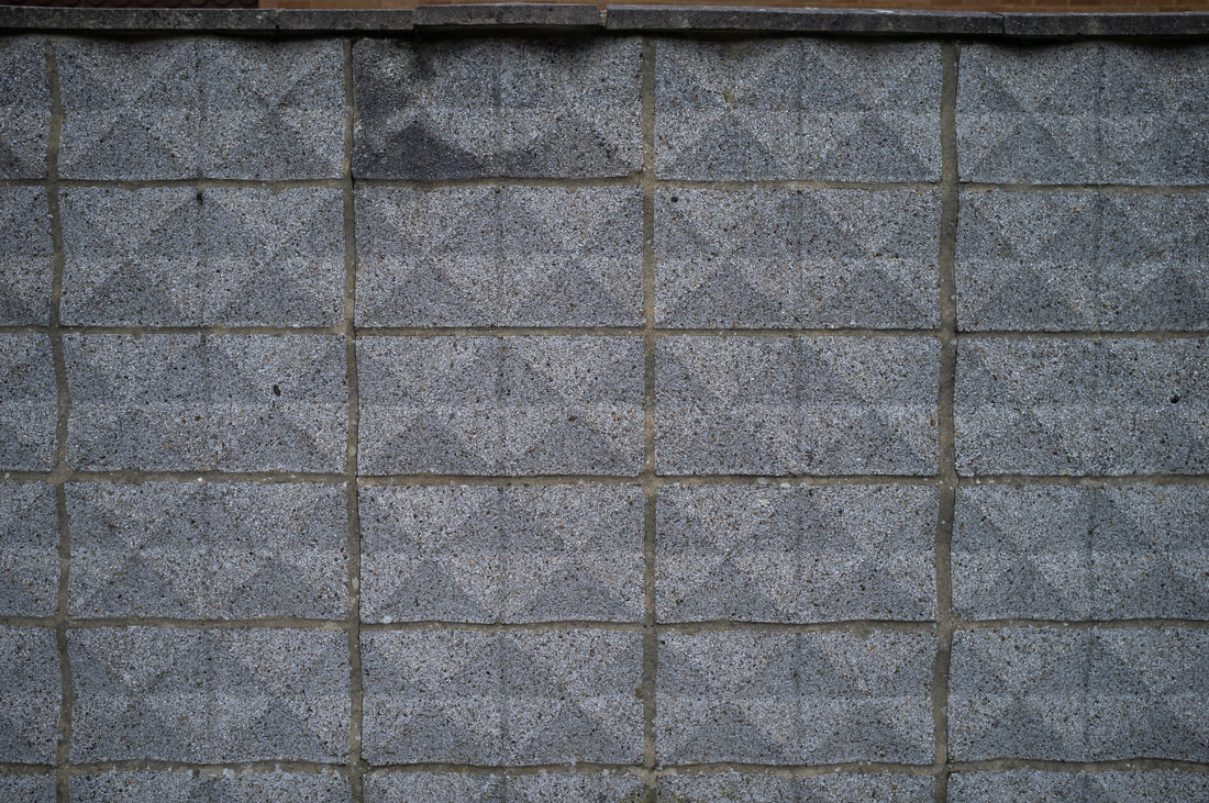
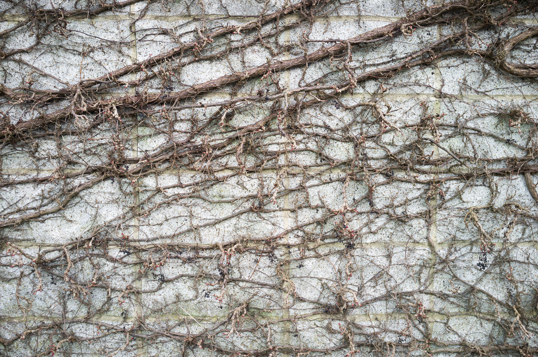
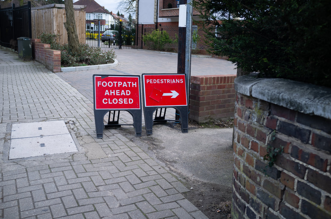
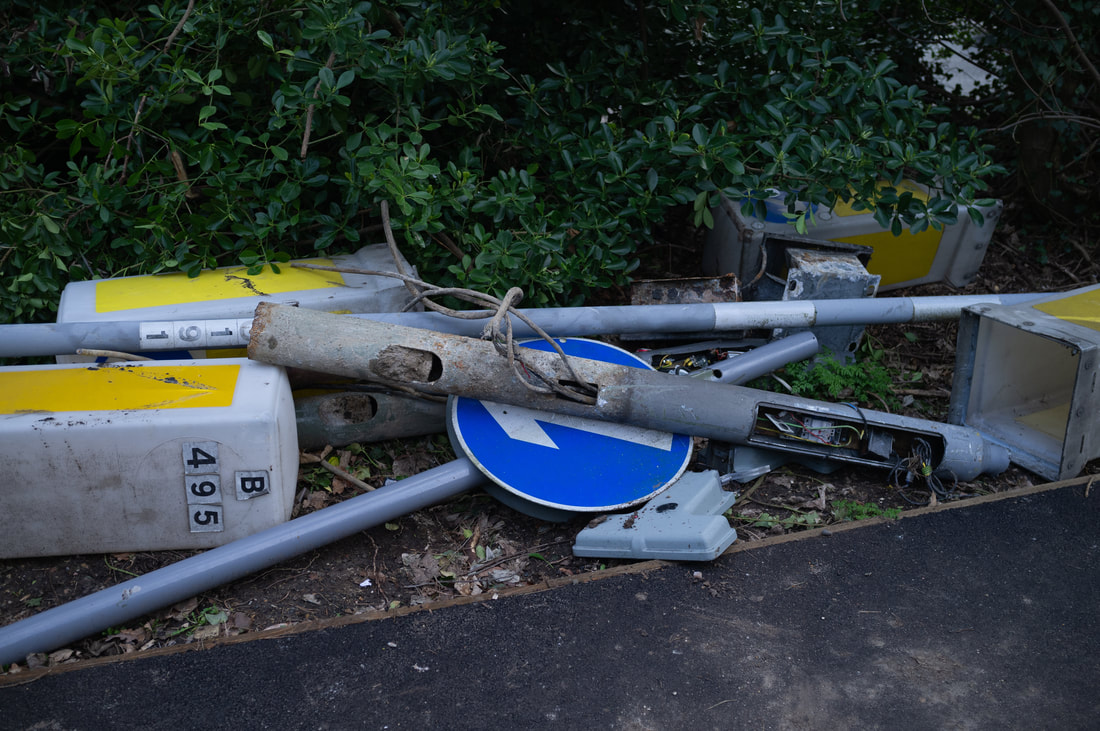
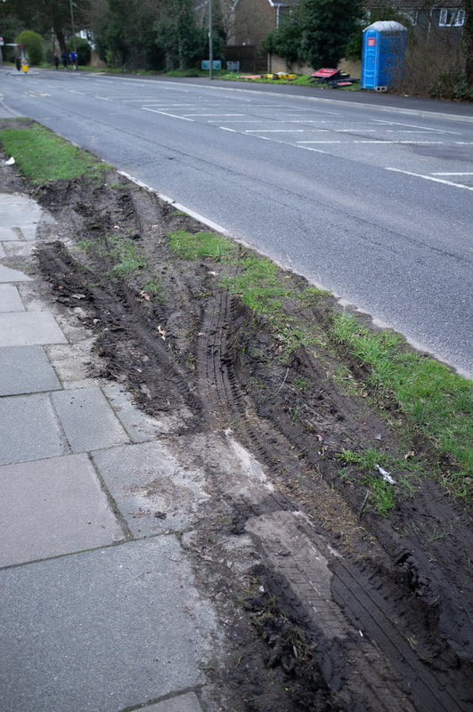

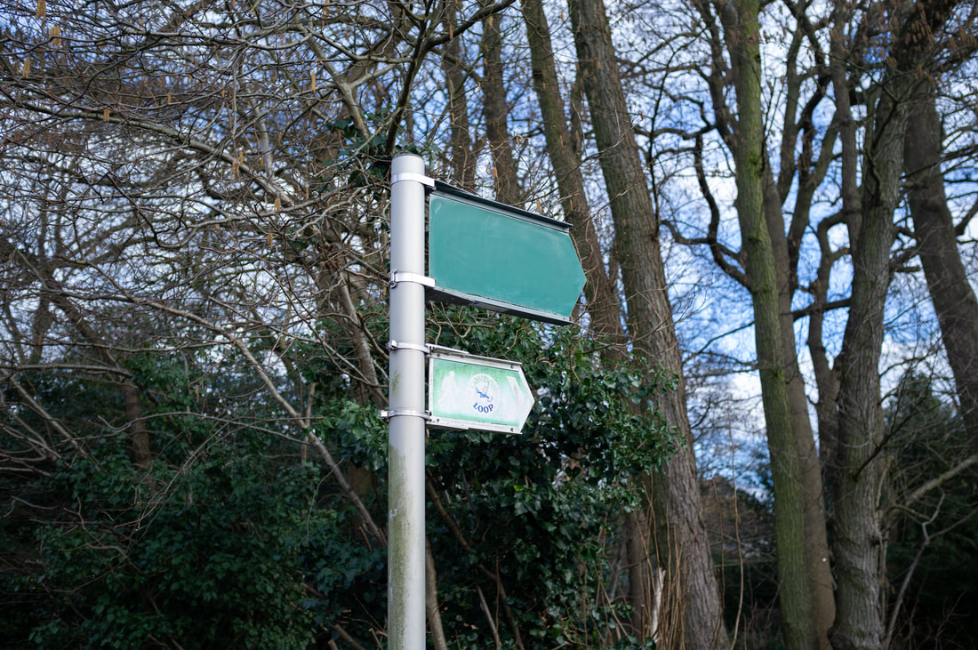

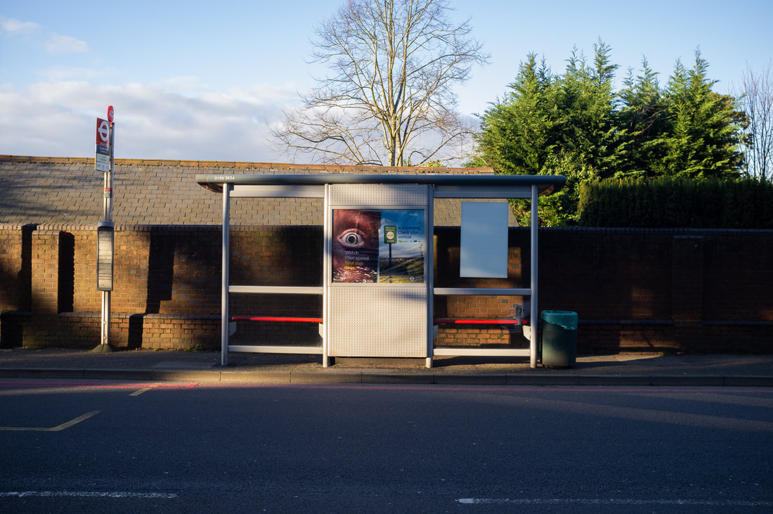
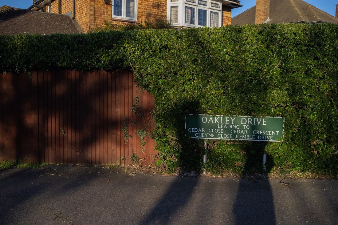
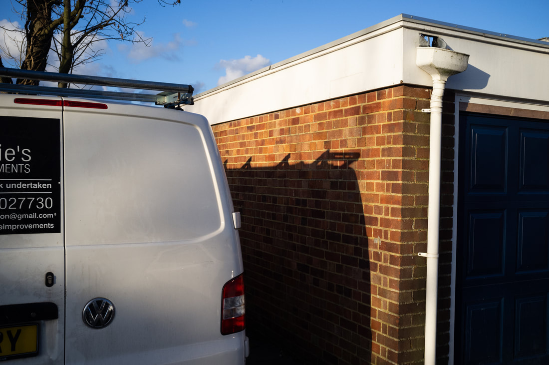
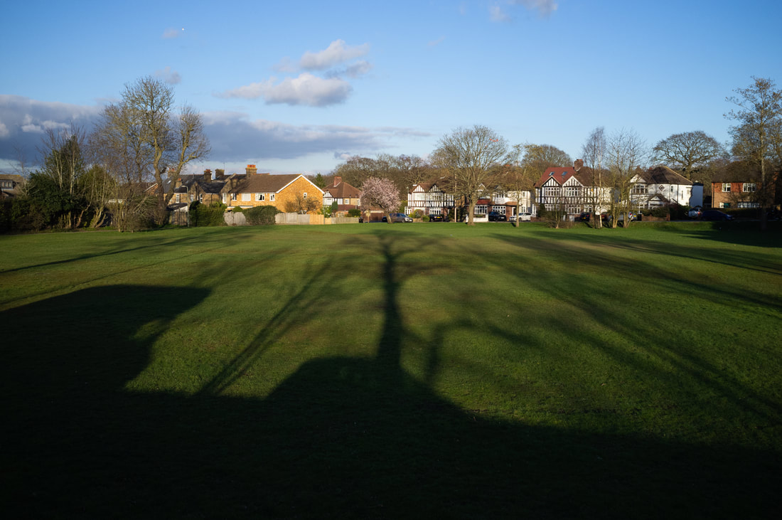
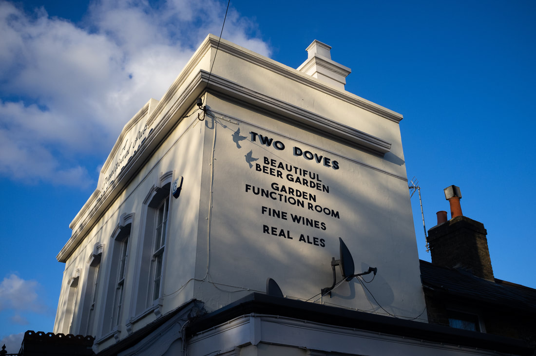
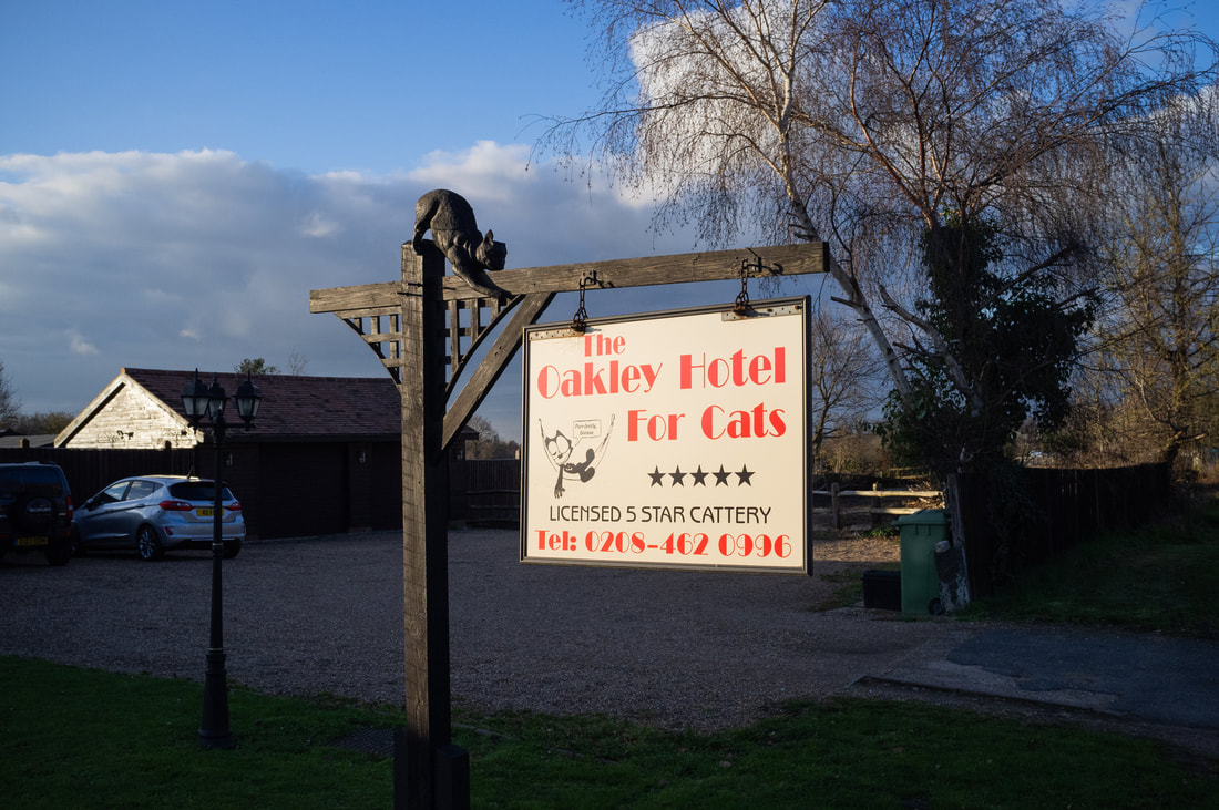
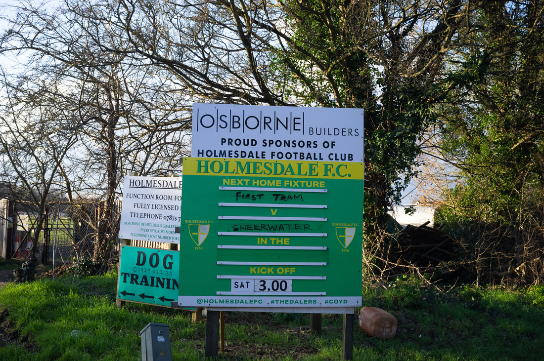
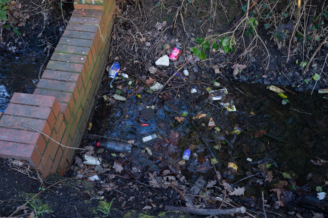
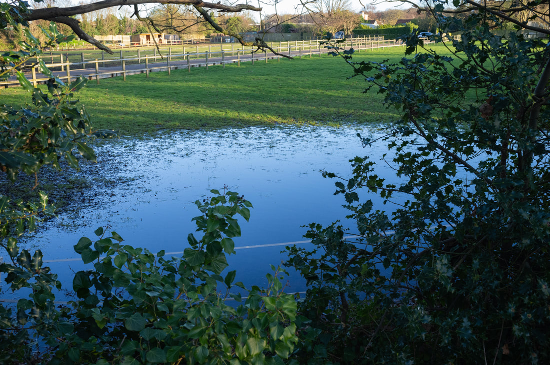
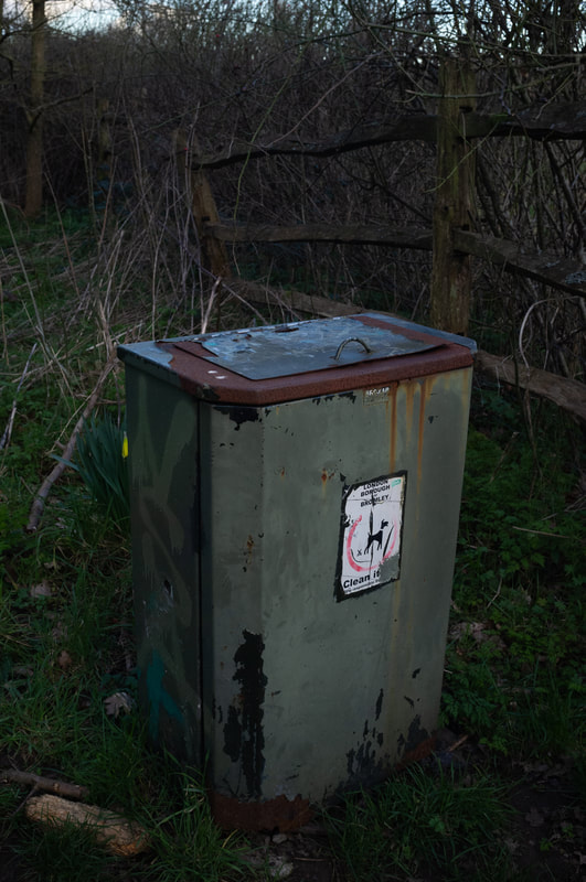
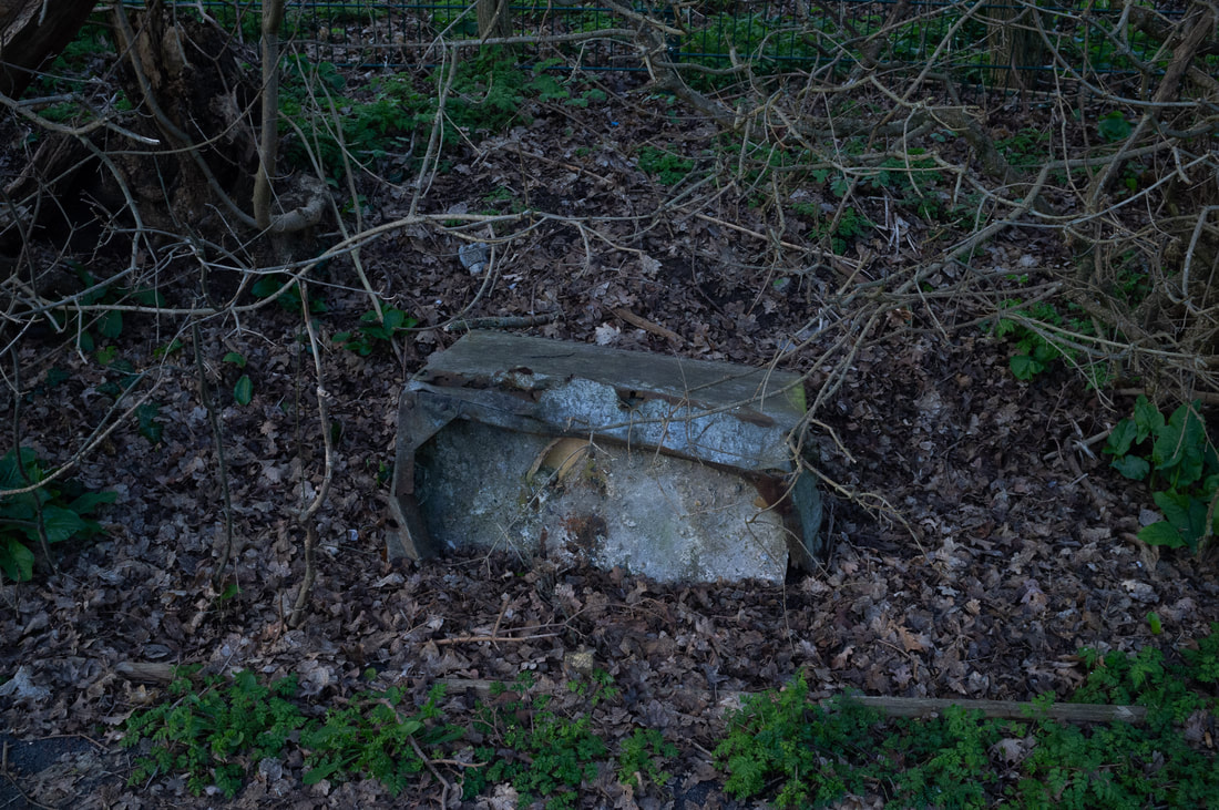
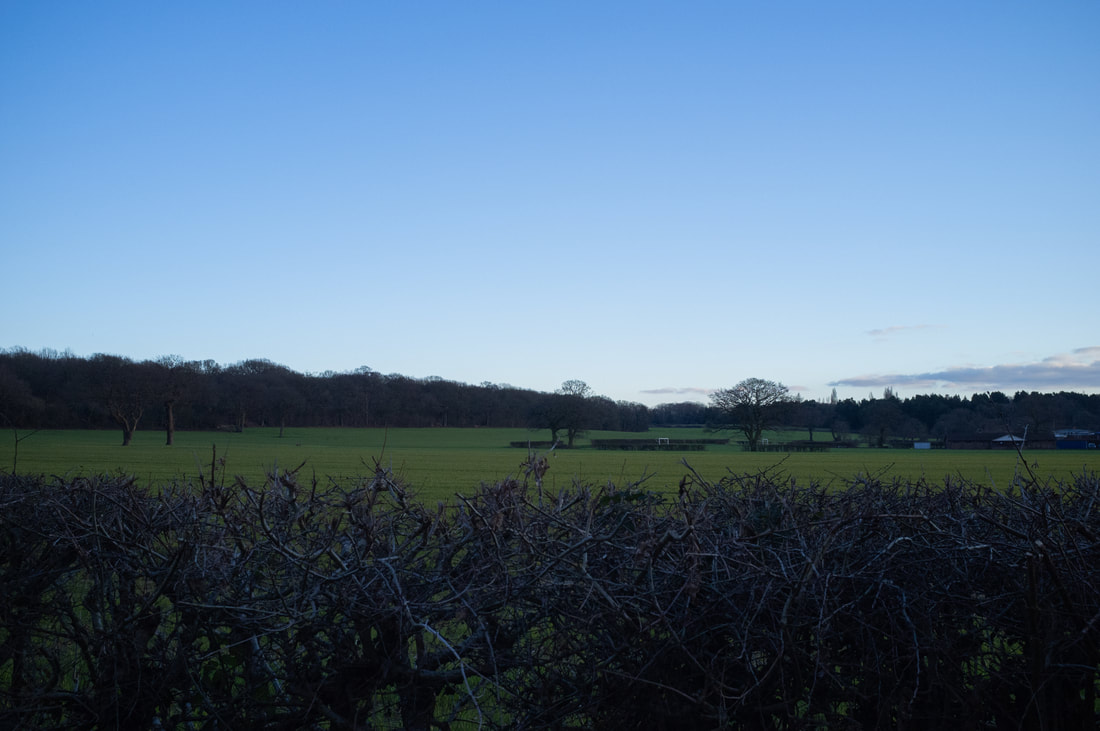
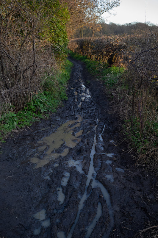
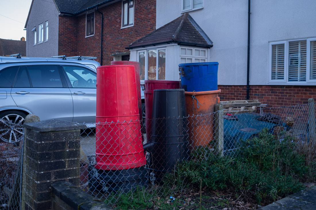
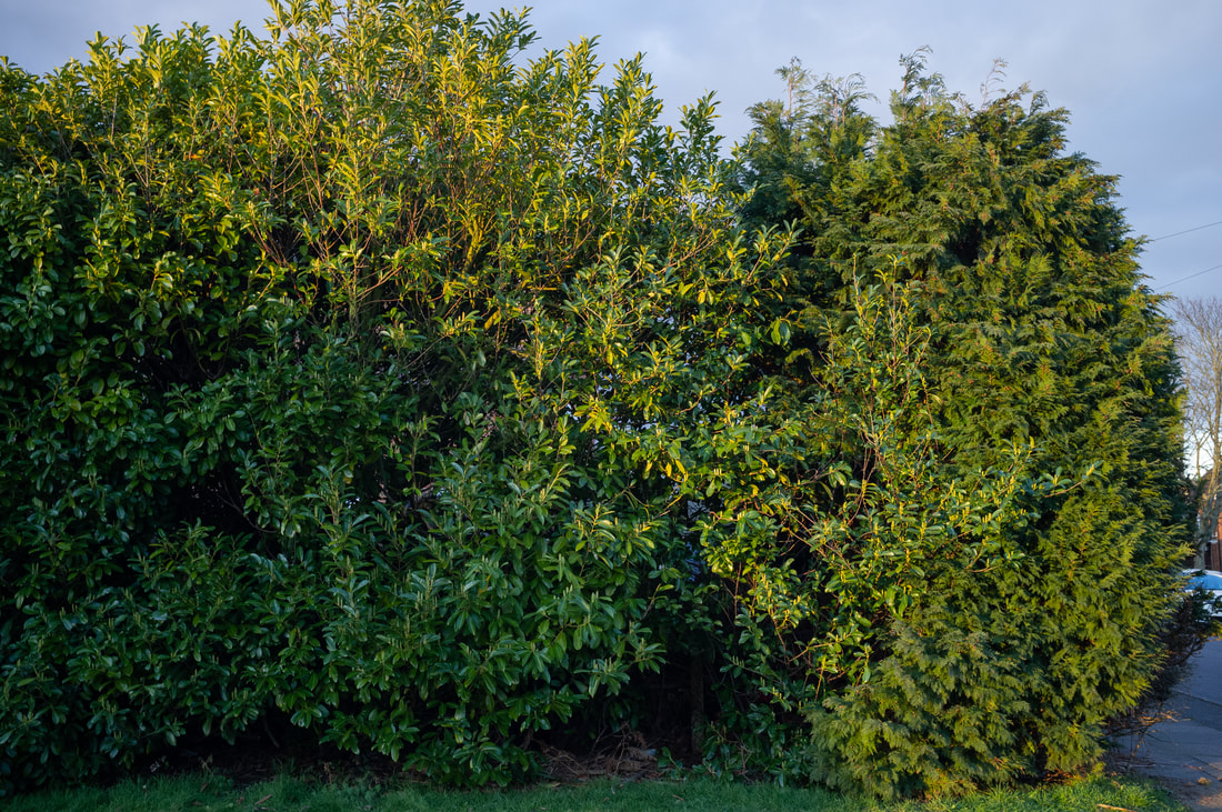
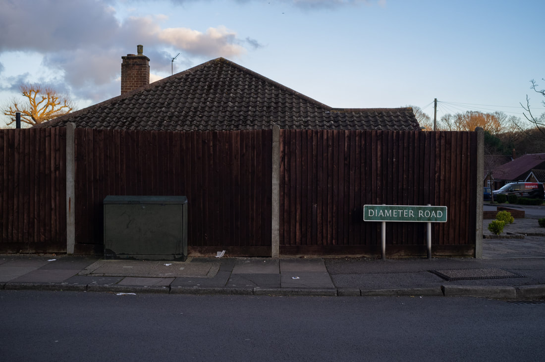
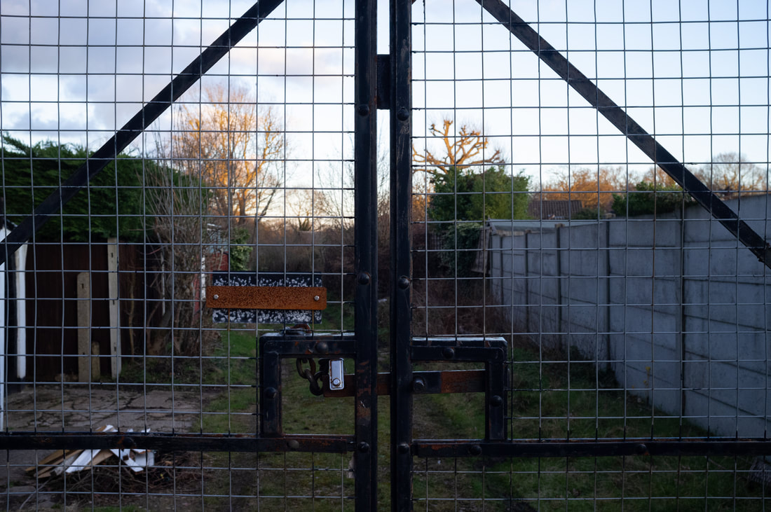

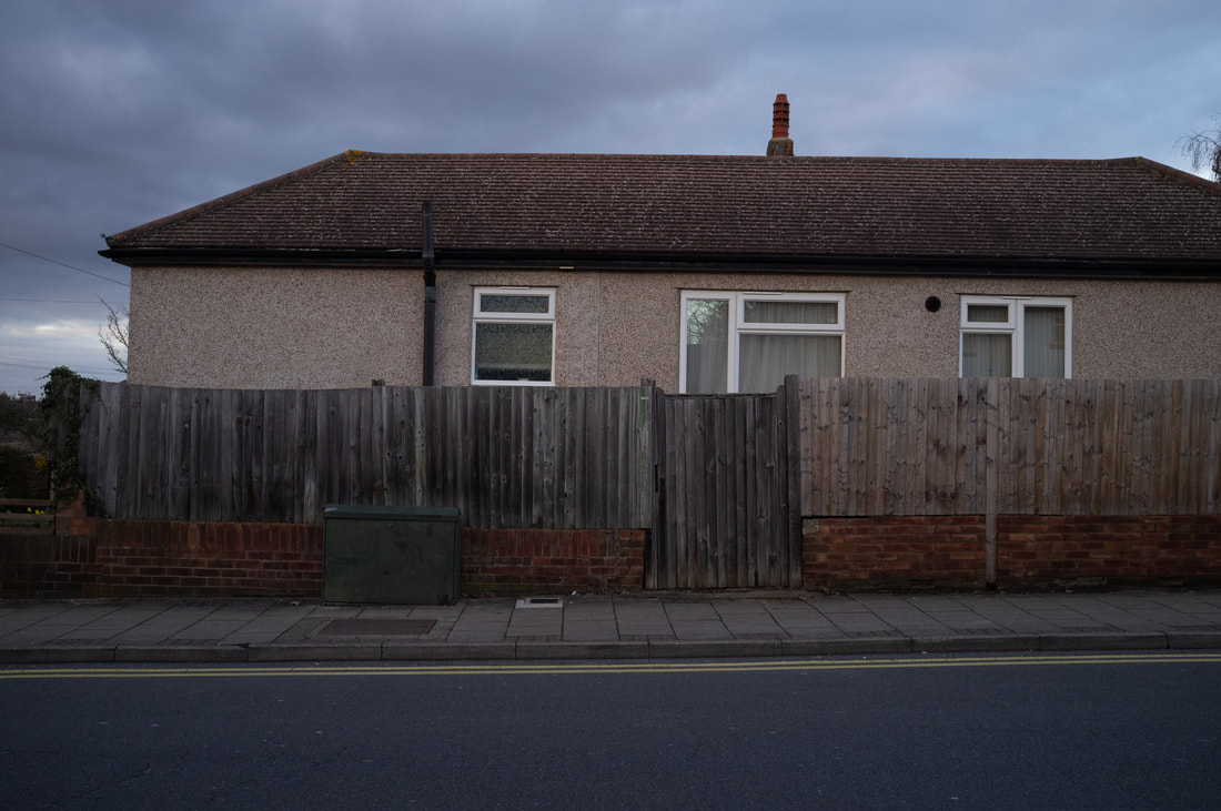
For My Crushed Right Eye
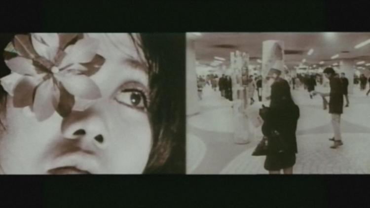
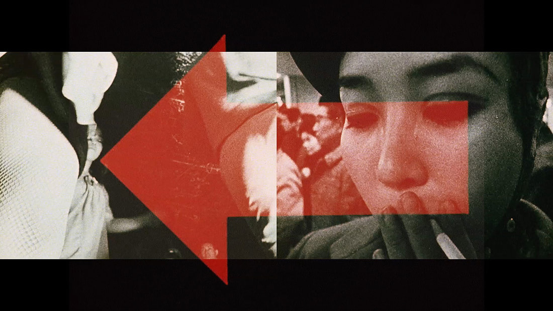
For My Crushed Right Eye is an experimental short film made by Toshio Matsumoto in 1968. The short film consists of multiple, what could be considered, distressing imagery, with police beating people on the streets, disfigured babies and motor racing crashes, accompanied by street scenes and videos of drag queens. These images are displayed in 3 projections, a diptych and a third projection that flashes these distressing images quickly in the middle of the screen. Furthermore, he uses speeches from political leaders of the past, radio and Western music to add to the chaotic, sensory overload that is bombarded onto the viewer. What I took from watching the short film is the interesting filmmaking techniques used to portray an interesting message that is completely left for the viewer to make. In addition to this, the use of sound is intriguing as much of the time the sound in corresponding with the side of the diptych that is being played. Therefore, I want to explore this aspect of the film, using sound and moving image in two halves, however, to combine still image with it too. Using a combination of both can cement my idea of exploring formal elements within photographs whilst taking photos of everyday moments, in diptychs this becomes more evident as the viewer would be searching for similarities and differences between them.
Diptych video (first draft):
Like my first still image video experiment, I wanted to incorporate some form of still image into the video and I feel using it in a diptych makes it more interesting. After watching some scenes from Japanese new-wave cinema, for example Toshio Matsumoto's short film For My Crushed Right Eye, that used some interesting compositions, and in the case of this specific auteur, diptychs. I feel as though using this format adds a level of intrigue and abrasiveness in terms of the diptych being still and moving image. To carry this on I may either have the diptych being strictly video or a triptych and have the middle image being still and the left and right ones being moving image. Furthermore, I feel the sound, a vinyl crackle, adds to this video better than the other. This is due to it sounding fairly similar to the ambience of a car. Also like my last experiment I took some inspiration from The Palms in using different mediums of art, in this case music/ sound, moving image and still image.
Diptych video (second draft)
In my second draft I wanted to make the video and photo relationship more fluid, by this I mean that when watching the first video the viewer is more inclined to watch the one side that is just video. To combat this problem I kept changing which side the video and photo was on, furthermore, I added more combinations like video and video, or, photo and photo. This creates a different sense of pacing, as I also included the sounds of the car during the videos, so when it was a photo and photo there wouldn't be a layer of sound that was previously there. In my next draft I would like to take new videos and photos to use, whilst exploring the formal elements more. As with these two drafts, they feel more as a practice for a bigger piece that can work with my overall theme of the everyday and using the formal elements within photography to accentuate the banal moments.
Photoshoot

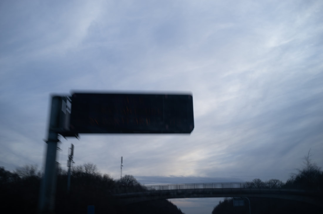
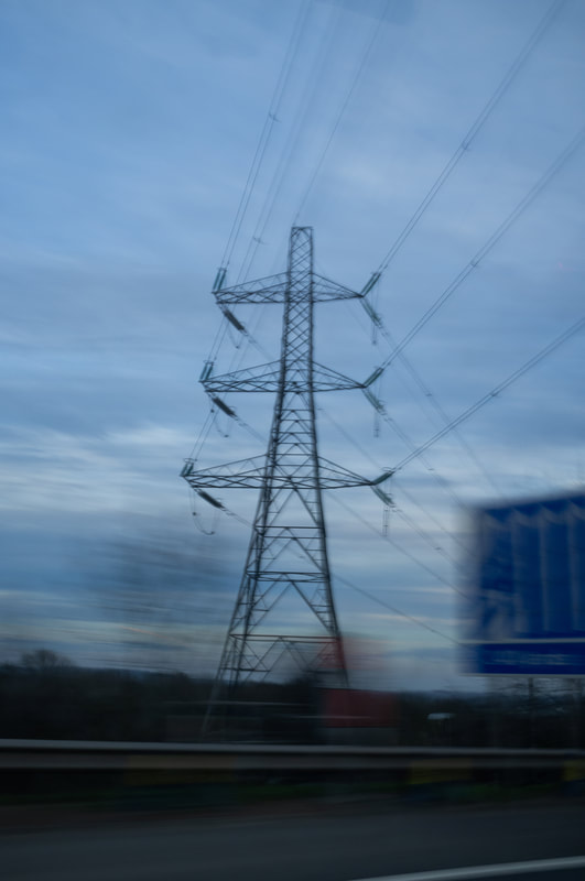

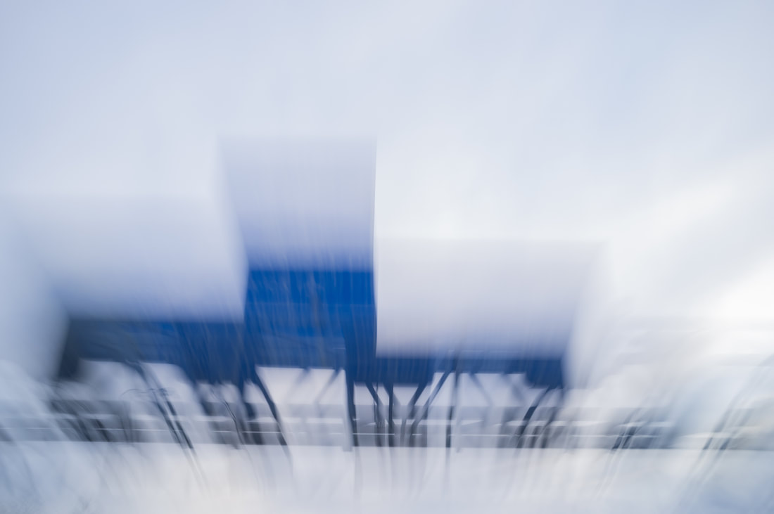


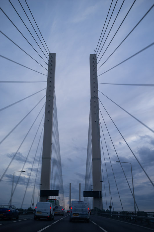
Photoshoot
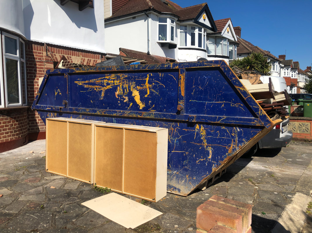

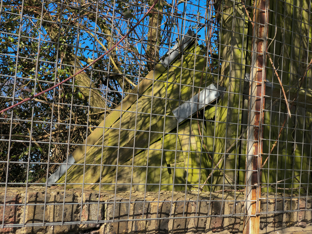
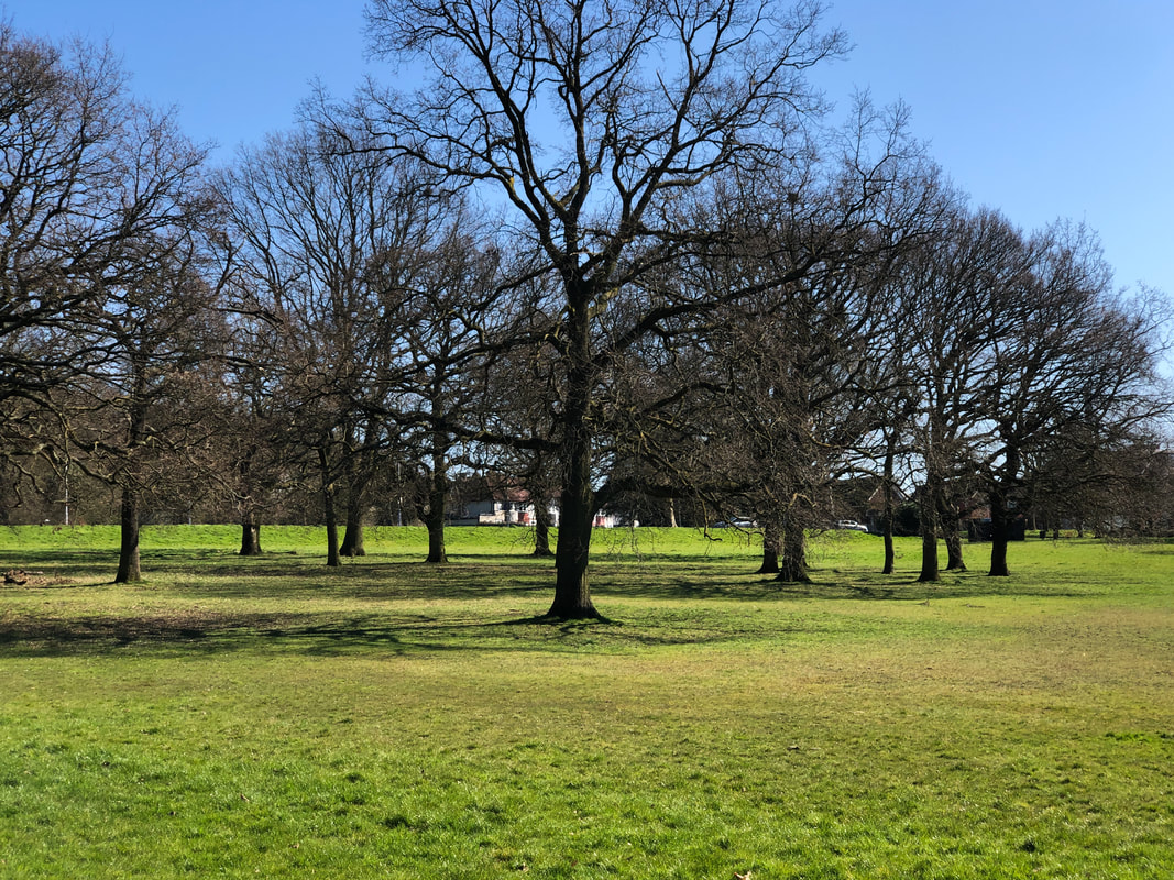

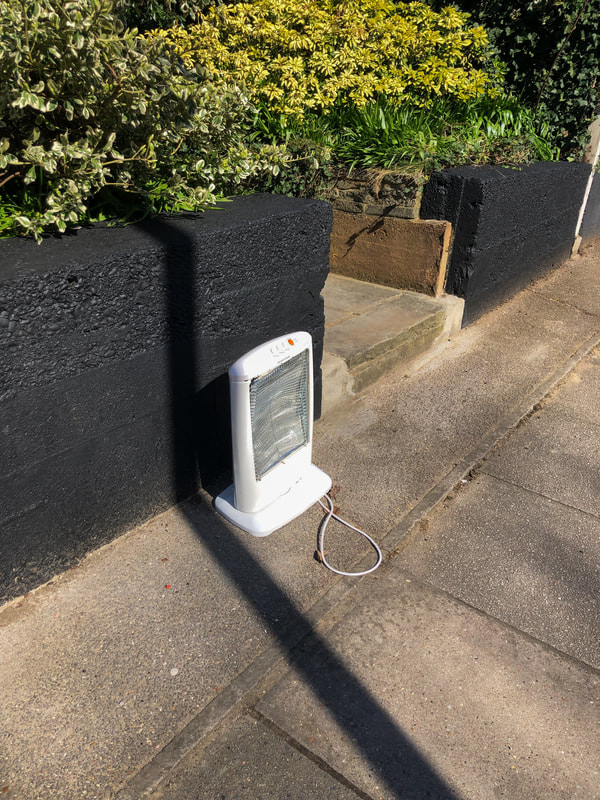
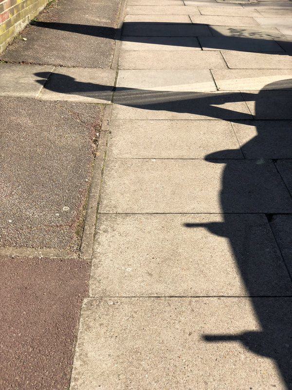

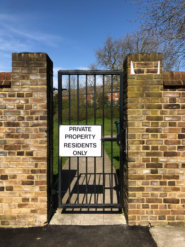

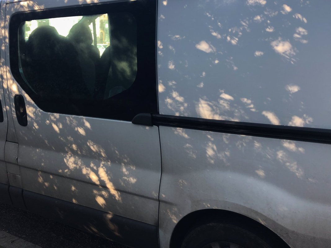
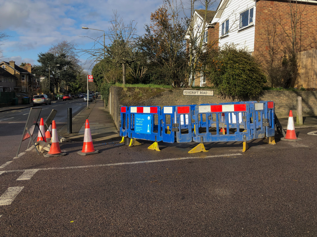
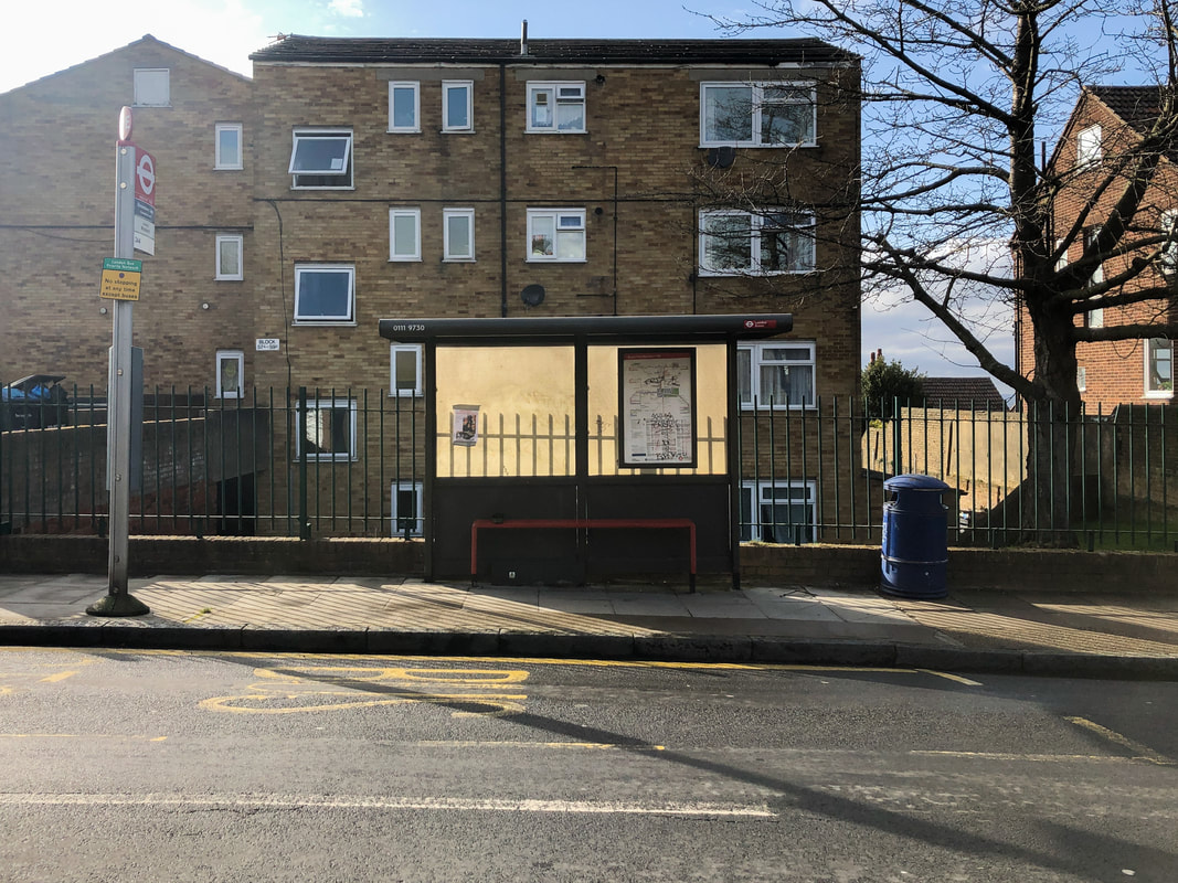
Final Piece
This final piece can be seen as a continuation from my last video experiments. In this I had made the decision to combine the photography I am more comfortable with, photos of ordinary moments, with videos of these scenes. The videos are both handheld and done with a tripod. Initially, I was reluctant to film handheld as I thought it wouldn't look as good and would be too shaky, however, I feel as though the small amount of shakiness allows for there to be a clearer distinction between the videos and photos. This was needed as the videos are made to be as close to the photos as possible, however, this distinction I think proved to be successful. Furthermore, I had carried on to find commonalities between photos and having them as diptychs too, rather than it strictly being a video and photo on screen at the same time. The diptychs allowed for the elements in the photos to be more prominent than if they were just viewed one after another. In addition, I incorporated the sounds of the videos to increase the amount of senses being stimulated. The sounds allow a feeling of immersion with the scenes, which causes the viewer to remember these moments within their own everyday life and view it differently. The music (The Disintegration Loops) I feel works fine with the video, as it has a pulsating rhythm which causes the viewer to feel somewhat entranced to the video. Therefore, I feel that this video was successful, as it was a fairly obvious continuation from what I had previously been experimenting with. However, I feel as though if I had the chance to refine it more, I would have done different parts that have separate focuses. For example, one on natural scenes, one on suburban scenes and one on city scenes.
